Dear David,
I did some testing with the skybox V1 and the Vr Comp editor.
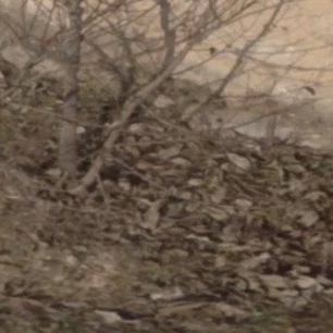
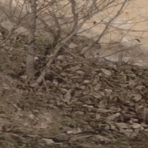
There is a very very slight blurriness between the original footage and Skybox V1. But then there is another regress between Skybox V1 and VR Comp editor which makes the difference between the original footage and Vr Comp editor more visible.
Here is a download link with my comparison: WeTransfer
You can see the blurriness on the grass and the brown cow (left) in the middle of the screen.
Do you notice this as well?
Thanks in advance!
Thank you for those comparison images, Ellen! I am noticing several differences, so let me tell you how I'm evaluating the differences and you can let me know if we're getting somewhere:
First, I'm bringing in all three pngs to After Effects, the original, the Skybox, and the Comp Editor images. I stack all three of them in a comp (select and drag all to the create new comp button). Then with the Original image up as the top layer, I set the blending mode to Difference on that layer. This allows me to show or hide the Skybox or Comp Editor layers to see the difference between the images.
Now, to really amplify any differences present, it helps to create a new adjustment layer and throw a Levels effect on that with the "input white" clamped way down close to black.
Here's what I observe:
1. Without the adjustment layer, the "Skybox" image shows mostly an apparent difference in the region where the 2D edit was added to paint or clone stamp sky color over the apparatus in the zenith. WITH the adjustment layer enabled, you can see slight differences across the whole image. (Differences between the Skybox image vs. the original)
2. Without the adjustment layer, the "Comp Editor" image shows only the difference of the added text, "VR Comp Editor." WITH the adjustment layer enabled, you can see the slight differences only in the region of the added 2D edit that contains the text, including the warped output frame region specified by the 2D edit.
Since you've added 2D edits to different regions of the two images (Skybox vs. Comp Editor), the question then becomes, what's the difference in apparent degradation between that shown in the Skybox png and that in the Comp Editor png. You can estimate that by hiding the original image and setting the new "top" layer to a Difference blending mode and doing the same comparison. They look *really* similar to me.
But to do an apples-to-apples comparison, it's probably better to make sure your comparisons have 2D edits on identical regions in the image. When I do that kind of comparison from scratch, I get very clean looking diffs even with the levels filter cranked way up.
Now, I happen to know that the underlying algorithms aren't totally identical in every respect, but the image quality on the new Plane To Sphere seems identical to Project 2D on some image types, superior on some image types, and only nearly identical on some image types. For one of our automated image quality tests, for example, we use a very tight 1-pixel grid, which falls apart on the old one and holds up reasonably well on the new one. "Real World" images like the ones you've provided aren't always as forgiving as synthetic ones, for either the old or new sampling scheme depending on context.
I hope this helps answer your questions, and if not, feel free to keep the thread open. I welcome dissent!