



QuietRobot
Known Participant
Jun 14, 2025 2:52 AM UTC
Question

Align inbox panel content

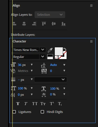
I think I would look better visually and and less tight towards the margins if the content of the inbox panels were aligned to the panel title. Is that possible? thanks team. 🙌


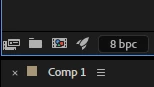
This is another example, the Interpret Fotage button is attached to the edge of the panel (and the monitor).


4 replies

sskaz
Inspiring
Jun 17, 2025 8:08 PM UTC

Please, no. I use every ounce of pixels and make my panels’ columns as small and narrow as possible to fit more room for viewports and more panels without needing to scroll.


I vastly prefer the snug fit of the “legacy” panels, as opposed to the modern Properties panel which uses a more visually aligned approach, and results in tons of empty and useless whitespace, especially on the left and right sides.

Translate
QuietRobot
Known Participant
Jun 23, 2025 1:05 PM UTC

But if you are not going to lose any pixeld and your panels, just aligning the content giving a consistent appearance.

Even if you don't use the new panel, I shouldn't worry that I adobe fix this.


Translate
sskaz
Inspiring
Jun 23, 2025 3:20 PM UTC

Sure, if the minimum width didn’t change, but I just don’t see them doing that since everything (nearly all apps and platforms) have converged on the design idea of gigantic whitespace as if I was using my fingers to interact with the UI.


But since Adobe pushed out the Spectrum UI After Effects updates last Summer/Fall, it might be quite a while before they shift any focus back onto UI/design changes again.

Translate