hellopaul4
Inspiring
March 20, 2026
Question

Did the menu highlighting just get really pale?

  • March 20, 2026
  • 2 replies
  • 83 views

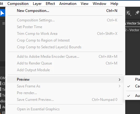
I’ve just updated AE Beta to 26.3.0x16, and noticed that the highlighting of moused-over items in the main menus is so pale that it’s almost non-existent. Here, I’ve moused-over “Preview”, not that you can really tell:


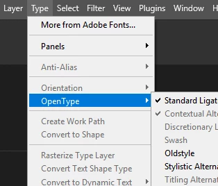
Here’s a nice, clear menu in Photoshop:


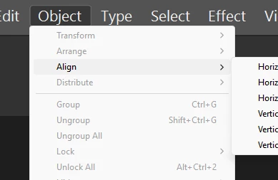
What’s going on with AE’s menus? Interestingly, Illustrator suffers from the same rubbish pale-menu problem too:


    2 replies

    hellopaul4
    Inspiring
    March 27, 2026

    Just wondering if anyone at Adobe has any thoughts on this? Why the inconsistency across apps? Can we all agree to get rid of the horrid pale grey AE/Illustrator menu design and adopt the superior Photoshop blue one?

    Shebbe
    Community Expert
    Community Expert
    March 26, 2026

    I don’t think it's related to the Beta, I see it in 25.5.0 as well. FWIW I don't think any of these are that elegant. It looks like Windows light even if you have the OS to dark and it’s appearance in the case of PS/AI conflicts with the menu bar itself.

    I hope that in the future the whole UI is their own rather than hybrid ugliness.