



Answered
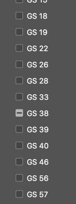
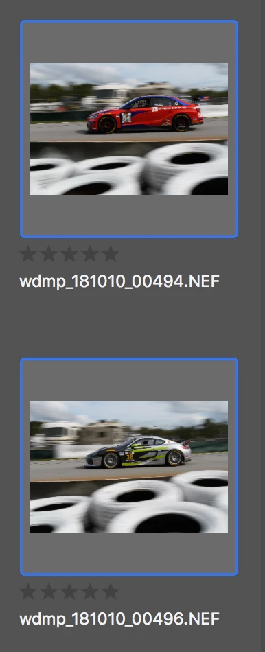
Bridge 2019 has big gaps between images in content view, between kewords
I am very frustrated. Bridge 2019 now has big, unused gaps between images in the "content" window and between my keywords. This means there is a lot of unused space, and more scrolling. Bridge 2018 was MUCH more compact. Is there a preference for "classic" view, or something like that? I have no idea what purpose this change served. Please help.
 AdChoices