
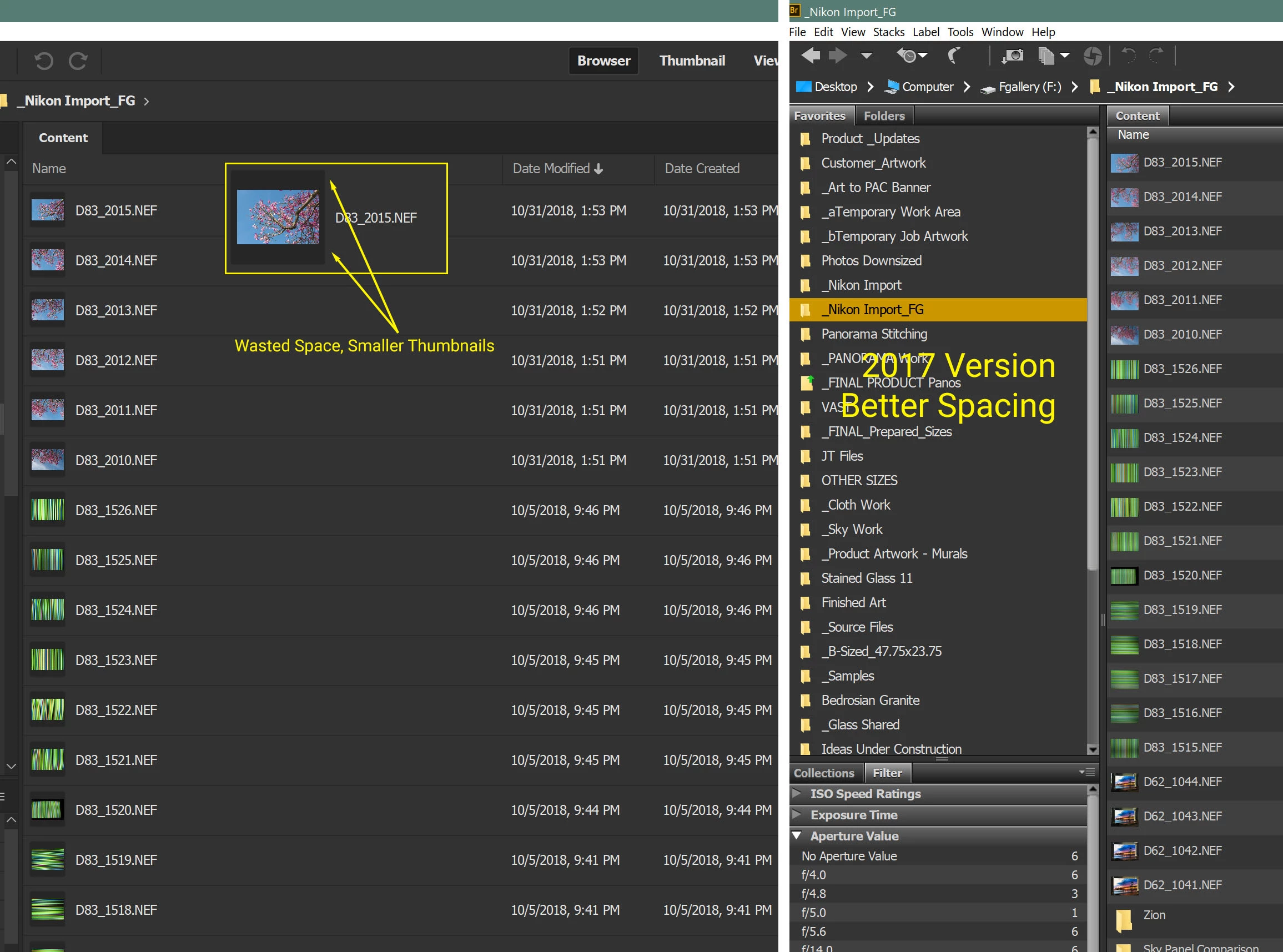
See How Adobe Wrecked the Bridge User Interface in 2019 version
To start with, List View is for displaying as much information as possible on the screen. The latest version has unnecessary padding on each row, and puts a black border around the thumbnail, rendering them USELESS at the size they are typically shown in this view. It REALLY helps to have both the thumbnail AND the filename when searching for an image. The goal of a software update should not be to make Bridge look more "up to date" or stylish. In the case of List view the designer should have asked himself this question: "How can I present the most information, in the most readable format to the user?" Please fix this, or give us an option to eliminate the padding and the black border around the thumbnail.
While you're at it, what was wrong with the larger color bars for labels? They were PERFECT, and much easier to see, than those little dots.
This image shows the 2019 Bridge version on the left, compared with the 2017 version on the right. This is a 4K 32" monitor with text set to 200%, which is mandatory for 4K.
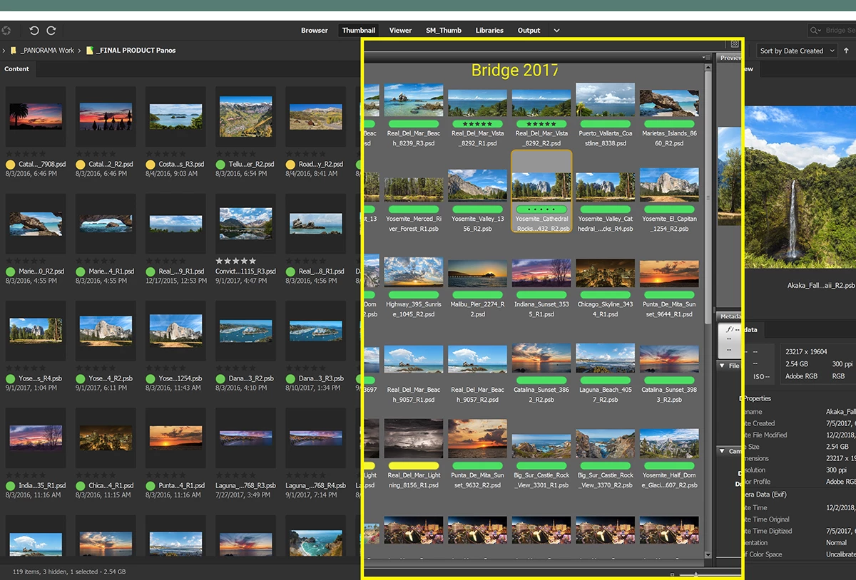
Below is the "New and Improved" Thumbnail View comparison, where the genius designers determined that it would be better to steal space from the filename for the important new label dot rather than leaving it above with the ratings stars. Now that the rating stars are always default text colored, they're not as visible as they were with a colored label background. And now the names of the files any longer are so short, you have no chance to guess what they are. There's padding everywhere in this new design, which reduces the amount of information on the screen, meaning constant scrolling. Note to Adobe Software Designers: Padding and black box backgounds are UNNECESSARY as the serve no useful purpose to a graphic designer. They are a waste of valuable screen pixels. What we need is clear, efficient, organized access to our thousands of image files. Even the Metadata and other tabs are all spaced out.
I'm new to this version but I'm sure I'll find more rookie design skills employed. If anybody knows a way to get the features like Photomerge and 'Load into Photoshop Layers' to work with Bridge 2017 and the latest Photoshop CC, please let me know and I'll wash my hands of this debacle of a design. Are you reading this Adobe? You destroyed an indispensable, formerly excellent application. Fix these issues now.
