Answered
Can I turn off BreakPoint for Mobile in Captivate 8?
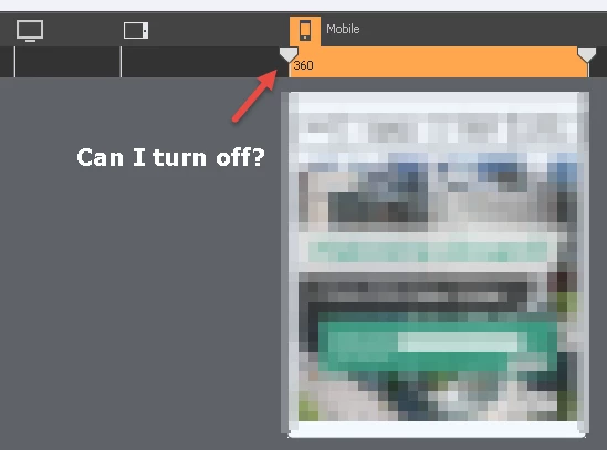
Within Captivate 8 is there a way to turn off the Mobile break-point?
Thanks

Within Captivate 8 is there a way to turn off the Mobile break-point?
Thanks
Lilybiri wrote
I didn't tell to delete items in the mobile breakpoint, just leave it alone. What you design on the primary Breakpoint is automatically taken over by the lower breakpoints. You have to start with that primary one. Later on you can change items on the lower breakpoint, or indicate that do not have to show up in them, or even replace items.
You bring up a few interesting points that I would like clarification on.
1. When you do responsive design, do you complete your primary breakpoint 100 before you work on the other breakpoints, or do you work with all of them together?
2. When you write "or indicate that do not have to show up in them, or even replace items" do you mean there is something in Captivate that allows me to indicate not to have the design show up in mobile?
When I do responsive design with Breakpoint views, I start with setting up a theme. Especially the text styles are important, because you have to define a font size for each breakpoint view. After finishing the theme, whcih inclused the master slides, and going to the slide design, I will indeed complete the Primary view, at least per slide, before going to the lower breakpoints and edit the layout for them. Use the right-click menu for items in the lower breakpoints to take out items or to add items that should be used only in that view. It needs quite a lot of training to get to grips with responsive design, cannot be put just in answers on a forum.
Already have an account? Login
Enter your E-mail address. We'll send you an e-mail with instructions to reset your password.
 AdChoices