


Captivate 6 & 8. Publish opens in iPad larger than browser window. If you rotate the view, the publish snaps to fit.
Have you experienced this? Do you have a solution?
(The content was a partial screen recording of an application. I put a table of contents on the side) I did not invoke any responsive actions.)
I publish for swf and HTML 5. I do not click the checkmark for 'fill browser screen'.
I then place publish on the web. I open it in my laptop, the publish fills the screen. I resize the browser and the published object resizes with the browser. Good!
I open it in iPhone, the publish immediately works in any orientation. Good!
However, if I open it in iPad, any orientation, the publish is larger than the browser screen. If I then rotate to the other orientation, the publish snaps to fill the browser. Then I rotate the iPad back to the origional orientation, and it now fills that screen properly. Weird!
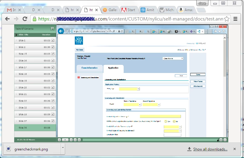
Below is a pix of it resizing properly on the desktop.
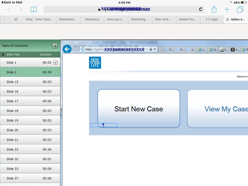
Pix below is how it improperly opens in iPad. If I then rotate the orientation, from then on it will always snap to the right size
Any ideas on how to remedy this?
Thx!
Dave
 AdChoices