Inspiring
August 18, 2024
Answered

Adding a sticky footer using Flexbox

  • August 18, 2024
  • 2 replies
  • 1220 views

Hi everyone,


I want the footer element to reside permanently on the bottom of the page. Using Flexbox, this should be easy to accomplish, but I have not had any success. I feel embarrassed to ask this question.


There is a flex container with three child elements; the parent element (flex-container) is set to display: flex.


<html>
<head>
<meta charset="UTF-8">
<title>HTML</title>
<style>
*, *::before, *::after {
margin: 0;
padding: 0;
box-sizing: border-box;
}
body {
min-height: 100dvb;
}
.flex-container {
display: flex;
flex-direction: row;
}
.flex-container > div {
height: 150px;
width: 200px;
color: #FFF;
}
.header {
background-color: peachpuff;
}
.main {
background-color: crimson;
}
.footer {
margin-left: auto;
background-color: darksalmon;
}
</style>
</head>
<body>
<div class="flex-container">
<div class="header"></div>
<div class="main"></div>
<div class="footer"></div>
</div>
</body>
</html>


When I set the flex-direction to row and the footer element to margin-left: auto as it appears above, everything works fine. The footer element is pushed to the far right side of the viewport like this.

 

But when I set the flex-direction to column and the footer element to margin-top: auto, the elements stack; there is no gap between the main and footer elements. I want the footer to be pushed to the bottom.
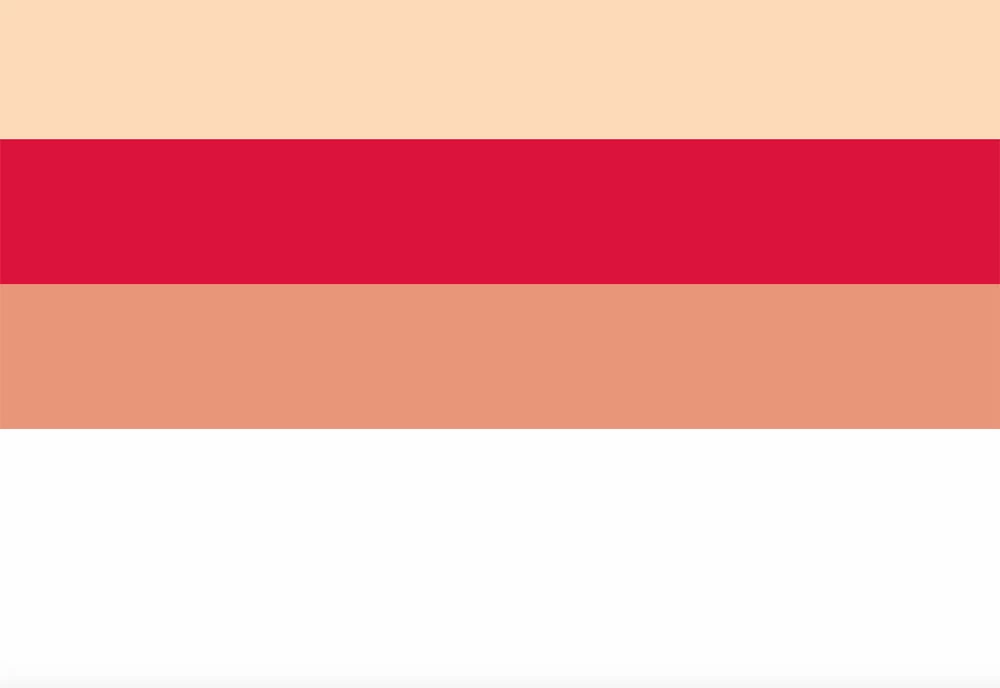
 

What am I doing wrong? Is there a better way?


Thanks.


Mark

This topic has been closed for replies.
Correct answer BenPleysier

Although @Nancy OShea's answer can be marked as correct, a real flexbox solution is to use flex-grow: 1; as in:

<!doctype html>
<html lang="en">

<head>
    <base href="/">
    <meta charset="UTF-8">
    <meta name="viewport" content="width=device-width, initial-scale=1, shrink-to-fit=no">
    <title>Untitled Document</title>

    <style>
        *,
        *::before,
        *::after {
            margin: 0;
            padding: 0;
            box-sizing: border-box;
        }

        html,
        body {
            height: 100vh;
        }

        body {
            display: flex;
            flex-direction: column;
        }

        body>* {
            min-height: 50px;
            padding: 20px;
        }

        header {
            background-color: peachpuff;
        }

        main {
            background-color: crimson;
            flex-grow: 1;
        }

        footer {
            background-color: darksalmon;
        }
    </style>
</head>

<body>
    <header>header</header>
    <main>main</main>
    <footer>footer</footer>
</body>

</html>


NB: 

  • I have used semantic elements rather than the generic <div> element. Useful for assitive technology.
  • The example is only meant to show the flexbox technology. 


2 replies

BenPleysier
Community Expert
BenPleysierCommunity ExpertCorrect answer
Community Expert
August 18, 2024

Although @Nancy OShea's answer can be marked as correct, a real flexbox solution is to use flex-grow: 1; as in:

<!doctype html>
<html lang="en">

<head>
    <base href="/">
    <meta charset="UTF-8">
    <meta name="viewport" content="width=device-width, initial-scale=1, shrink-to-fit=no">
    <title>Untitled Document</title>

    <style>
        *,
        *::before,
        *::after {
            margin: 0;
            padding: 0;
            box-sizing: border-box;
        }

        html,
        body {
            height: 100vh;
        }

        body {
            display: flex;
            flex-direction: column;
        }

        body>* {
            min-height: 50px;
            padding: 20px;
        }

        header {
            background-color: peachpuff;
        }

        main {
            background-color: crimson;
            flex-grow: 1;
        }

        footer {
            background-color: darksalmon;
        }
    </style>
</head>

<body>
    <header>header</header>
    <main>main</main>
    <footer>footer</footer>
</body>

</html>


NB: 

  • I have used semantic elements rather than the generic <div> element. Useful for assitive technology.
  • The example is only meant to show the flexbox technology. 


Wappler is the DMXzone-made Dreamweaver replacement and includes the best of their powerful extensions, as well as much more!
Inspiring
August 19, 2024

Hi Nancy & Ben,


Thanks for responding. I'll give them both a try. I had the header, main, and footer elements wrapped in a DIV. Once I removed it, everything worked just fine.


Thanks.


Mark

Nancy OShea
Community Expert
Community Expert
August 18, 2024

Try this:


<!doctype html>
<html lang="en">
<head>
<meta charset="utf-8">
<title>CSS Flexbox Footer at Bottom</title>
<meta name="viewport" content="width=device-width, initial-scale=1">
<style>
body {
margin:0;
min-height: 100vh;
display: flex;
flex-direction: column;
}

main {display:flex;width:95%;}

.col {padding:0 2%; }

.flex1 {width:25%}

.light {background:#DDD;}

.dark {background:#222; color:#FFF}

/**OPTIONAL FOOTER AT SCREEN BOTTOM**/
footer {margin-top:auto}

/* Special Rules for mobiles */
@media only screen and (max-width: 800px) {
main {flex-wrap: wrap}
}
.classname {
font-family:Cambria, "Hoefler Text", "Liberation Serif", Times, "Times New Roman", "serif"
font-size:2rem;
color:lightcoral;
font-weight:bold;
}

</style>
</head>
<body>
<nav class="dark">
<p>Navigation here</p>
</nav>

<header>
<h1 class="classname">Hello World</h1>
</header>

<main>
<div class="col light flex1">
<p>Marzipan soufflé cotton candy tart sweet bonbon. Macaroon fruitcake pie gummies gummi bears biscuit dragée. Topping icing marshmallow. Soufflé gummies dessert jelly dessert liquorice.</p>
</div>
<div class="col">
<p>Marzipan soufflé cotton candy tart sweet bonbon. Macaroon fruitcake pie gummies gummi bears biscuit dragée. </p>
<p>Marzipan soufflé cotton candy tart sweet bonbon. Macaroon fruitcake pie gummies gummi bears biscuit dragée. Topping icing marshmallow. Soufflé gummies dessert jelly dessert liquorice.</p>

<p>Marzipan soufflé cotton candy tart sweet bonbon. Macaroon fruitcake pie gummies gummi bears biscuit dragée. Topping icing marshmallow. Soufflé gummies dessert jelly dessert liquorice.</p>

<p>Marzipan soufflé cotton candy tart sweet bonbon. Macaroon fruitcake pie gummies gummi bears biscuit dragée. Topping icing marshmallow. Soufflé gummies dessert jelly dessert liquorice.</p>
</div>
<div class="col light flex1">
<p>Marzipan soufflé cotton candy tart sweet bonbon. Macaroon fruitcake pie gummies gummi bears biscuit dragée. </p>
</div>
</main>

<footer class="dark">
<p>Footer goes here</p>
</footer>

</body>
</html>


Nancy O'Shea— Product User & Community Expert