New Participant
February 11, 2017
Question

Customizable menu with images in a fluid grid layout

  • February 11, 2017
  • 1 reply
  • 1919 views

Apologies, but I'm fairly new to web design. Although I have a specific question, if what I am doing isn't possible (or if nobody has an answer), in the end I'd like to know the best way to create a customizable menu (with the ability to insert images into the menu) in a fluid grid layout. So that is the ultimate goal here.

I am using CS6 and my website is in a fluid grid layout. I am building menus with the Ajatix Advanced CSS 5 Dreamweaver Extension add-on because it allows one to insert images into the menu. With the Ajatix menu builder I am able to build the menu exactly how I want it. However, when I insert it into the website, it does not conform to the fluid grid layout CSS. So the menu does not resize and it does not appear that CSS stylesheet created for the Ajatix menu and the CSS stylesheet of the fluid grid layout are communicating with each other, or one is overriding the other.

If anyone knows that this Ajatix menu builder is completely and forever incompatible with the fluid grid layout then I guess you can provide a quick answer. But if you could then please advise on other solutions I'd greatly appreciate it. I haven't included any code in this question because I thought I would start general and get more specific upon request.

The end-goal is to have the user click on the image box (see below) in my website and have the menu pop-out. Each menu item within is also an image file designed in photoshop, not the standard text provided in the spry menus. Is what I am doing possible? Or am I simply going about this the wrong way? Or am I missing something very simple here? I attempted to use the spry menu but it did not appear to allow for images and it simply did not have the functionality that I needed. I also read that spry menus do not work with fluid grid layouts, but it appears that the Ajatix menu builder also doesn't work with fluid grid layouts either. Am I wrong about the spry menu though? Should I revisit that option? Or what should I be using instead? 

This is what the website looks like and each image box will potentially be a menu “button,” although right now, only the first one to the left is and all the rest are simply image placeholders to demonstrate how the first one to the left (as a menu) does not resize. 
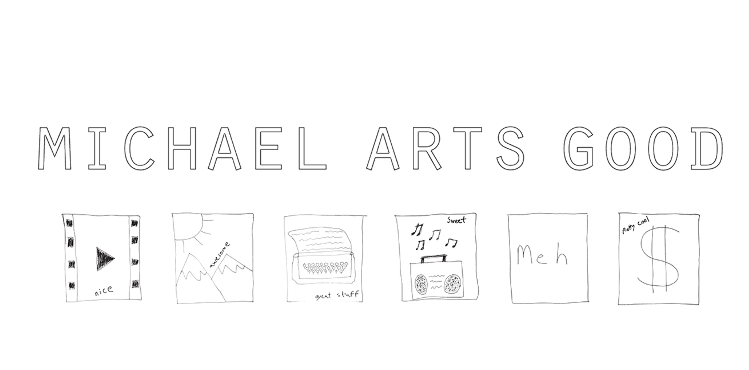
This is what the menu button looks like when it is clicked:
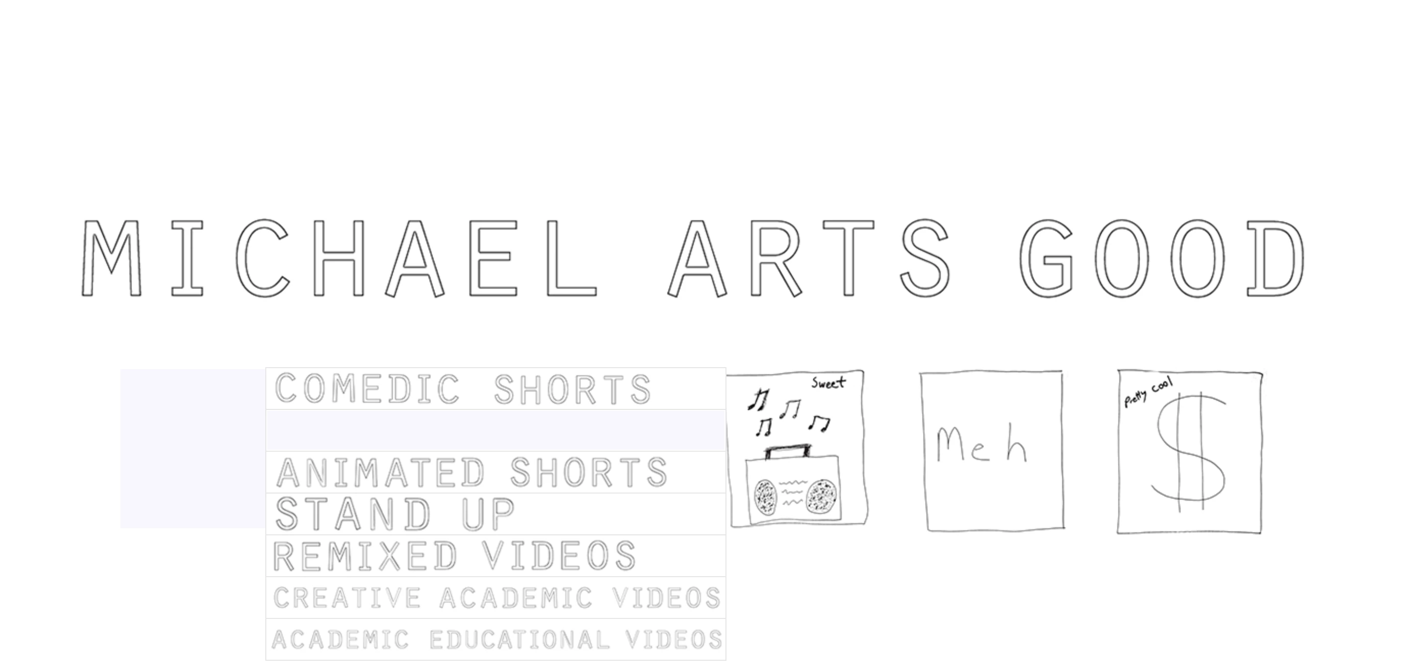
But this is what happens when the website is resized smaller, as everything shrinks except for the menu (the other image buttons have not been turned into menus yet):
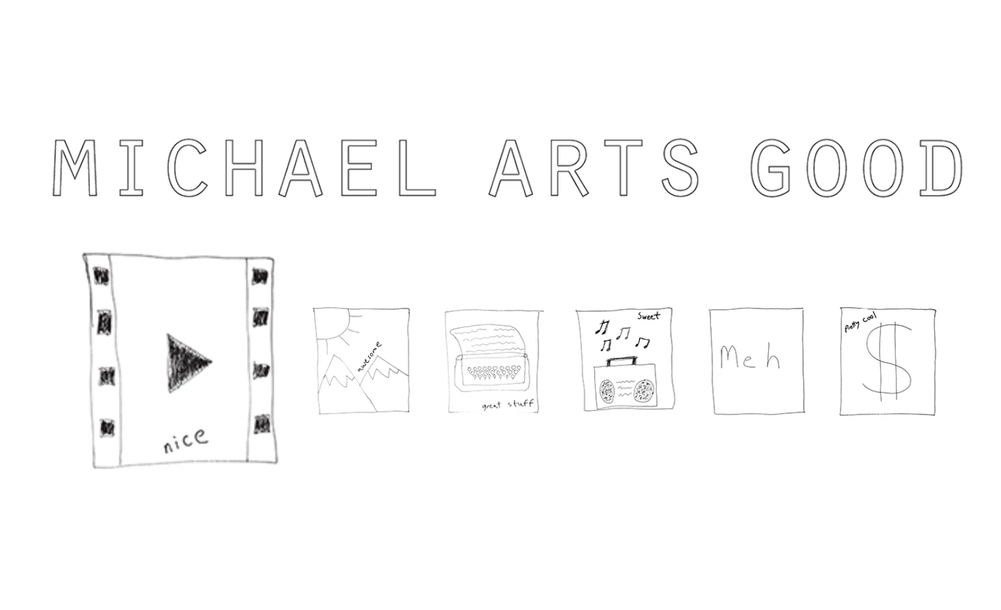
Thanks and best.

This topic has been closed for replies.

1 reply

Nancy OShea
Community Expert
February 11, 2017

1) I don't recommend using legacy Fluid Grid layouts.  They were a nice idea at the time (2012) but have since been trumped by other better methods -- Bootstrap and CSS Flexbox for example.   FGLayouts were removed from the latest version of Dreamweaver.

2) Making responsive menus can be challenging because they must be well... er.... responsive to fit on mobile, tablet and desktop displays.  Links must also be finger tap friendly for non-mouse devices. 

Bootstrap uses the navicon (aka hamburger) menu.  When the icon is tapped a vertical list of links appears.  This works very well on mobile devices.   On Desktops, links are displayed horizontally.

You will very rarely find a responsive menu that uses bitmap graphics anymore because it's a hassle to maintain and visually poor when re-scaled on Retina/Hi-Res displays.   Images of text can't be indexed, searched or translated so for  accessibility reasons, it's usually best to use simple menus made with plain text or text and SVG icons.  A working Bbotstrap example in Reply #6 below.

Re: Images on top of images.  Basic HTML/CSS question

Nancy

Nancy O'Shea— Product User & Community Expert
New Participant
February 12, 2017

Thanks for your response Nancy. I had no idea fluid grid layouts were so out of date!

So it looks like Bootstrap won't be that difficult to upgrade to and start using (it's free right? it looks like it works well with Dreamweaver?). I just want to make sure that I don't spend time upgrading and then find myself still unable to design the website I want to design.

You say when the Bootstrap navicon button is pressed it displays a list horizontally on a desktop? I would like the menu list to display vertically at all times (see image example). So can this be adjusted, or is there something else in Bootstrap that will work? A vertical drop down menu?

And just a point of clarification, are you saying that I should turn my images of text into SVG icons? I haven't looked too far into it, but I think I could save the PNG files as SVG files in Illustrator. Would that work?

Most importantly, how easy is it to insert the images files/SVG files into the Bootstrap navicon menu, or vertical menu if there is one?

Thanks and Best

BenPleysier
Community Expert
February 12, 2017

To give you a leg up with Bootstrap, copy and paste the following code into a new document.

<!doctype html>

<html>

<head>

<meta charset="utf-8">

<meta http-equiv="X-UA-Compatible" content="IE=edge">

<meta name="viewport" content="width=device-width, initial-scale=1">

<title>Untitled Document</title>

<!-- Latest compiled and minified CSS -->

<link rel="stylesheet" href="https://maxcdn.bootstrapcdn.com/bootstrap/3.3.7/css/bootstrap.min.css" integrity="sha384-BVYiiSIFeK1dGmJRAkycuHAHRg32OmUcww7on3RYdg4Va+PmSTsz/K68vbdEjh4u" crossorigin="anonymous">

<!-- Optional theme -->

<link rel="stylesheet" href="https://maxcdn.bootstrapcdn.com/bootstrap/3.3.7/css/bootstrap-theme.min.css" integrity="sha384-rHyoN1iRsVXV4nD0JutlnGaslCJuC7uwjduW9SVrLvRYooPp2bWYgmgJQIXwl/Sp" crossorigin="anonymous">

<styles>

</styles>

</head>

<body>

<nav class="navbar navbar-default" role="navigation">

  <!-- Brand and toggle get grouped for better mobile display -->

  <div class="navbar-header">

    <button type="button" class="navbar-toggle" data-toggle="collapse" data-target=".navbar-ex1-collapse">

      <span class="sr-only">Toggle navigation</span>

      <span class="icon-bar"></span>

      <span class="icon-bar"></span>

      <span class="icon-bar"></span>

    </button>

    <a class="navbar-brand" href="#">Brand</a>

  </div>

  <!-- Collect the nav links, forms, and other content for toggling -->

  <div class="collapse navbar-collapse navbar-ex1-collapse">

    <ul class="nav navbar-nav">

      <li class="active"><a href="#">Link</a></li>

      <li><a href="#">Link</a></li>

      <li class="dropdown">

        <a href="#" class="dropdown-toggle" data-toggle="dropdown">Dropdown <b class="caret"></b></a>

        <ul class="dropdown-menu">

          <li><a href="#">Action</a></li>

          <li><a href="#">Another action</a></li>

          <li><a href="#">Something else here</a></li>

          <li><a href="#">Separated link</a></li>

          <li><a href="#">One more separated link</a></li>

        </ul>

      </li>

    </ul>

    <form class="navbar-form navbar-left" role="search">

      <div class="form-group">

        <input type="text" class="form-control" placeholder="Search">

      </div>

      <button type="submit" class="btn btn-default">Submit</button>

    </form>

    <ul class="nav navbar-nav navbar-right">

      <li><a href="#">Link</a></li>

      <li class="dropdown">

        <a href="#" class="dropdown-toggle" data-toggle="dropdown">Dropdown <b class="caret"></b></a>

        <ul class="dropdown-menu">

          <li><a href="#">Action</a></li>

          <li><a href="#">Another action</a></li>

          <li><a href="#">Something else here</a></li>

          <li><a href="#">Separated link</a></li>

        </ul>

      </li>

    </ul>

  </div><!-- /.navbar-collapse -->

</nav>

<!-- jQuery (necessary for Bootstrap's JavaScript plugins) -->

<script src="https://ajax.googleapis.com/ajax/libs/jquery/1.12.4/jquery.min.js"></script>

<!-- Latest compiled and minified JavaScript -->

<script src="https://maxcdn.bootstrapcdn.com/bootstrap/3.3.7/js/bootstrap.min.js" integrity="sha384-Tc5IQib027qvyjSMfHjOMaLkfuWVxZxUPnCJA7l2mCWNIpG9mGCD8wGNIcPD7Txa" crossorigin="anonymous"></script>

</body>

</html>

The above contains a horizontal menubar that becomes a 'hamburger' in smaller screen sizes. It is easy enough to have the 'hamburger' at all times if you prefer.

You mention that you want images to represent the menubar. From experience, this will not work for a horizontal menubar. Many of my clients want that as well; one case in mind is BunchOBlokes - Men in Crisis where the horizontal arrangement of the left-hand icons did not work in a responsive design, i.e. the real-estate did not allow full size buttons and resized buttons were too small on small screens. As a compromise, I placed the images in a vertical menubar. B.t.w., the site is made using the Bootstrap framework. More on Bootstrap see Bootstrap 3 Tutorial

To work with SVG's requires a lot more knowledge. To get you started, have a look at Everything You Need To Know About SVG | CSS-Tricks. Illustrator is a top notch tool for the creation of SVG's as you will notice by following the tutorial.

Wappler is the DMXzone-made Dreamweaver replacement and includes the best of their powerful extensions, as well as much more!