Participant
August 8, 2025
Question

Dreamweaver Drop Down Menu

  • August 8, 2025
  • 3 replies
  • 324 views

Hello, 

This is my first time using Dreamweaver and everything seemed to be going well until I tried to add a drop down menu to my navigation bar. While the list items are being added, they appear beside the button they're supposed to be underneath of- like they're a part of the main navigation bar and not a drop down. I've tried everything I can think of to fix it, but every piece of CSS I try to add distorts the larger navigation bar while still not bringing the two menu options down. I've included a screenshot of my screen and how it appears in the preview, can anyone tell me where I went wrong?
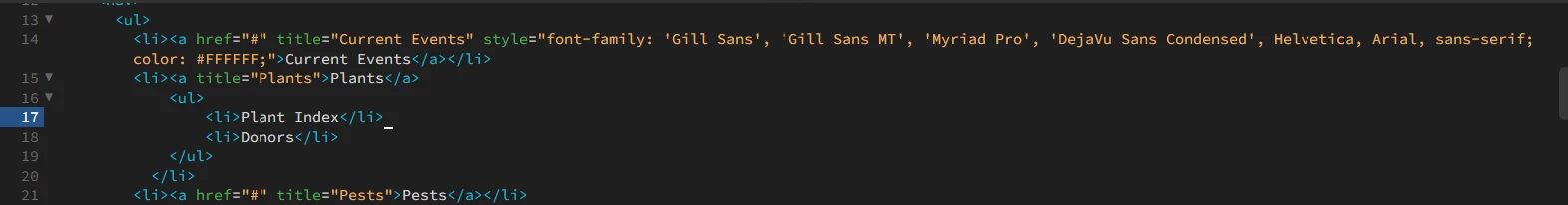
3 replies

Legend
August 11, 2025

If you're still looking for a solution:


<!DOCTYPE html>
<html lang="en">
<head>
<meta charset="UTF-8">
<title>Responsive Navigation</title>
<style>
* {
box-sizing: border-box;
}

body {
font-family: helvetica, sans-serif;
font-size: 16px;
}

.mainNav {
background-color: #233854;
}

.topLinks {
margin: 0;
padding: 20px;
display: flex;
justify-content: space-between;
list-style: none;
}
@media screen and (max-width: 768px) {
.topLinks {
background-color: #233854;
padding: 0;
}
}

.topLinks li {
margin: 0;
padding: 0;
position: relative;
}

@media screen and (max-width: 768px) {
.topLinks li {
position: static;
}
}

.topLinks a {
text-decoration: none;
color: #fff;
cursor: pointer;
}

@media screen and (max-width: 768px) {
.topLinks a {
padding: 15px 20px;
display: block;
border-bottom: 1px solid #fff;
}

}
@media screen and (max-width: 768px) {
.topLinks {
display: none;
}
}

.topLink span {
display: inline-block;
margin: 0 0 0 10px;
}

.subLinks {
position: absolute;
top: 2.4em;
margin: 0 0 0 -20px;
padding: 0;
background-color: #3c6090;
width: 200px;
display: none;
opacity: 0;
transition: opacity 500ms ease-in-out
}

@media screen and (max-width: 768px) {
.subLinks {
position: static;
width: 100%;
margin: 0;
}
}

.subLinks li {
list-style: none;
margin: 0;
padding: 0;
}

.subLinks a {
display: block;
padding: 12px 20px;
border-bottom: 1px solid #fff;
}

@media screen and (max-width: 768px) {
.subLinks a {
padding: 12px 35px;
width: 100%;
}
}

.subLinks a:hover {
background-color: #5d86bb;
}

.mobileIcon {
color: #fff;
background-color: #233854;
display: none;
padding: 10px 25px;
font-size: 25px;
cursor: pointer;
}

@media screen and (max-width: 768px) {
.mobileIcon {
display: flex;
justify-content: end;
}
}

.burger {
display: flex;
flex-wrap: wrap;
align-items: center;
height: 25px;
width: 22px;
}

.burger > div {
width: 100%;
height: 2px;
background-color: #fff;
}

.activeContent {
display: block;
}

.fadeIn {
opacity: 1;
}

.showTopLinks {
display: block;
}

</style>
</head>
<body>

<div class="mobileIcon">
<div class="burger">
<div></div>
<div></div>
<div></div>
</div>
</div>
<nav class="mainNav">

<ul class="topLinks">
<li>
<a class="topLink">Current Events<span>+</span></a>
<ul class="subLinks">
<li><a href="#">Current Events 1</a></li>
<li><a href="#">Current Events 2</a></li>
<li><a href="#">Current Events 3</a></li>
<li><a href="#">Current Events 4</a></li>
<li><a href="#">Current Events 5</a></li>
</ul>
</li>
<li><a class="topLink">Plants<span>+</span></a>
<ul class="subLinks">
<li><a href="#">Plants 1</a></li>
<li><a href="#">Plants 2</a></li>
<li><a href="#">Plants 3</a></li>
<li><a href="#">Plants 4</a></li>
<li><a href="#">Plants 5</a></li>
</ul>
</li>

<li><a class="topLink">Plant Index<span>+</span></a>
<ul class="subLinks">
<li><a href="#">Plant Index 1</a></li>
<li><a href="#">Plant Index 2</a></li>
<li><a href="#">Plant Index 3</a></li>
<li><a href="#">Plant Index 4</a></li>
<li><a href="#">Plant Index 5</a></li>
</ul>
</li>

<li><a class="topLink">Pests<span>+</span></a>
<ul class="subLinks">
<li><a href="#">Pests 1</a></li>
<li><a href="#">Pests 2</a></li>
<li><a href="#">Pests 3</a></li>
<li><a href="#">Pests 4</a></li>
<li><a href="#">Pests 5</a></li>
</ul>

</li>
<li><a class="topLink">Team</a></li>
<li><a class="topLink">Get</a></li>


</ul>

</nav>


<script>
let topLink = document.querySelectorAll('.topLink');
let subLinks = document.querySelectorAll('.subLinks');
let burger = document.querySelector('.burger');
let topLinks = document.querySelector('.topLinks');

burger.onclick = function() {
topLinks.classList.toggle('showTopLinks')
}

topLink.forEach((topLink, index) => {
if (subLinks[index]) {
topLink.onclick = function () {
subLinks.forEach((subLinks) => {
subLinks.classList.remove('activeContent', 'fadeIn');
})
subLinks[index].classList.add('activeContent');
setTimeout(function () {
subLinks[index].classList.add('fadeIn')
}, 200)
}
}
});

window.addEventListener('resize', function() {
if (window.innerWidth > 768) {
topLinks.classList.remove('showTopLinks');
subLinks.forEach((subLinks) => {
subLinks.classList.remove('activeContent', 'fadeIn');
})
}
if (window.innerWidth < 768) {
subLinks.forEach((subLinks) => {
subLinks.classList.remove('activeContent', 'fadeIn');
})
}
});
</script>
</body>
</html>
BenPleysier
Community Expert
Community Expert
August 11, 2025

@osgood_, great example of not using Bootstrap. However, the example could be improved if clicking away from the dropdown automatically closed it.

Wappler is the DMXzone-made Dreamweaver replacement and includes the best of their powerful extensions, as well as much more!
Legend
August 17, 2025
quote

@osgood_, great example of not using Bootstrap. However, the example could be improved if clicking away from the dropdown automatically closed it.


By @BenPleysier


I think all you need to do is add the below:


window.onclick = function(event) {
if (!event.target.matches('.topLink')) {
let subLinks = document.querySelectorAll('.subLinks');
subLinks.forEach((subLinks) => {
subLinks.classList.remove('activeContent', 'fadeIn');
})
}
}


Granted it's tricky building one's own solutions but you learn a lot. If I was starting over I might come at it from a different perspective these days...........it ain't what it used to be.

BenPleysier
Community Expert
Community Expert
August 8, 2025

Why not use Bootstrap 5.3. That will give you this result

This is the code that was used. Copy and paste it into a new document to see the result

<!DOCTYPE html>
<html lang="en">

<head>
  <base href="/">
  <meta charset="UTF-8" />
  <meta name="viewport" content="width=device-width, initial-scale=1.0" />
  <title>Bootstrap 5.3 Navigation</title>

  <link rel="stylesheet" href="https://cdn.jsdelivr.net/npm/bootstrap@5.3.3/dist/css/bootstrap.min.css" integrity="sha384-QWTKZyjpPEjISv5WaRU9OFeRpok6YctnYmDr5pNlyT2bRjXh0JMhjY6hW+ALEwIH" crossorigin="anonymous" />
  <script src="/dmxAppConnect/dmxBootstrap5Navigation/dmxBootstrap5Navigation.js" defer></script>
</head>

<body>
  <nav>
    <div class="container-fluid border-bottom border-warning border-4" style="background: #233954; color: white">
      <ul class="navbar-nav flex-row justify-content-around pt-5">
        <li class="nav-item">
          <a class="nav-link active" aria-current="page" href="#">Home</a>
        </li>
        <li class="nav-item dropdown">
          <a class="nav-link dropdown-toggle" href="#" role="button" data-bs-toggle="dropdown" aria-expanded="false">
            Plants
          </a>
          <ul class="dropdown-menu">
            <li><a class="dropdown-item" href="#">Plant Index</a></li>
            <li><a class="dropdown-item" href="#">Donors</a></li>
          </ul>
        </li>
        <li class="nav-item">
          <a class="nav-link" href="#">Pests</a>
        </li>
        <li class="nav-item">
          <a class="nav-link" href="#">Team</a>
        </li>
        <li class="nav-item">
          <a class="nav-link" href="#">Get</a>
        </li>
      </ul>
    </div>
  </nav>
  <script src="https://cdn.jsdelivr.net/npm/bootstrap@5.3.3/dist/js/bootstrap.bundle.min.js" integrity="sha384-YvpcrYf0tY3lHB60NNkmXc5s9fDVZLESaAA55NDzOxhy9GkcIdslK1eN7N6jIeHz" crossorigin="anonymous"></script>
</body>

</html>


Wappler is the DMXzone-made Dreamweaver replacement and includes the best of their powerful extensions, as well as much more!
Nancy OShea
Community Expert
Community Expert
August 8, 2025

HTML = content structure

CSS = styles to make it pretty

JavaScript = adds interaction. 


Show us your code. The best way is to upload your problem page to your site's server and post the URL here.

A second option is to post your code on Code Pen or JS Fiddle and post the link here.

A less optimal third option is to copy & paste all relevant code into a web forum reply with the </> icon.  Don't use email, it won't come through. 


Nancy O'Shea— Product User & Community Expert