Known Participant
April 26, 2017
Answered

Fluid Grid vs. Bootstrap

  • April 26, 2017
  • 4 replies
  • 3936 views

I've have recently upgraded from CS6 to the latest version of CC 2017.

I enjoy exploring and getting used to moving around in CC, but there is a feature that I had relied heavily upon (in CS6) that I can't seem to find, or figure out:

What I liked most about the fluid grid layout in CS6, was that I was able to easily switch between the three device sizes and modify the CSS in the properties panel for each device accordingly.

I read somewhere that I should use container class, rather than the container-fluid class to achieve this? I changed the container class, but it did not make things any clearer.

*** Also, with the FGlayout, it was a case of inserting a FG div tag - is it correct with CC that I simply set <body container class="container-fluid"> ? ***

Any guidance would be very much appreciated.

Mike.

This topic has been closed for replies.
Correct answer Nancy OShea

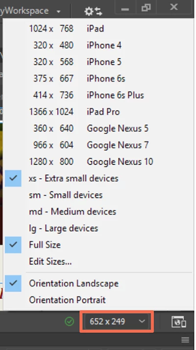
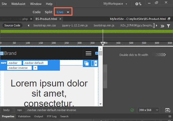
See screenshot.   Pick your target devices.  Lots to choose from.

Also see the Visual Media Queries Bar.

Use Media Queries to design responsive sites in Dreamweaver

Nancy

4 replies

pziecina
Legend
April 26, 2017

Just in case anyone is interested, even css for float based layouts is now undergoing a rewrite, to bring it up-to-date with rwd and hi-dpi.

visit the w3c site and read the css 2.2 specs.

Nancy OShea
Community Expert
Nancy OSheaCommunity ExpertCorrect answer
Community Expert
April 26, 2017

See screenshot.   Pick your target devices.  Lots to choose from.

Also see the Visual Media Queries Bar.

Use Media Queries to design responsive sites in Dreamweaver

Nancy

Nancy O'Shea— Product User & Community Expert
Known Participant
April 26, 2017

As much as I genuinely enjoy it, I really wish I did have the time to research and code my own responsive websites. But I haven't really discovered yet, or know why (bootstrap), is bloated, tried and tested.

As long as the website functions correctly, displays great content, fast and doesn't harm SEO -  I think it's ideal for small businesses like myself, who do their own web development, but lack the required skills.

I will get stuck into that Bootstrap tutorial, BenPleysier​. Thank you.

Absolutely spot on again Nancy OShea​ - exactly what I was looking for. Thank you.

Jon Fritz
Community Expert
Community Expert
April 26, 2017

In the beginning, the internet was ugly. Long pages of stacked images and text, bad colors, the <blink> tag...

Then people figured out <table> layouts. It was a marked improvement over the previous method. The internet changed, drastically, from a long parade of vertically stacked boredom to some semblance of "page layout".

It was far better, and it worked well, for years.

Then came the early days of Cascading Stylesheets. A wholly different way to take near-complete control over the styling of a page. It allowed far more flexibility than table-based layouts and the internet changed again. Now pages could truly look and feel very much like the printed documents from the same company on just about any desktop monitor. The internet changed drastically again.

It was far better, and it worked well, for years.

Then came mobile devices and CSS Media Queries. Now you could change the design of the page based on the user's device. Entire websites shift and reform to the will of the handheld. Another massive change to how the internet looks and feels, a truly revolutionary way to present information.

It was far better, and has worked well, for years.

Now we have these new, bleeding edge technologies: Flexbox and CSS Grid. They represent slightly better, much more confusing way to do that same thing we're already doing. This time, for the pain of relearning exactly how to do it, and what needs to be written for which browser to get it to function, we get a largely unapparent improvement to our layouts. As far as the average viewer is concerned, we could make the switch today, with 100% of websites being magically redesigned using the latest capabilities at our disposal and the collective viewership of these miraculously reformatted sites would yawn at the sameness of it all.

The jump from "basic to table", "table to css", "css to media query based css" were all far larger leaps than these latest and greatest box-model bending layout tools.

Your sites are fine with Bootstrap for the foreseeable future. Eventually, within the next year or two, Bootstrap will move to these new functions of CSS (and with it, very likely DW as well) and you'll be writing sites using the new capabilities. You likely won't even notice the switch until/unless someone tells you about it.


I don't use Bootstrap. I don't particularly care for it myself, but there's absolutely nothing wrong with using it now, or until something much more game changing comes along than Flex and Grids.

Just my $0.02.

BenPleysier
Community Expert
Community Expert
April 26, 2017

If you want to code your own responsive template and you want to do your own research on adding a navigation bar, carousel, responsive image, media object, jumbotron, buttons, form elements, accordions, tabs, breadcrumbs etc, then I agree with Paula, don't use Bootstrap.

Bootstrap is a bloated, tried and tested system that has been deployed by a mere 12,810,580 active sites.

Bootstrap uses this phrase to promote their free-of-charge product: Bootstrap is the most popular HTML, CSS, and JS framework for developing responsive, mobile first projects on the web.

Wappler is the DMXzone-made Dreamweaver replacement and includes the best of their powerful extensions, as well as much more!
BenPleysier
Community Expert
Community Expert
April 26, 2017

Forgot to add, just in case you do not want to listen to us, to learn Bootstrap see Bootstrap 3 Tutorial

Wappler is the DMXzone-made Dreamweaver replacement and includes the best of their powerful extensions, as well as much more!
pziecina
Legend
April 26, 2017

Fluid grid layouts has been removed, as it was not fit for purpose, bootstrap is the 3rd party open source replacement.

Some loved both, others hate both, but going forward it is not recommended that fluid grids is used for more than maintaining sites previously created with that feature. As a CC subscriber you can download all versions of Dw CC, you just cannot run them at the same time.

Personally i would not recommend using bootstrap, or any of the frameworks. That though is my opinion.

pellumbb77589221
Participating Frequently
January 22, 2021

Hi, Can you explain where this came from "but going forward it is not recommended that fluid grids is used for more than maintaining sites previously created with that feature." Can you say why it is not recommended?  It  currently works fine for me even on new sites.

Nancy OShea
Community Expert
Community Expert
January 22, 2021

Legacy FluidGrids were removed from DW about 7-8 years ago.  It was a flawed system to begin with and very temperamental to use.  Subsequently, Adobe gave up on it. 


Personally, I think Bootstrap is much better than FGLs ever were for many reasons. And millions of websites worldwide use Bootstrap very successfully but it's not the only responsive framework available.  Use whichever system works best for you.


Nancy O'Shea— Product User & Community Expert