Known Participant
December 10, 2017
Answered

I need help adding a section to my webpage on Dreamweaver!

  • December 10, 2017
  • 3 replies
  • 855 views

Hi All!

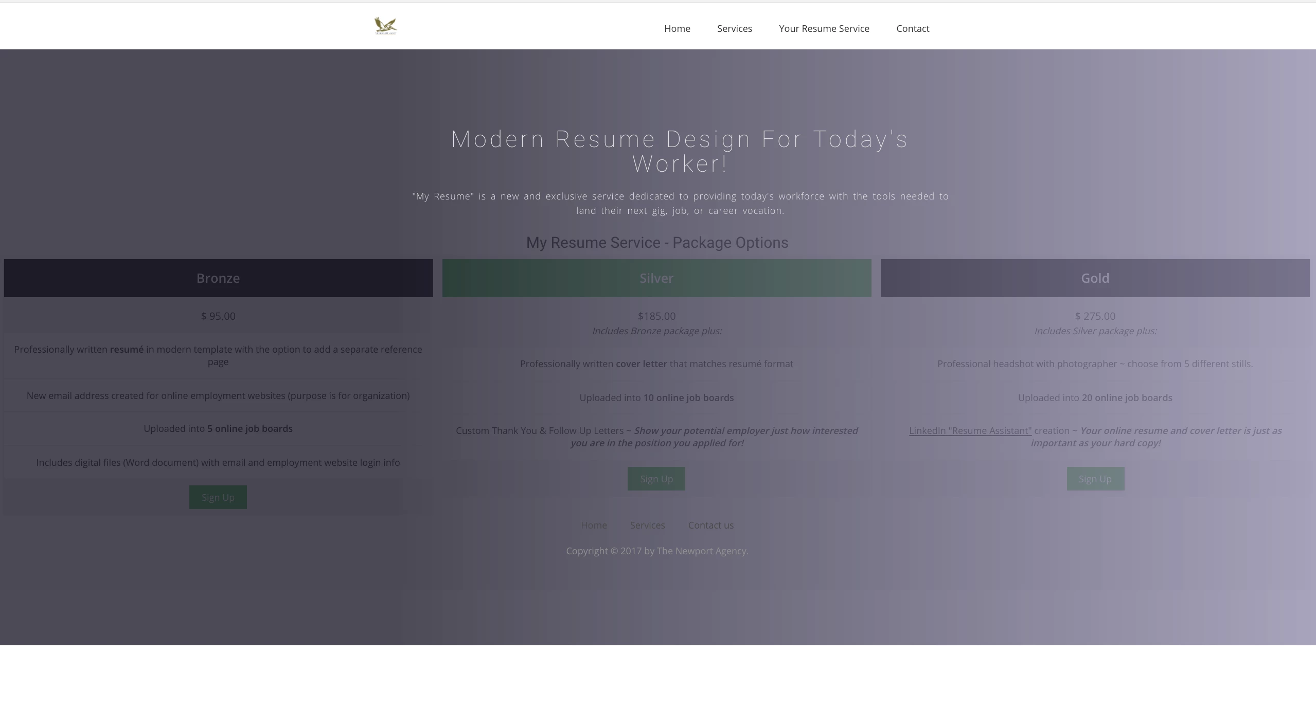
I have attached a screenshot of the problem I am having building this webpage. As you can see from that image, I want "My Resume Service-Package Options" to have a white background and not the grey gradient color it overlays.

My goal is to have the resume service packages not as wide, centered, and to not be covered by the grey gradient overlay.

Any help would be appreciated - thanks!

(Attached below is the code)

-Kyle

HTML File on Dreamweaver:

<!DOCTYPE html>

<html class="no-js">

<head>

<meta charset="utf-8">

<meta http-equiv="X-UA-Compatible" content="IE=edge">

<title>My Resume Service | The Newport Agency</title>

<meta name="description" content="">

<meta name="viewport" content="width=device-width, initial-scale=1">

<meta name="author" content="Kyle Kiser | The Newport Agency">

<base href="http://www.NewportAdAgency.com/MyResume.html" target="_blank">

<!-- Place favicon.ico and apple-touch-icon.png in the root directory -->

<!-- CSS -->

<link rel="stylesheet" href="css/owl.carousel.css">

<link rel="stylesheet" href="css/bootstrap.min.css">

<link rel="stylesheet" href="css/font-awesome.min.css">

<link rel="stylesheet" href="css/style.css">

<link rel="stylesheet" href="css/ionicons.min.css">

<link rel="stylesheet" href="css/animate.css">

<link rel="stylesheet" href="css/responsive.css">

<!-- Js -->

<script src="js/vendor/modernizr-2.6.2.min.js"></script>

<script src="//ajax.googleapis.com/ajax/libs/jquery/1.10.2/jquery.min.js"></script>

<script>window.jQuery || document.write('<script src="js/vendor/jquery-1.10.2.min.js"><\/script>')</script>

<script src="js/bootstrap.min.js"></script>

<script src="js/owl.carousel.min.js"></script>

<script src="js/min/waypoints.min.js"></script>

<script src="js/jquery.counterup.js"></script>

<script src="js/plugins.js"></script>

<script src="js/main.js"></script>

<style>

* {

    box-sizing: border-box;

}

.columns {

    float: left;

    width: 33.3%;

    padding: 8px;

}

.price {

    list-style-type: none;

    border: 1px solid #eee;

    margin: 0;

    padding: 0;

    -webkit-transition: 0.3s;

    transition: 0.3s;

}

.price:hover {

    box-shadow: 0 8px 12px 0 rgba(0,0,0,0.2)

}

.price .header {

    background-color: #111;

    color: white;

    font-size: 25px;

}

.price li {

    border-bottom: 1px solid #eee;

    padding: 20px;

    text-align: center;

}

.price .grey {

    background-color: #eee;

    font-size: 20px;

}

.button {

    background-color: #4CAF50;

    border: none;

    color: white;

    padding: 10px 25px;

    text-align: center;

    text-decoration: none;

    font-size: 18px;

}

@media only screen and (max-width: 600px) {

    .columns {

        width: 100%;

    }

}

</style>

</head>

<body>

<!-- Header Start -->

<header>

  <div class="container">

    <div class="row">

      <div class="col-md-12">

        <!-- header Nav Start -->

        <nav class="navbar navbar-default">

          <div class="container-fluid">

            <!-- Brand and toggle get grouped for better mobile display -->

            <div class="navbar-header">

              <button type="button" class="navbar-toggle collapsed" data-toggle="collapse" data-target="#bs-example-navbar-collapse-1"> <span class="sr-only">Toggle navigation</span> <span class="icon-bar"></span> <span class="icon-bar"></span> <span class="icon-bar"></span> </button>

              <a class="navbar-brand" href="index.html"> <img src="images/Logo 2.jpg" alt="Logo" width="50"> </a> </div>

            <!-- Collect the nav links, forms, and other content for toggling -->

            <div class="collapse navbar-collapse" id="bs-example-navbar-collapse-1">

              <ul class="nav navbar-nav navbar-right">

                <li><a href="index.html">Home</a></li>

                <li><a href="work.html">Services</a></li>

                <li><a href="MyResume.html">Your Resume Service</a></li>

                <li><a href="contact.html">Contact</a></li>

                </li>

              </ul>

            </div>

            <!-- /.navbar-collapse -->

          </div>

          <!-- /.container-fluid -->

        </nav>

      </div>

    </div>

  </div>

</header>

<!-- header close -->

<!-- Slider Start -->

<section id="global-header">

<div class="container">

  <div class="row">

    <div class="col-md-12">

      <div class="block">

        <h1>Modern Resume Design for Today's Worker!</h1>

        <p>"My Resume" is a new and exclusive service dedicated to providing today's workforce with the tools needed to land their next gig, job, or career vocation.

      </div>

    </div>

  </div>

</div>

<!-- Main Content Goes Here -->

<main>

  <h2 style="text-align:center">My Resume Service - Package Options</h2>

  <div class="columns">

    <ul class="price">

      <li class="header"><b>Bronze</b></li>

      <li class="grey">$ 95.00</li>

      <li>Professionally written <b>resumé</b> in modern template with the option to add a separate reference page</li>

      <li>New email address created for online employment websites (purpose is for organization) </li>

      <li>Uploaded into <b>5 online job boards</b></li>

      <li>Includes digital files (Word document) with email and employment website login info</li>

      <li class="grey"><a href="#" class="button">Sign Up</a></li>

    </ul>

  </div>

  <div class="columns">

    <ul class="price">

      <li class="header" style="background-color:#4CAF50"><b>Silver</b></li>

      <li class="grey"> $185.00<br>

        <i><small>Includes Bronze package plus:</small></i></li>

      <li>Professionally written <b>cover letter</b> that matches resumé format</li>

      <li>Uploaded into <b>10 online job boards</b></li>

      <li>Custom Thank You & Follow Up Letters ~ <small><b><i>Show your potential employer just how interested you are in the position you applied for!</i></b></small></li>

      <li class="grey"><a href="#" class="button">Sign Up</a></li>

    </ul>

  </div>

  <div class="columns">

    <ul class="price">

      <li class="header"><b>Gold</b></li>

      <li class="grey">$ 275.00<br>

        <i><small>Includes Silver package plus:</small></i></li>

      <li>Professional headshot with photographer ~ choose from 5 different stills.</li>

      <li>Uploaded into <b>20 online job boards</b></li>

      <li><ins>LinkedIn "Resume Assistant"</ins> creation ~ <small><i><b>Your online resume and cover letter is just as important as your hard copy!</b></i></small></li>

      <li class="grey"><a href="#" class="button">Sign Up</a></li>

    </ul>

  </div>

</main>

<!-- footer Start -->

<footer>

  <div class="container">

    <div class="row">

      <div class="col-md-12">

        <div class="footer-manu">

          <ul>

            <li><a href="index.html">Home</a></li>

            <li><a href="work.html">Services</a></li>

            <li><a href="contact.html">Contact us</a></li>

          </ul>

        </div>

        <p>Copyright &copy; 2017 by The Newport Agency</a>.</p>

      </div>

    </div>

  </div>

</footer>

<script>document.write('<script src="http://' + (location.host || 'localhost').split(':')[0] + ':35729/livereload.js?snipver=1"></' + 'script>')</script>

</body>

</html>

This topic has been closed for replies.
Correct answer Nancy OShea

How much do you know about working with Bootstrap classes and 12-box grid system?  Read the documentation.  https://getbootstrap.com/docs/3.3/css/#grid

There are 2 types of containers.  Container-fluid is full width.  Container is fixed-width & centered on screen.  If you want to make your content wider, change containter to container-fluid and increase the medium column size from 7 to 10.

<div class="container container-fluid">

    <div class="row">

      <div class="col-md-7 col-sm-12">

3 replies

Known Participant
December 10, 2017

Hi All,

This is what I got after playing around with it more. I want to make the package options wider. I liked how it took up the whole width of the page. I'm going to be adding more options but this is the centerpiece.

Thanks,

Kyle

Known Participant
December 10, 2017

<!DOCTYPE html>

<html class="no-js">

<head>

<meta charset="utf-8">

<meta http-equiv="X-UA-Compatible" content="IE=edge">

<title>Welcome to The Newport Agency</title>

<meta name="description" content="Marketing Made Easy For You!">

<meta name="viewport" content="width=device-width, initial-scale=1">

<!-- Place favicon.ico and apple-touch-icon.png in the root directory -->

<!-- CSS -->

<link rel="stylesheet" href="css/owl.carousel.css">

<link rel="stylesheet" href="css/bootstrap.min.css">

<link rel="stylesheet" href="css/font-awesome.min.css">

<link rel="stylesheet" href="css/style.css">

<link rel="stylesheet" href="css/ionicons.min.css">

<link rel="stylesheet" href="css/animate.css">

<link rel="stylesheet" href="css/responsive.css">

<!-- Js -->

<script src="js/vendor/modernizr-2.6.2.min.js"></script>

<script src="//ajax.googleapis.com/ajax/libs/jquery/1.10.2/jquery.min.js"></script>

<script>window.jQuery || document.write('<script src="js/vendor/jquery-1.10.2.min.js"><\/script>')</script>

<script src="js/bootstrap.min.js"></script>

<script src="js/owl.carousel.min.js"></script>

<script src="js/plugins.js"></script>

<script src="js/min/waypoints.min.js"></script>

<script src="js/jquery.counterup.js"></script>

<style>

* {

box-sizing: border-box;

}

.columns {

float: left;

width: 33.3%;

padding: 8px;

}

.price {

list-style-type: none;

border: 1px solid #eee;

margin: 0;

padding: 0;

-webkit-transition: 0.3s;

transition: 0.3s;

}

.price:hover {

box-shadow: 0 8px 12px 0 rgba(0,0,0,0.2)

}

.price .header {

background-color: #111;

color: white;

font-size: 25px;

}

.price li {

border-bottom: 1px solid #eee;

padding: 20px;

text-align: center;

}

.price .grey {

background-color: #eee;

font-size: 20px;

}

.button {

background-color: #4CAF50;

border: none;

color: white;

padding: 10px 25px;

text-align: center;

text-decoration: none;

font-size: 18px;

}

@media only screen and (max-width: 600px) {

.columns {

width: 100%;

}

}

</style>

</head>

<body>

<!-- Header Start -->

<header>

  <div class="container">

    <div class="row">

      <div class="col-md-12">

        <!-- header Nav Start -->

        <nav class="navbar navbar-default">

          <div class="container-fluid">

            <!-- Brand and toggle get grouped for better mobile display -->

            <div class="navbar-header">

              <button type="button" class="navbar-toggle collapsed" data-toggle="collapse" data-target="#bs-example-navbar-collapse-1"> <span class="sr-only">Toggle navigation</span> <span class="icon-bar"></span> <span class="icon-bar"></span> <span class="icon-bar"></span> </button>

              <a class="navbar-brand" href="index.html"> <img src="images/Logo 2.jpg" alt="Logo" width="60"> </a> </div>

            <!-- Collect the nav links, forms, and other content for toggling -->

            <div class="collapse navbar-collapse" id="bs-example-navbar-collapse-1">

              <ul class="nav navbar-nav navbar-right">

                <li><a href="index.html">Home</a></li>

                <li><a href="work.html">Services</a></li>

                <li><a href="YourResumeService.html">Your Resume Service</a></li>

                <li><a href="contact.html">Contact</a></li>

              </ul>

            </div>

            <!-- /.navbar-collapse -->

          </div>

          <!-- /.container-fluid -->

        </nav>

      </div>

    </div>

  </div>

</header>

<!-- header close -->

<!-- Slider Start -->

<section id="slider">

  <div class="container">

    <div class="row">

      <div class="col-md-10 col-md-offset-2">

        <div class="block">

          <h1 class="animated fadeInUp">Modern Resume Design for Today's Worker!</h1>

          <p> "Your Resume Service" is a new and exclusive service dedicated to providing today's workforce with the tools needed to land their next gig, job, or career vocation.</p>

        </div>

      </div>

    </div>

  </div>

</section>

<!-- Wrapper Start -->

<section id="intro">

  <div class="container">

    <div class="row">

      <div class="col-md-7 col-sm-12">

        <div class="block">

          <div class="section-title">

            <h2 style="text-align:center">My Resume Service - Package Options</h2>

            <div class="columns">

              <ul class="price">

                <li class="header"><b>Bronze</b></li>

                <li class="grey">$ 95.00</li>

                <li>Professionally written <b>resumé</b> in modern template with the option to add a separate reference page</li>

                <li>New email address created for online employment websites (purpose is for organization) </li>

                <li>Uploaded into <b>5 online job boards</b></li>

                <li>Includes digital files (Word document) with email and employment website login info</li>

                <li class="grey"><a href="#" class="button">Sign Up</a></li>

              </ul>

            </div>

            <div class="columns">

              <ul class="price">

                <li class="header" style="background-color:#4CAF50"><b>Silver</b></li>

                <li class="grey"> $185.00<br>

                  <i><small>Includes Bronze package plus:</small></i></li>

                <li>Professionally written <b>cover letter</b> that matches resumé format</li>

                <li>Uploaded into <b>10 online job boards</b></li>

                <li>Custom Thank You & Follow Up Letters ~ <small><b><i>Show your potential employer just how interested you are in the position you applied for!</i></b></small></li>

                <li class="grey"><a href="#" class="button">Sign Up</a></li>

              </ul>

            </div>

            <div class="columns">

              <ul class="price">

                <li class="header"><b>Gold</b></li>

                <li class="grey">$ 275.00<br>

                  <i><small>Includes Silver package plus:</small></i></li>

                <li>Professional headshot with photographer ~ choose from 5 different stills.</li>

                <li>Uploaded into <b>20 online job boards</b></li>

                <li><ins>LinkedIn "Resume Assistant"</ins> creation ~ <small><i><b>Your online resume and cover letter is just as important as your hard copy!</b></i></small></li>

                <li class="grey"><a href="#" class="button">Sign Up</a></li>

              </ul>

            </div>

          </div>

        </div>

      </div>

      <!-- .col-md-7 close -->


    </div>

    <!-- .col-md-5 close -->

  </div>

  </div>

</section>

<section id="feature">

  <div class="container"> </div>

  </div>

</section>

<!-- footer Start -->

<footer>

  <div class="container">

    <div class="row">

      <div class="col-md-12">

        <div class="footer-manu">

          <ul>

            <li><a href="#">About Us</a></li>

            <li><a href="work.html">Services</a></li>

            <li><a href="#">Contact us</a></li>

          </ul>

        </div>

        <p>Copyright &copy; 2017 by The Newport Agency</a>.</p>

      </div>

    </div>

  </div>

</footer>

<script>document.write('<script src="http://' + (location.host || 'localhost').split(':')[0] + ':35729/livereload.js?snipver=1"></' + 'script>')</script>

</body>

</html>

Nancy OShea
Community Expert
Nancy OSheaCommunity ExpertCorrect answer
Community Expert
December 11, 2017

How much do you know about working with Bootstrap classes and 12-box grid system?  Read the documentation.  https://getbootstrap.com/docs/3.3/css/#grid

There are 2 types of containers.  Container-fluid is full width.  Container is fixed-width & centered on screen.  If you want to make your content wider, change containter to container-fluid and increase the medium column size from 7 to 10.

<div class="container container-fluid">

    <div class="row">

      <div class="col-md-7 col-sm-12">

Nancy O'Shea— Product User & Community Expert
Nancy OShea
Community Expert
Community Expert
December 10, 2017

Where did you find this Template? 

Nancy O'Shea— Product User & Community Expert
Known Participant
December 10, 2017
Nancy OShea
Community Expert
Community Expert
December 10, 2017

It looks like supreme overkill to me.  And since you don't know how to work with it, I think you'll get your project done much quicker without a complicated template.

Use one of the Starter Templates in DW.  You'll have a lot less code to manage and you can build it to suit your requirements.

Go to File > New > Starter Templates.  Pick one and hit the Create button.

After saving your file, DW will create assets folders in your local site folder.

Post back if you have more questions.

Nancy

Nancy O'Shea— Product User & Community Expert
BenPleysier
Community Expert
Community Expert
December 10, 2017

This post has been moved to the Dreamweaver forum where it will get a wider audience.

Wappler is the DMXzone-made Dreamweaver replacement and includes the best of their powerful extensions, as well as much more!