Known Participant
August 11, 2021
Question

I need Media Query help in Dreamweaver

  • August 11, 2021
  • 4 replies
  • 188 views

I'm a newbie to Dreamweaver. I need it for a school assignment. We need 3 media queries: Cellphone, Tablet, and Full-Screen Desktop. I tried making media queries but every time I make adjustments and then move on to another area to make changes, the screen goes back to the original size. Nothing sticks. I save all after making changes, doesn't work. I even went to an Adobe employee for help but they couldn't even figure out the problem because according to the lady, they are not trained in coding. I did at one point have errors on the page but I fixed those and the media query is still not working. I don't know what is wrong and this assignment is due in a few days. Please help asap.


This is what the coding looks like for the cellphone media query: 
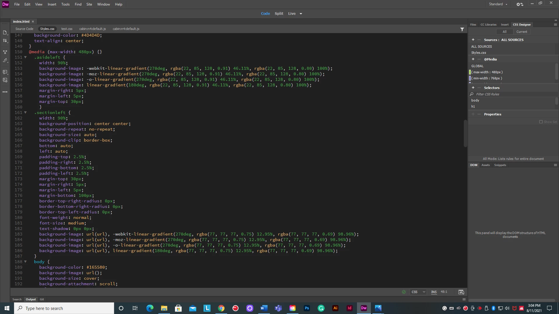
    This topic has been closed for replies.

    4 replies

    Legend
    August 12, 2021

    The answer to your email is yes (best to post questions in the forum as there are more participants here that can help you)


    @media screen and (max-width: 768px) {

    All css selectors that you need to adjust go within the media query curly brackets.

    }


    Example: If I have a css selector like:


    .headerText {

    color: orange;

    font-size: 30px;

    padding: 10px;

    }


    and I wanted to adjust the color and font-size properties for mobile devices:


    @media screen and (max-width: 768px) {

    .headerText {

    color: mauve;

    font-size: 24px;

    }

    }


    @media screen and (max-width: 480px) {

    .headerText {

    color: green;

    font-size: 18px;

    }

    }


    You can insert as many css selectors as is required within the media query curly brackets. If I had another css selector that I need to adjust css properties for I could include it as below:


    @media screen and (max-width: 480px) {

    .headerText {

    color: green;

    font-size: 18px;

    }

    .footerText {

    color: blue;

    padding: 10px;

    text-align: center;

    }

    }

    BenPleysier
    Community Expert
    Community Expert
    August 11, 2021
    quote

    We need 3 media queries: Cellphone, Tablet, and Full-Screen Desktop.

    By @Lisa5D5E


    You are being tricked. Actually, you need 2 media queries, namely changing from base style rules (which is Cellphone) to Tablet and from tablet to Desktop.


    For example, you first design for the Cellphone - probably a single column. Then as your real estate grows, you change the layout to two columns. For the larger screens, your layout becomes 3 columns.


    The brealpoints would look like 

    @media only screen and (min-width: 600px) {....}

    @media only screen and (min-width: 1025px) {....}


    Change the values to suit.


    It is important to note that, once you have established the base style rules, you should only add the style rules that are required to override the base rules.. What I mean by that, if the heading colours remain the same for all screen sizes, then the style rule should be placed in the base styling only. If the change is the number of columns, then the column width would be the only overriding rule that will be placed in the media query; not the heading colour because that does not change. I hope this makes sense.


    Wappler is the DMXzone-made Dreamweaver replacement and includes the best of their powerful extensions, as well as much more!
    Nancy OShea
    Community Expert
    Community Expert
    August 11, 2021

    Proper code syntax will make life easier.  Opening and closing curly braces for media queries and opening & closing curly braces for the rules inside them are essential.


    <!doctype html>
    <html lang="en">
    <head>
    <meta charset="utf-8">
    <title>Untitled Document</title>
    <meta http-equiv="X-UA-Compatible" content="IE=edge">
    <meta name="viewport" content="width=device-width, initial-scale=1">
    
    <style>
    /* Rules for ALL devices */
    body {width:95%; margin:0 auto;}
    img {max-width:100%;}
    
    
    /* Special Rules for mobiles */
    @media only screen and (max-width: 599px) {
    
    selector {property: value;}
    selector {property: value;}
    selector {property: value;}
    body {background:palegoldenrod};
    }
    
    /* Special Rules for tablets */
    @media only screen and (min-width: 600px) and (max-width: 1024px) {
    
    selector {property: value;}
    selector {property: value;}
    selector {property: value;}
    body {background: paleturquoise}
    }
    
    /* Special Rules for larger screens */
    @media only screen and (min-width: 1025px) {
    
    selector {property: value;}
    selector {property: value;}
    selector {property: value;}
    body {background: palegreen;}
    }
    /* End of media queries */
    </style>
    </head>
    <body>
    <div>
    <h1>Hello World!</h1>
    <a href="https://example.com">
    <img src="https://dummyimage.com/400x300"  alt="Placeholder" title="Example.com">
    </a>
    <p>Lorem ipsum dolor sit amet, consectetur adipisicing elit. Perspiciatis velit minima hic tenetur ea nesciunt tempore voluptas, architecto obcaecati, iusto optio quidem explicabo odit expedita quas? Aliquam libero numquam nesciunt!</p>
    </div>
    </body>
    </html>


    Nancy O'Shea— Product User & Community Expert
    Legend
    August 11, 2021

    You haven't actually wrapped the block of css you want to change at a certain screen width in the media query.


    Your top image shows the media query closing bracket directly after the opening bracket (see in red below), so the media query is not wrapping the following block of css code, which you want to take effect at 480px:


    @media (max-width: 480px) {}


    Bottom image shows similar for 768px:

    @media (max-width: 768px) {}