This topic has been closed for replies.

2 replies

Nancy OShea
Community Expert
Community Expert
April 5, 2022

Dreamweaver CC was completely rebuilt in 2017.  And that Bayside Beat tutorial from 2016 is outdated.  Although the code is still OK, the methods described in that tutorial do not hold up in 2022.


If you're using modern Dreamweaver CC, you should look at tutorials that discuss building a responsive site with Bootstrap, CSS Flexbox and/or CSS Grids below.  Good coding skills are essential to using Dreamweaver.


Nancy O'Shea— Product User & Community Expert
b.tiemann@tgh-info.de
Participant
April 6, 2022

Hi Osgood,


your informations have been very helpfully for me. You are right:

The reason for so many failed attempts in the last month to understand the correct procedure building Websites via DW is because of taking obsolete tutorials, including those of Daniel Walter Scott, which I also subscribed.

Now I hope to make faster progression – thanks of your reconnaissance.


Kind regards

Bernhard

Legend
April 5, 2022
quote

https://helpx.adobe.com/de/dreamweaver/how-to/make-website-pt6-web-links-navigation.html


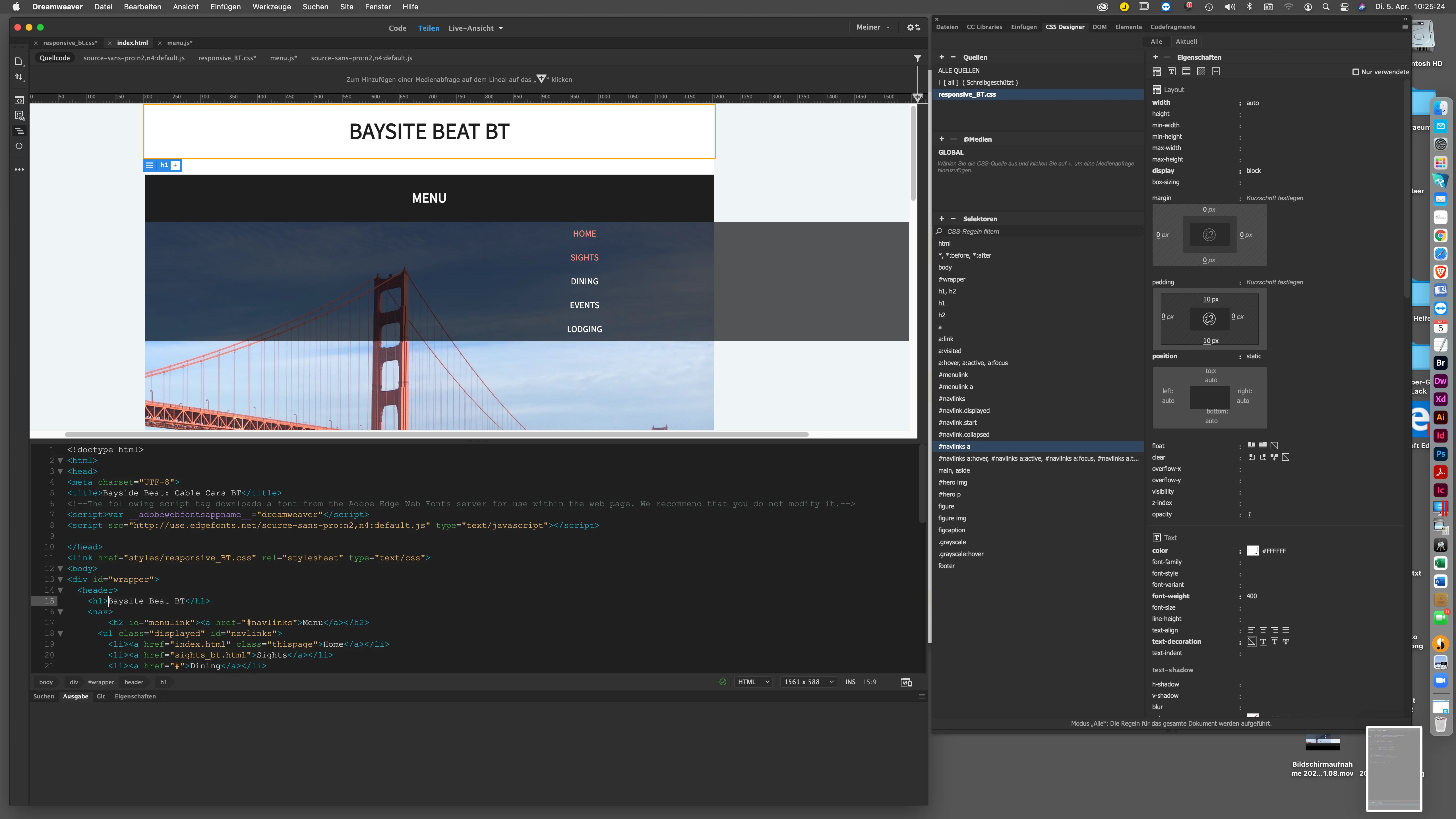
Leider bleibt die Navigationsleiste unter "Menu" zu breit, obwohl ich "block" angewählt habe.

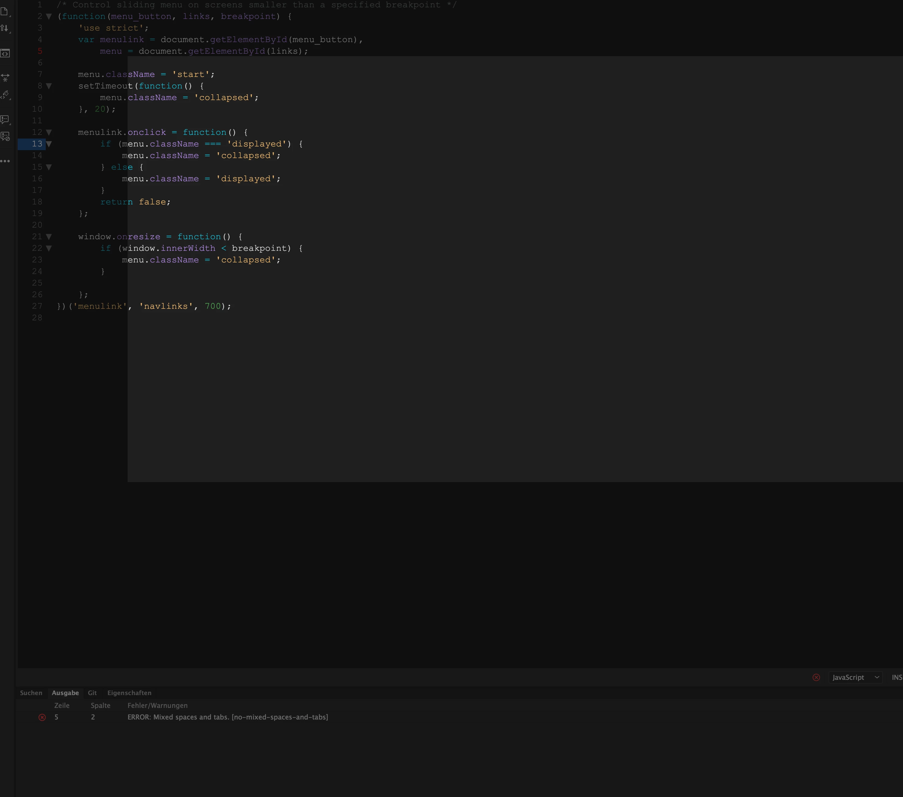
Im Java-Script, das von Adobe geliefert wurde, wird außerdem ein Fehler angezeigt:


I think you can ignore the Javascript warning. The validation tools in any web-editor are there just as a guidance. Many are not up-to-date, also they dont pick up all the errors and they also show errors which aren't errors. The tutorial you are using was written many years ago and is probably not now a good example of a modern day mobile responsive menu.


If you view the page in a real browser does the menu work/align correctly? It may be that the limitations of Dreamweavers design view are not showing the positioning correctly.

b.tiemann@tgh-info.de
Participant
April 5, 2022

Hi, Osgood,


thanks a lot.


In SAFARI it works, but not in CHROME.


You’re right, its an old Example of responsive websites, but the first one, where I can learn effectively, purposefully and sustainably.


Before I start with Grid-Technique, I will understand the essentials.


by the way:


In den Anweisungen steht:

"

  1. Lasse im Bereich „Selektoren“ den „#navlinks“-Selektor ausgewählt. Klicke auf das Pluszeichen, um einen neuen Selektor anzulegen. Gib im editierbaren Feld „#navlinks.displayed“ ein.

    Achte darauf, dass sich kein Leerzeichen zwischen „#navlinks“ und dem Punkt am Anfang des Klassenselektors befindet. Dies ist kein Selektornachfahre: „#navlinks.displayed“ wirkt sich auf Elemente aus, die die ID „navlinks“ und die Klasse „displayed“ aufweisen.

 
  1. Erstelle einen Selektor mit dem Namen „#navlinks.start“. Setze die Property „display“ auf den Wert none.

  2. Erstelle einen Selektor mit dem Namen „#navlinks.collapsed“. Lege folgende Properties fest:


Die Anweisung lautet also "#navlinks.displayed" etc. also PLURAL


Dann weiter unten bei "Mögliche Probleme"

"Es können auch Fehler im CSS-Code passieren. Beispielsweise dürfen keine Leerzeichen in den letzten drei von dir erstellten Selektoren vorkommen: „#navlink.displayed“„#navlink.start“ und „#navlink.collapsed“. Überprüfe auch, ob du am Ende jeder manuell eingegebenen CSS-Anweisung ein Semikolon (;) gesetzt hast."


Hier steht aber Singular.


Mit Singular "navlink …" funktionierts, mit Plural nicht!


Herzliche Grüße

Legend
April 5, 2022
quote

Hi, Osgood,


thanks a lot.


In SAFARI it works, but not in CHROME.


By @b.tiemann@tgh-info.de


Seems to work fine in Chrome for me if I open up the index.html in the 'part7' folder included in the download files.


However I would not advise using any tutorials that are more than 2 years old.