
Answered
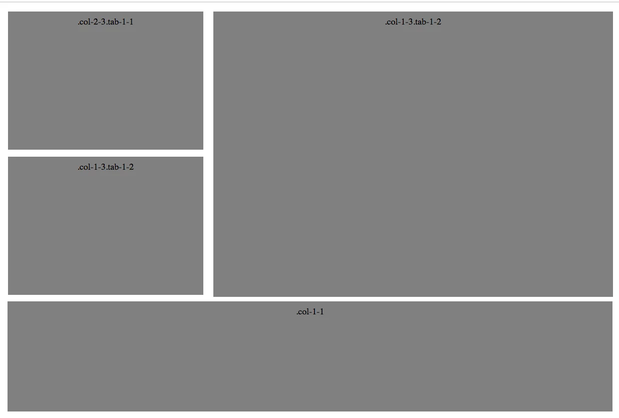
need help with image grid
Hello,
I am building a simple image grid and one of the the divs is getting pushed down due to the height of the div next to it. How can I get it to move up like the image attached? If you view my code you will see how it's pushed down.
Thank you for any help.
<!DOCTYPE html>
<html lang="en" >
<head>
  <meta charset="UTF-8">

  <style>
	.grid {
  background: white;
}
.grid:after {
  content: "";
  display: table;
  clear: both;
}

[class*='col-'] {
  float: left;
}

.col-1-1 {
  width: 100%;
}

.col-3-4 {
  width: 75%;
}

.col-2-3 {
  width: 33.33%;
}

.col-1-3 {
  width: 66.66%;
}

.col-1-2 {
  width: 50%;
}

.col-1-4 {
  width: 25%;
}

.col-1-8 {
  width: 12.5%;
}
.module {

  margin: 10px;
  height: auto;
  text-align: center;
}


@media (max-width: 800px) {
  .tab-1-1 {
    width: 100%;
  }

  .tab-3-4 {
    width: 75%;
  }

  .tab-2-3 {
    width: 66.66%;
  }

  .tab-1-3 {
    width: 33.33%;
  }

  .tab-1-2 {
    width: 50%;
  }

  .tab-1-4 {
    width: 25%;
  }

  .tab-1-8 {
    width: 12.5%;
  }
}
@media (max-width: 400px) {
  [class*='col-'] {
    width: 100%;
  }
}</style>

</head>
<body>
<!-- partial:index.partial.html -->
<div class='grid'>
  <div class='col-2-3 tab-1-1'>
    <div class='module'><img style="width:100%" src="https://campaigns.premierinc.com/images/content/191125_TML_PioneersTest_272_COMP.jpg"></div>
  </div>
  <div class='col-1-3 tab-1-2'>
    <div class='module'><img style="width:100%" src="https://campaigns.premierinc.com/images/content/191125_TML_PioneersTest_123_COMP.jpg"></div>
  </div>
  <div class='col-2-3 tab-1-1'>
    <div class='module'><img style="width:100%" src="https://campaigns.premierinc.com/images/content/191125_TML_PioneersTest_272_COMP.jpg"></div>
	</div>
  <div class='col-1-1'>
    <div class='module'><img style="width:100%" src="https://campaigns.premierinc.com/images/content/city.jpg"></div>
  </div>
</div>


</body>
</html>

 AdChoices