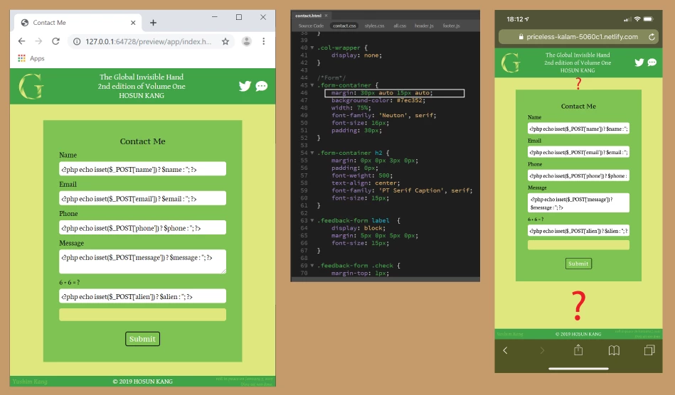
Hosun
Inspiring
September 14, 2019
Answered

positioning-2

  • September 14, 2019
  • 2 replies
  • 585 views

Hi,


Clicking the far-right icon in <header> opens Contact Me.


I set margin to .form-container for the vertical positioning of the green box.

It looks working on PC. But it doesn't work on iPhone.


Is there any solution?


I tried 

main {

             display: flex;

             align-items: center;

         }

But it doesn't work.


https://priceless-kalam-5060c1.netlify.com/


Hosun Kang


This topic has been closed for replies.
Correct answer osgood_

Try the css combination below:


The height: 97vh; compensates for the fixed footer, which takes up a bit of vertical space.

You have obviously somewhere added padding on the 'body' element which was accounting for a bit more vertical space so I have removed the padding on the body element as well in the css styles below:


.page-wrapper {
display: flex;
flex-direction: column;
height: 97vh;
}
main {
display: flex;
justify-content: center;
align-items: center;
flex: 1;
}
body {
padding: 0;
}


2 replies

BenPleysier
Community Expert
Community Expert
September 15, 2019

That is the problem when too many different views are relayed to you. In one of my replies I gave you a very simple way to push the Footer to the bottom of the viewport if the content was not long enough. I now see a different approach where a  fixed footer is mentioned and all is undone.


Have a look at a simplified version of pushing the the footer down:


<!doctype html>
<html>
<head>
<base href="/aa/">
<meta name="ac:base" content="/aa">
<meta charset="UTF-8">
<title>Untitled Document</title>
<style> /* better placed in external document */
* { /* use the reset method instead */
margin: 0;
padding: 0;
}
html {
min-height: 100%;
}
body {
display: flex;
flex-direction: column;
min-height: 100vh;
}
header { /* for demo only */
background: green;
height: 250px;
}
main {
flex: 1 0 auto;
background: yellow; /* for demo only */
}
footer { /* for demo only */
background: green;
height: 80px;
}
</style>
</head>
<body>
<header>HEADER</header>
<main>MAIN CONTENT</main>
<footer>FOOTER</footer>
</body>
</html>

Wappler is the DMXzone-made Dreamweaver replacement and includes the best of their powerful extensions, as well as much more!
osgood_Correct answer
Legend
September 14, 2019

Try the css combination below:


The height: 97vh; compensates for the fixed footer, which takes up a bit of vertical space.

You have obviously somewhere added padding on the 'body' element which was accounting for a bit more vertical space so I have removed the padding on the body element as well in the css styles below:


.page-wrapper {
display: flex;
flex-direction: column;
height: 97vh;
}
main {
display: flex;
justify-content: center;
align-items: center;
flex: 1;
}
body {
padding: 0;
}