Participating Frequently
July 31, 2019
Answered

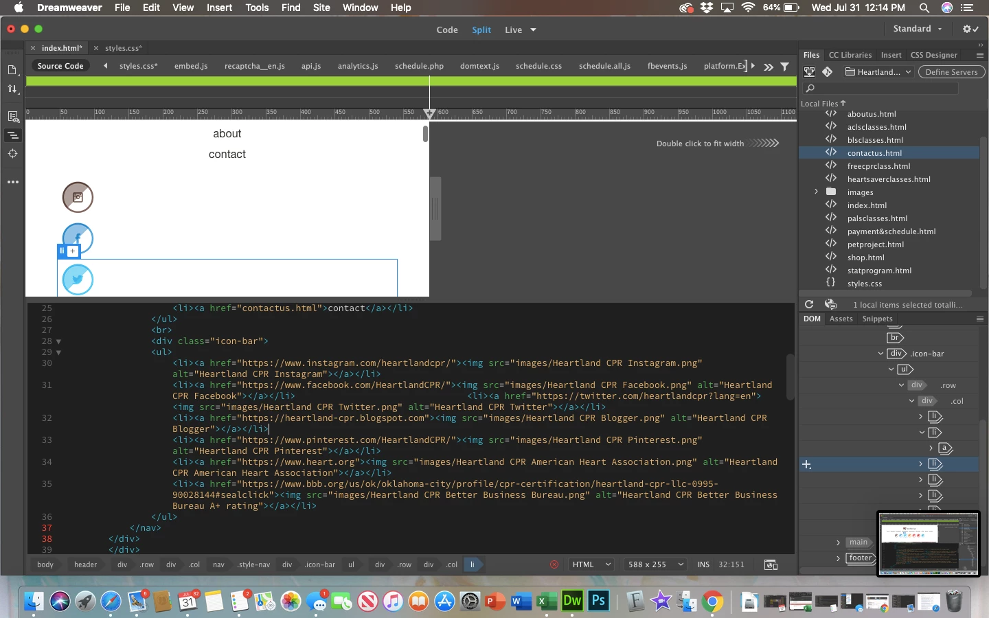
Social media icons will not lay side-by-side

  • July 31, 2019
  • 2 replies
  • 1014 views

I'm fairly new to building sites and have limited knowledge of what I'm doing, but my issue lies in the social media icons of my site. When in mobile view, the icons stack vertically but I want them to stay horizontal and shrink to fit the screen like they do in my tablet and desktop view. I've tried display: inline-block, no change. Does anyone know what I can do to fix this? I'm sure it's a simple fix, but I cannot figure it out. Again, sorry I know so little but any help would be greatly appreciated. Below the picture is the full css I'm working with.

Thanks!

Header 1

@charset "UTF-8";

/* CSS Document */

html,

html * {

  padding: 0;

  margin: 0;

  box-sizing: border-box;

  font-family: Gotham, Helvetica Neue, Helvetica, Arial, sans-serif;

}

header {

  padding: 32px;

}

img {

  width: 100%;

  max-width: 100%;

  height: auto;

  vertical-align: middle;

}

footer {

  padding: 20px 30px;

  background-color: #dbecf1;

  text-align: center

}

body {

  margin-left: auto;

  margin-right: auto;

}

.style-logo {

  margin-left: auto;

  margin-right: auto;

  display: block;

  width: 192px;

}

.style-nav ul {

  list-style-type: none;

}

.style-nav ul li a {

  text-decoration: none;

  color:#2F322a;

  text-align: center;

  display: block;

  text-transform: lowercase;

  padding: 6px;

}

.row:before, .row:after {

  content: "";

  display: table;

}

.row:after {

  clear:both;

}

.hero {

  background-image: url("images/hero.jpg");

  background-size: cover;

  padding: 20px 20px 50px 20px;

  color: #fffffff;

  text-align: center;

  text-shadow: 2px 2px 5px black;

}

.herops {

  background-image: url("CSS/images/hero payment and schedule.jpg");

  background-size: cover;

  padding: 20px 20px 50px 20px;

  color: #fffffff;

  text-align: center;

  text-shadow: 2px 2px 5px black;

}

.heroabout {

  background-image: url("CSS/images/neonheart.gif");

  background-size: cover;

  padding: 20px 20px 50px 20px;

  color: #fffffff;

  text-align: center;

  text-shadow: 2px 2px 5px black;

}

h1 {

  font-size: 57px;

  text-transform: uppercase;

  font-weight: 200;

  margin-bottom: 60px;

  color: #ffffff;

}

h2 {

  font-size: 30px;

  text-transform: uppercase;

  font-weight: 200;

  margin-bottom: 23px;

  color: #ffffff;

}

h3 {

  font-size: 16px;

  text-transform: uppercase;

  font-weight: 200;

  margin-bottom: 120px;

  color: #ffffff;

}

h4 {

  font-size: 16px;

  font-weight: 200;

  margin-bottom: 35px;

  color: #ffffff;

}

p {

  font-size: 16px;

  font-weight: 400;

  margin-bottom: 35px;

  color: #ffffff;

}

.button {

  border: 2px #ffffff solid;

  padding: 8px 30px 8px 30px;

  border-radius: 30px;

  color: #ffffff;

  text-decoration: none;

}

.info-box-red {

  background-color:#874243;

  color: #ffffff;

  padding: 30px 20px 60px;

  text-align: center;

}

.info-box-dark {

  background-color:#2d2d35;

  color: #ffffff;

  padding: 30px 20px 60px;

  text-align: center;

}

.footer-text {

  font-size: 13px;

  margin: 20px;

  color: #000000;

}

.col {

  width: 100%;

  padding: 0px 7px 14px;

}

.icon-bar ul {

  list-style-type: none;

  float: auto;

}

.icon-bar ul li a {

  padding: 6px;

  display: inline-table;

  align-items: center;

}

.class-buttons ul {

  list-style-type: none;

  display: inline-block;

}

.class-buttons ul li a {

  align-items: center;

}

/*Tablet View*/

@media (min-width: 768px){

  body {

  max-width: 778px;

  }

  .style-nav ul li {

  display: inline-block;

  }

  .style-nav ul {

  text-align: center;

  }

  .icon-bar ul li {

  display: inline-block;

  }

  .icon-bar ul {

  align-content: center;

  }

  .class-buttons ul {

  align-content: center;

  }

  .class-buttons ul li {

  display: inline-block;

  }

  h1 {

  font-size: 40px;

  magin-bottom: 90px;

  }

  h2 {

  font-size: 25px;

  margin-bottom: 53px;

  }

  h3 {

  font-size: 16px;

  margin-bottom: 120px;

  }

  h4 {

  font-size: 16px;

  margin-bottom: 35px;

  }

.col-md-one-half {

  width: 50%;

  }

  .col {

  float: left;

  padding: 0px 7px 14px;

  }

/*Desktop View*/

@media (min-width: 1024px){

  body {

  max-width: 1200px;

  }

  .style-logo {

  float: left;

  }

  .style-nav  {

  float: right;

}

  .col-lg-one-fourth {

  width:25%;

  }

  .icon-bar {

  float: right;

  }

This topic has been closed for replies.
Correct answer Nancy OShea

Sure.  Anything is possible if you know how to work with HTML & CSS code.

Building on what I posted earlier, this code uses flexbox for layout.  Copy & paste into a new, blank document and test on your various devices.

<!doctype html>

<html lang="en">

<head>

<meta charset="utf-8">

<title>Social Icons Demos</title>

<meta http-equiv="X-UA-Compatible" content="IE=edge">

<meta name="viewport" content="width=device-width, initial-scale=1">

<style>

.container {

display: flex;

width:50%;

margin:0 auto;

align-items: center;

justify-content:center;

/**for demo purposes**/

border: 1px dotted #555;

}

.row {flex-wrap: wrap;}

.social {

border-radius: 50%;

padding:4px;

}

</style>

</head>

<body>

<div class="container">

<div class="row">

<!--Social Icons-->

<a href="#" title="Facebook"><img class="social" src="https://dummyimage.com/50x50/ad2164/ffffff.jpg&text=FB" alt="Facebook"></a>

<a href="#" title="Twitter"><img class="social" src="https://dummyimage.com/50x50/ad2164/ffffff.jpg&text=TW" alt=""></a>

<a href="#" title="YouTube"><img class="social" src="https://dummyimage.com/50x50/ad2164/ffffff.jpg&text=YT" alt="YouTube"></a>

<a href="#" title="Blogger"><img class="social" src="https://dummyimage.com/50x50/ad2164/ffffff.jpg&text=BL" alt="Blogger"></a>

<a href="#" title="Pinterest"><img class="social" src="https://dummyimage.com/50x50/ad2164/ffffff.jpg&text=PN" alt="Pinterest"></a>

<a href="#" title="AHA"><img class="social" src="https://dummyimage.com/50x50/ad2164/ffffff.jpg&text=AHA" alt="AHA"></a>

</div>

</div>

</body>

</html>

2 replies

Legend
September 13, 2019

Will this post show on top of the pile?

Nancy OShea
Community Expert
Community Expert
July 31, 2019

An average human finger tip is about 50 px by 50 px.  See screenshot of a tap target.

Tap targets should also be spaced about 8 pixels apart, horizontally and vertically, so that a user's finger tap on one target does not inadvertently touch another tap target.

Accessible Styles  |  Web Fundamentals  |  Google Developers

If you think you can achieve this on a small mobile display, then you don't need much CSS code.  It all comes down to your HTML. For this example, I'm using online placeholder images.  Replace the placeholders with your own SVGs or  FontAwesome icons.

<!doctype html>

<html lang="en">

<head>

<meta charset="utf-8">

<title>Social Icons Demos</title>

<meta http-equiv="X-UA-Compatible" content="IE=edge">

<meta name="viewport" content="width=device-width, initial-scale=1">

<style>

.social {

border-radius: 50%;

padding:4px;

}

</style>

</head>

<body>

<!--Social Icons-->

<a href="#" title="Facebook"><img class="social" src="https://dummyimage.com/50x50/ad2164/ffffff.jpg&text=Facebook" alt="Facebook"></a>


<a href="#" title="Twitter"><img class="social" src="https://dummyimage.com/50x50/ad2164/ffffff.jpg&text=Twitter" alt="Twitter"></a>


<a href="#" title="YouTube"><img class="social" src="https://dummyimage.com/50x50/ad2164/ffffff.jpg&text=YouTube" alt="YouTube"></a>

</body>

</html>

Nancy O'Shea— Product User & Community Expert
Participating Frequently
July 31, 2019

Okay, that makes sense. Thanks for the quick reply!

Is there a way that you know that I could basically have them centered and then be in two rows as opposed to all stacked on top of each other? That may work in place of what I wanted it to do if it's possible.

Nancy OShea
Community Expert
Nancy OSheaCommunity ExpertCorrect answer
Community Expert
July 31, 2019

Sure.  Anything is possible if you know how to work with HTML & CSS code.

Building on what I posted earlier, this code uses flexbox for layout.  Copy & paste into a new, blank document and test on your various devices.

<!doctype html>

<html lang="en">

<head>

<meta charset="utf-8">

<title>Social Icons Demos</title>

<meta http-equiv="X-UA-Compatible" content="IE=edge">

<meta name="viewport" content="width=device-width, initial-scale=1">

<style>

.container {

display: flex;

width:50%;

margin:0 auto;

align-items: center;

justify-content:center;

/**for demo purposes**/

border: 1px dotted #555;

}

.row {flex-wrap: wrap;}

.social {

border-radius: 50%;

padding:4px;

}

</style>

</head>

<body>

<div class="container">

<div class="row">

<!--Social Icons-->

<a href="#" title="Facebook"><img class="social" src="https://dummyimage.com/50x50/ad2164/ffffff.jpg&text=FB" alt="Facebook"></a>

<a href="#" title="Twitter"><img class="social" src="https://dummyimage.com/50x50/ad2164/ffffff.jpg&text=TW" alt=""></a>

<a href="#" title="YouTube"><img class="social" src="https://dummyimage.com/50x50/ad2164/ffffff.jpg&text=YT" alt="YouTube"></a>

<a href="#" title="Blogger"><img class="social" src="https://dummyimage.com/50x50/ad2164/ffffff.jpg&text=BL" alt="Blogger"></a>

<a href="#" title="Pinterest"><img class="social" src="https://dummyimage.com/50x50/ad2164/ffffff.jpg&text=PN" alt="Pinterest"></a>

<a href="#" title="AHA"><img class="social" src="https://dummyimage.com/50x50/ad2164/ffffff.jpg&text=AHA" alt="AHA"></a>

</div>

</div>

</body>

</html>

Nancy O'Shea— Product User & Community Expert