But do you have a lighter weight of the font that you used for your name and at various other places? Your name deserves to stand out, large and bold. But the combination of white-on-yellow followed by the extremely dark phone number and mail address clashes a bit. The white text seems to be a tad smaller than the dark text below it, but then again that is a known optical illusion.
You could counteract that by making the white text a fraction larger (possibly not even an entire point), the darker text smaller, set the darker text in a color (not the dark pink; *maybe* that nice shade of green works), move the dark line a millimeter or so lower, or – my preference – use the same font and size but with a slightly lower font weight, if one's available.
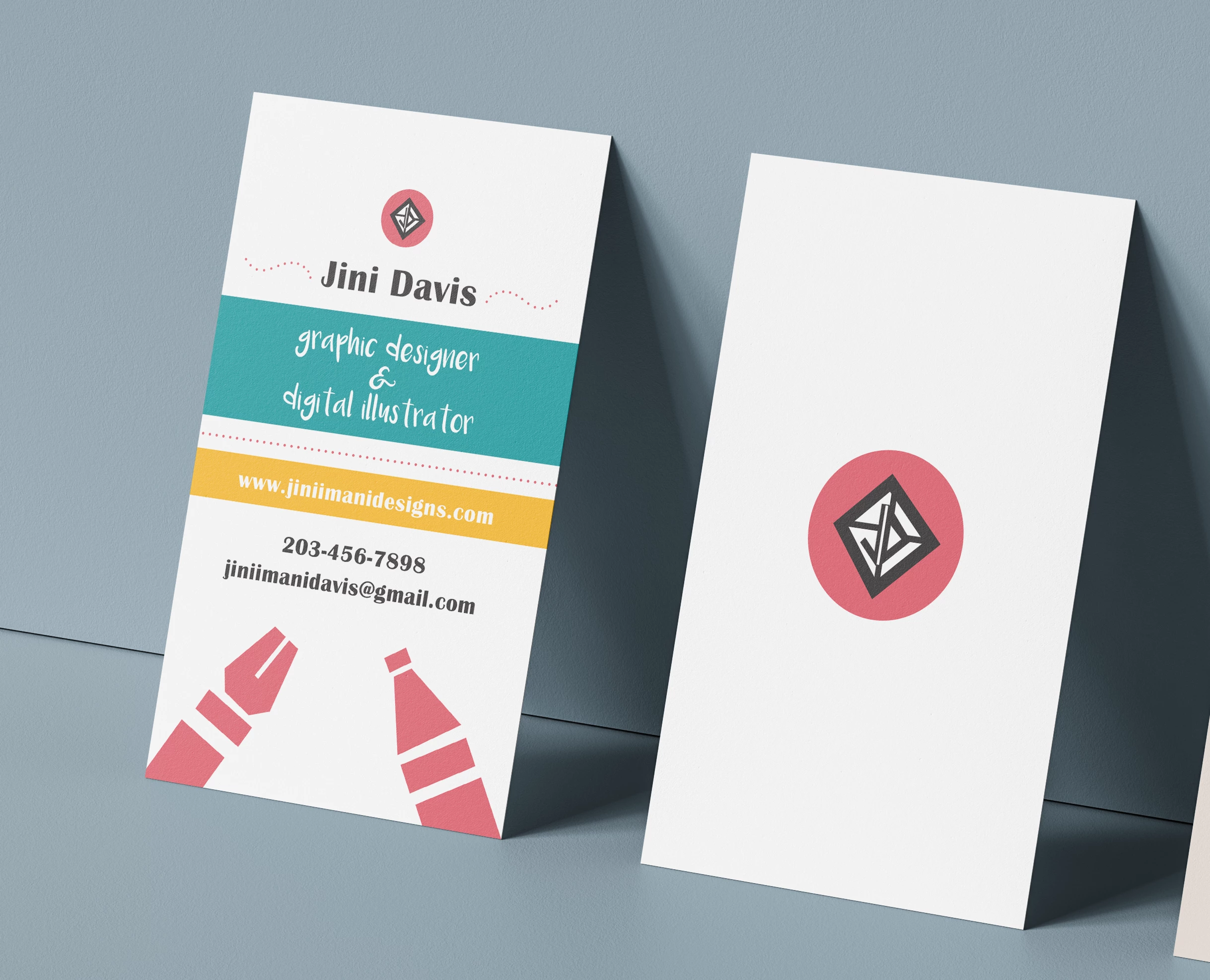
Ah – nitpick: would you consider moving the small logo at the top of your name up by a small amount? It doesn't "need" to be vertically centered perfectly (and I bet that optically that would appear to be too high), only a few millimeters higher.