Inspiring
July 5, 2023
Answered

Arabic letters and Baseline

  • July 5, 2023
  • 2 replies
  • 1115 views

Why is it that arabic characters shift the text down a few baselines.

The english body font is 11/17. The arabic characters are 17/17.

The baseline grid is set to 4.25 points which is a division of 17.


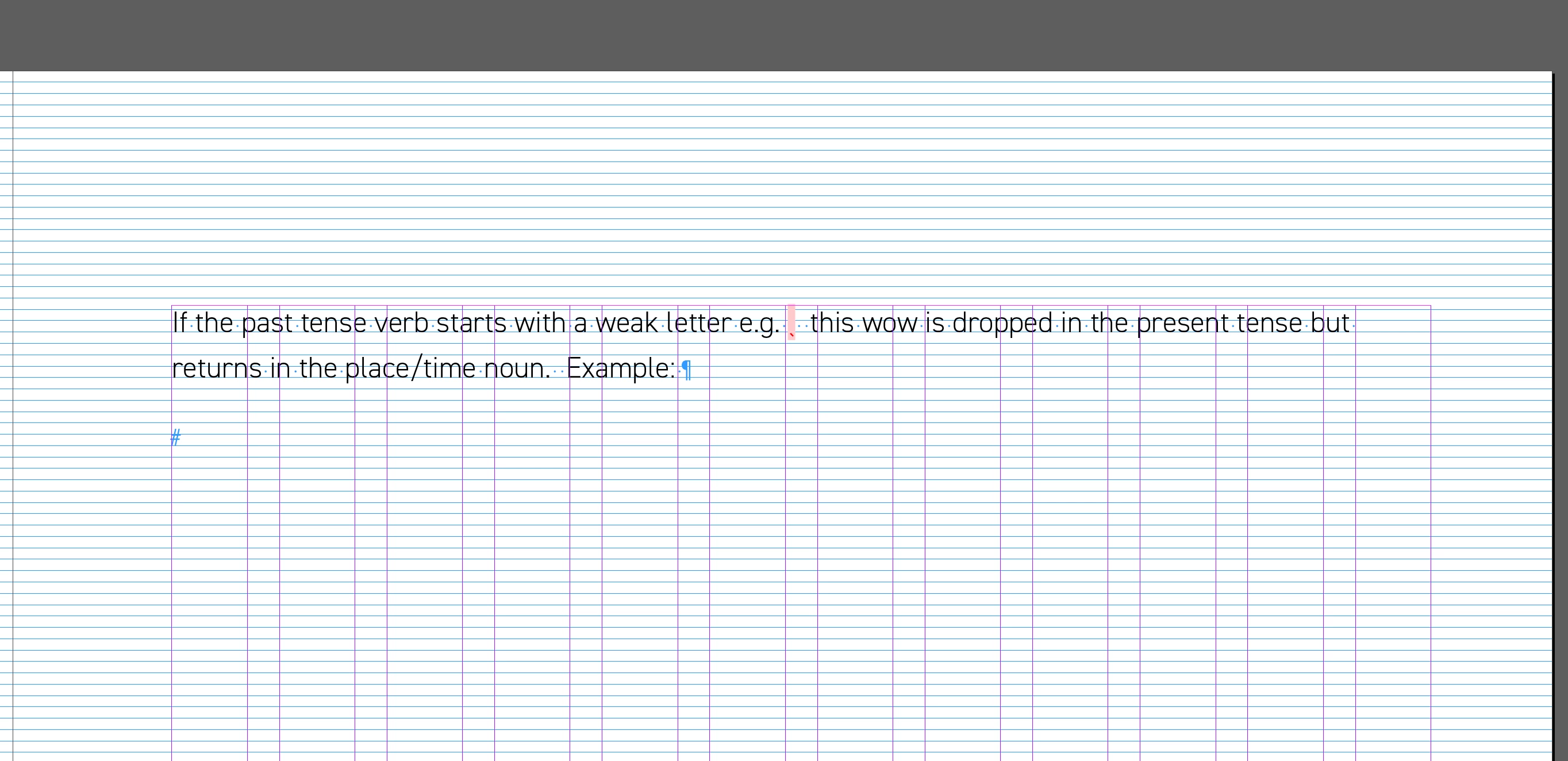
The first 2 images show the body text without the arabic character style applied (the pink bit)

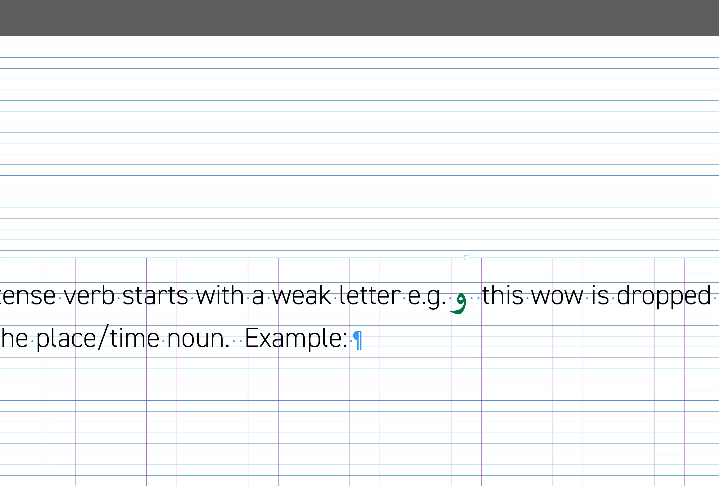
The 3rd image shows what happends when the arabic character stlye is applied.


This topic has been closed for replies.
Correct answer Joel Cherney

I have a few clients that want mixed Latin script and Arabic script set in two different fonts, so I wind up dealing with such issues on a regular basis. If you're setting this type manually, I don't know if my solution will work for you, but I like to use a GREP Style to apply stying to Arabic throughout my document. In the character style, instead of increasing the font size of Arabic text, I use horizontal and vertical scaling to increase the size of the Arabic glyphs without affecting the font size. In most cases, this avoids problems when dealing with text aligned to baseline grid (as well as a whole raft of other potential issues). 

2 replies

Zaid Al Hilali
Community Expert
Community Expert
July 5, 2023

I replicated the issue on my InDesign. It is not only the Arabic text that will shift the whole line down, even the English text will do the same if you increase its size.

Inspiring
July 5, 2023

If i decrease the size of the arabic text to 13, then it goes up. But i want it to stay at size 17 as it looks too small. but i don't want it to drop down a few baselines.

Joel Cherney
Community Expert
Joel CherneyCommunity ExpertCorrect answer
Community Expert
July 5, 2023

I have a few clients that want mixed Latin script and Arabic script set in two different fonts, so I wind up dealing with such issues on a regular basis. If you're setting this type manually, I don't know if my solution will work for you, but I like to use a GREP Style to apply stying to Arabic throughout my document. In the character style, instead of increasing the font size of Arabic text, I use horizontal and vertical scaling to increase the size of the Arabic glyphs without affecting the font size. In most cases, this avoids problems when dealing with text aligned to baseline grid (as well as a whole raft of other potential issues). 

Robert at ID-Tasker
Legend
July 5, 2023

Not sure what do you mean? 

They look exactly the same to me - but I'm on my phone. 

Leading set to 17 means text is on every 4th gridline.

Or am I missing something? 


Zaid Al Hilali
Community Expert
Community Expert
July 5, 2023

I set my baseline at 4.25pt

Type English, or Arabic text on one line for example, and have the font size at 12pt. Leading at 17pt.


Increase font size only one point at a time to see the line is pushed down to the next baseline.