Colors Dull on InDesign - Need Advice!
Hi All,
I teach high school and I have a student creating a book cover for an assignment I give my Intro to Design students. In the seven years I have been teaching, this is the first time I have had a student have troubles with how colors appear on screen. I have been looking at her file and can't figure out the issue. I made a new file from scratch and I'm not having the same troubles with mine, so it's something about her file in particular.
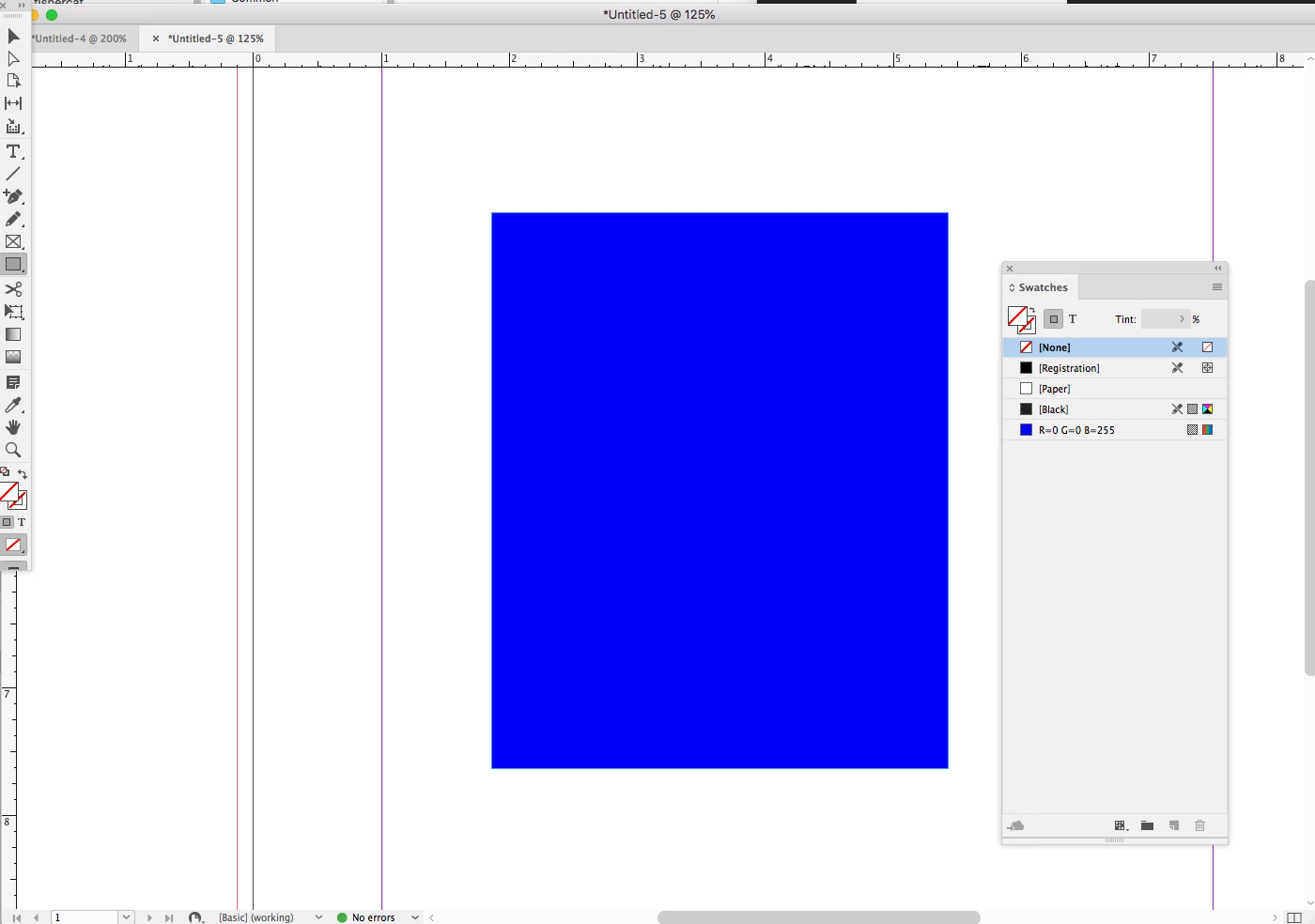
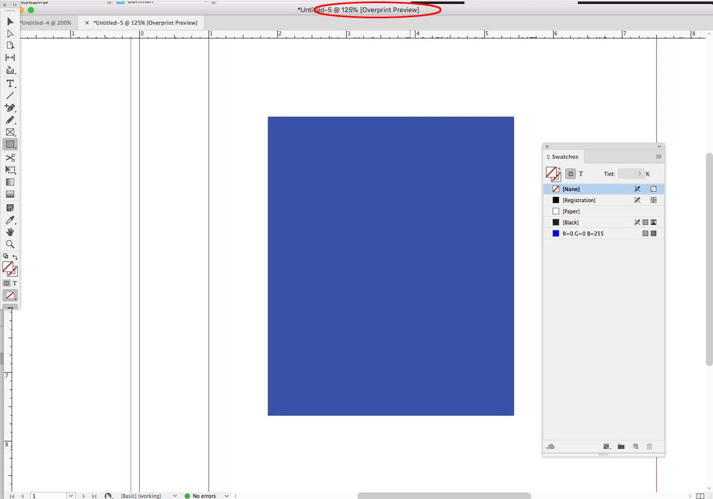
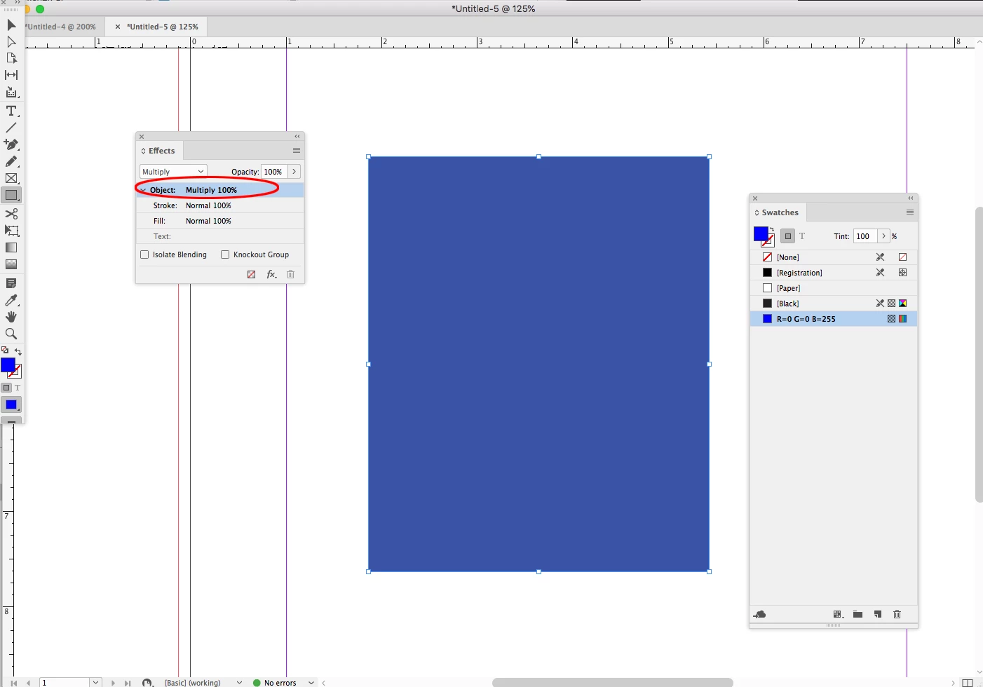
She was not importing any photos to her project, just using the shape tool to set a background color. My students set up their files with the intent of Print. I know this will give them a CMYK color space but I have told the students that they can use the color picker and as long as they "save RGB swatch" the brighter color they want will show on screen. We don't actually print these projects, I view and grade them on screen. When she creates and saves an RGB swatch it shows up super dull. She's trying to create R 0, G 0, B 255 and it always shows up this very washed out looking color. Oddly, when she extends her shape beyond the page border and out to the bleed, the color looks darker over the gray pasteboard than it does over white page. It does not do this on the document I made.
Her color:

Mine:

Both are the same RGB value. Both documents are GPU preview. Both are in a proof set up of Document CMYK U.S. Web Coated (SWOP) v2
Does anyone know what to do? I've been looking up info on color spaces and not finding anything helpful. I apologize if this seems really elementary, I am self taught on Graphic Design (my background is painting and printmaking) so when odd issues like this come up, I can't seem to figure out the trouble. I appreciate the help!