
Inspiring
June 24, 2023
Answered

Fit frame to content: sizes up to baseline, which is slightly too small.

  • June 24, 2023
  • 9 replies
  • 709 views

I the latest InDesign, when I tell a frame object to 'size frame to content' and the bottom of the text frame has a line of text, it gets sized slight smaller that I would expect:
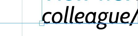
On the left you see the frame handle, and as you can see the frame has shrunk 'up' to the baseline, not to the actual size of the content, which extends below the baseline. Is there a way I get get this to size to the actual content, so including the (actual) descend of the font?

This topic is closed to new replies. Start a new post to keep the conversation going.
Correct answer Peter Kahrel

In your screenshot the bottom of each figure is exactly at the bottom margin, so they're probably floats that align with the bottom of the text area.


In your captions, if you move them a bit up to cause the undershoot to disappear, then you'll see that other letters, such as A, i, m, and n, appear to too high, they'll be above the baseline.


I agree with Peter S. that you should set your text such that the last line of each text column aligns with the bottom margin. How you achieve that is another matter, but it will fix your problem.

9 replies

Peter Kahrel
Community Expert
Peter KahrelCommunity ExpertCorrect answer
Community Expert
June 25, 2023

In your screenshot the bottom of each figure is exactly at the bottom margin, so they're probably floats that align with the bottom of the text area.


In your captions, if you move them a bit up to cause the undershoot to disappear, then you'll see that other letters, such as A, i, m, and n, appear to too high, they'll be above the baseline.


I agree with Peter S. that you should set your text such that the last line of each text column aligns with the bottom margin. How you achieve that is another matter, but it will fix your problem.

Peter Kahrel
Community Expert
Community Expert
June 24, 2023

What you see is expected: the bit that extends below the frame edge is called 'undershoot'. Characters with undershoot are typcally a, b, c, d, e, o, etc. Compare that with descenders, which stick out even more. I roman/regular fonts, the characters f, i, x and some others don't have undershoot. In your italic font probably all characters have some undershoot, but you can verify frame fitting with a regular font.


Undershoot is an optical adjustment. Without it, characters like o and u appear to be sitting a fraction too high relative to other characters..

Inspiring
June 24, 2023

That is like the character protrusion that gives you optically straight vertical edges, e.g. with justified or ragged left text. I was actually wondering about the descenders.


My use case is that I have text frames with images and captions and if I align these on the bottom of the page's major text frame, they generally extend bewow the other column (I am using two-column) already because the final line of the other column often gets positioned slightly above. If the image then puts the baseline of the caption exactly at the bottom, the effect is worsened. I can of course position all these 'image plus caption' objects slightly up, but if the caption itself (which often has multiple lines) would have some extension (which a fit to content taking the descends into account would give me) I would get a slightly more pleasing aesthetic, with less hassle. A bit like setting the baseline for the first line of a text object does on the top (but for which I do not have an option at the bottom of that image-plus-caption object afaik.

Scott Falkner
Community Expert
Community Expert
June 24, 2023

I cannot imagine a scenario in which I would want a photo to align with the descenders of the caption rather than the baseline of the caption.

Peter Spier
Community Expert
Community Expert
June 24, 2023

This has been the case for as long as I remember. Italics can also extend beyond the edge on the right.

Scott Falkner
Community Expert
Community Expert
June 24, 2023

Does this matter? Personally I prefer this method. Say you have text you want aligned to the bottom of a text frame. What part of the text should align with the bottom of the frame? The descender, the bounding box of the font, or the baseline? To me baseline is the one corret answer. So if aligning to the bottom of a text frame puts the baseline on the bottom of hte frame (letting descenders and other features extend outside the frame) then the implication is that the baseline is the bottom of the text and the frame should snap to the baseline.