leilagolden
Known Participant
June 24, 2017
Answered

glyph help?

  • June 24, 2017
  • 4 replies
  • 596 views

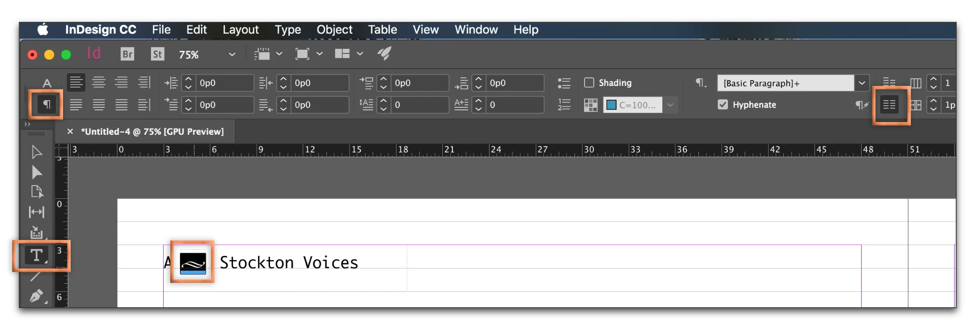
I'm trying to place a glyph on a line between page # and book title, but the glyph won't stay on the line - only above or below. No text wrap issues, I checked. I have a screen shot if that helps. Thanks!

Here's the screenshot

Why won't it lower to sit at the base of the type? When I try to, it just becomes an empty box with the red + sign

This topic has been closed for replies.
Correct answer Barb Binder

Actually, I was just playing with it... let's go the other way and align it to the baseline grid—along with the rest of the running head elements, which are in their own frames, and are not actually aligned with each other. (The A is higher that Stockton Voices).

Or...

why not just put all three elements in the same frame? Baseline grid or no baseline grid, they will line up correctly. I used em spaces on either side—Type > Insert White Space > Em Space.

4 replies

Barb Binder
Community Expert
Community Expert
June 24, 2017

LOL, I'm moving slowly this morning, Leila... which of the three answers did you pick? I'm hoping it was the last one—it was the easiest.

~Barb at Rocky Mountain Training
leilagolden
Known Participant
June 24, 2017

fussing with it re: arrows, because I like to do things the hard way...I'll

learn!

On Sat, Jun 24, 2017 at 11:15 AM, BarbBinder <forums_noreply@adobe.com>

Barb Binder
Community Expert
Barb BinderCommunity ExpertCorrect answer
Community Expert
June 24, 2017

Actually, I was just playing with it... let's go the other way and align it to the baseline grid—along with the rest of the running head elements, which are in their own frames, and are not actually aligned with each other. (The A is higher that Stockton Voices).

Or...

why not just put all three elements in the same frame? Baseline grid or no baseline grid, they will line up correctly. I used em spaces on either side—Type > Insert White Space > Em Space.

~Barb at Rocky Mountain Training
leilagolden
Known Participant
June 24, 2017

Thanks!

that is helpful

And then I realize, it ought to be higher anyway...

Barb Binder
Community Expert
Community Expert
June 24, 2017

Hi Leila: It's hard to tell what's going on from that screen shot, but I see a baseline grid in the background so let's start there—is the glyph snapped to the grid? You might select the glyph, and take if off the grid, and then switch back to the selection tool and use the arrow keys to nudge it down.

~Barb at Rocky Mountain Training
John T Smith
Community Expert
Community Expert
June 24, 2017

The Lounge Forum is not for technical help, please provide the name of the program you are using so your message may be moved to the correct program forum... A program would be Photoshop or Dreamweaver or Illustrator or InDesign or ???

leilagolden
Known Participant
June 24, 2017

sorry- I am new to this, I'm all set, but for the future, how do I ask technical questions for Indesign?

Barb Binder
Community Expert
Community Expert
June 24, 2017

Hi Leila: come back to this forum. You can bookmark this link—InDesign.

If you've already got the glyph were you want it, just ignore this, but you can shift selected text up and down with the Baseline Shift command:

~Barb at Rocky Mountain Training