I see a way with a couple of GREP styles and some character styles.
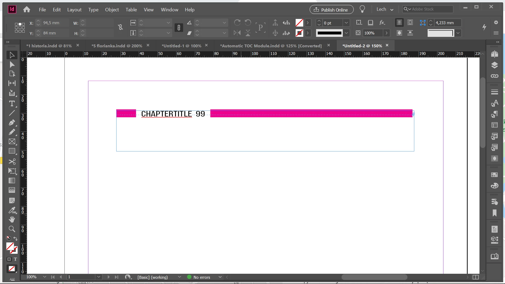
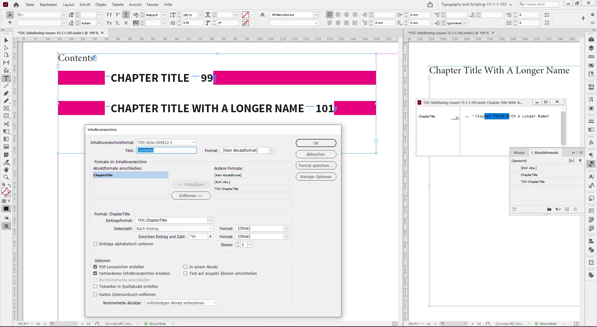
The paragraph style applied in the TOC has a paragraph shading applied.
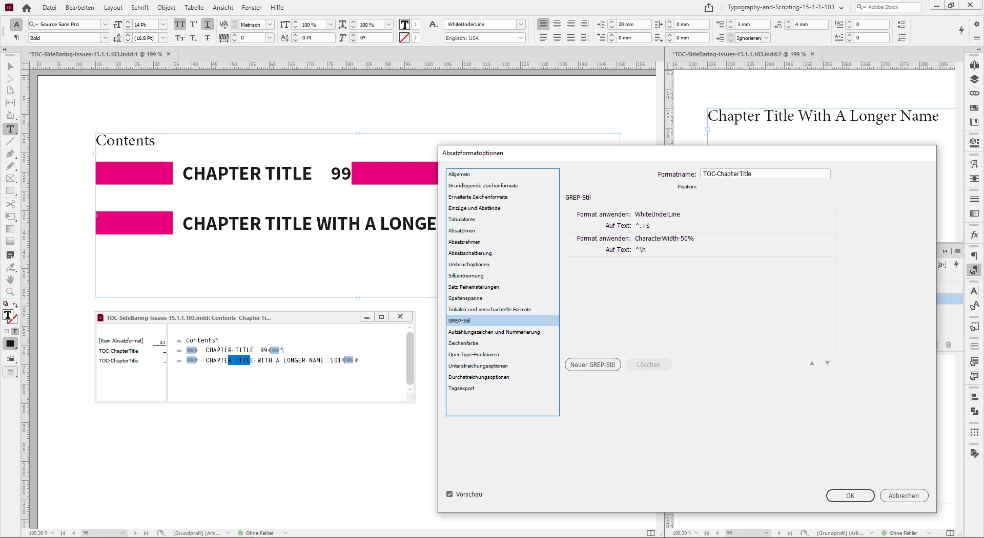
The gap in the shading is controlled by a GREP style that applies a character style with a underline colored in [Paper].
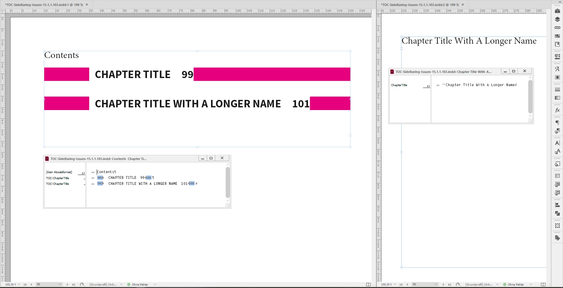
Some screenshots from my German InDesign to illustrate this:
One or two issues remain:
[1] The left and especially the right side-bearing.
[2] Text that is running in more than two lines.
Issue [1], left and right side-bearing.
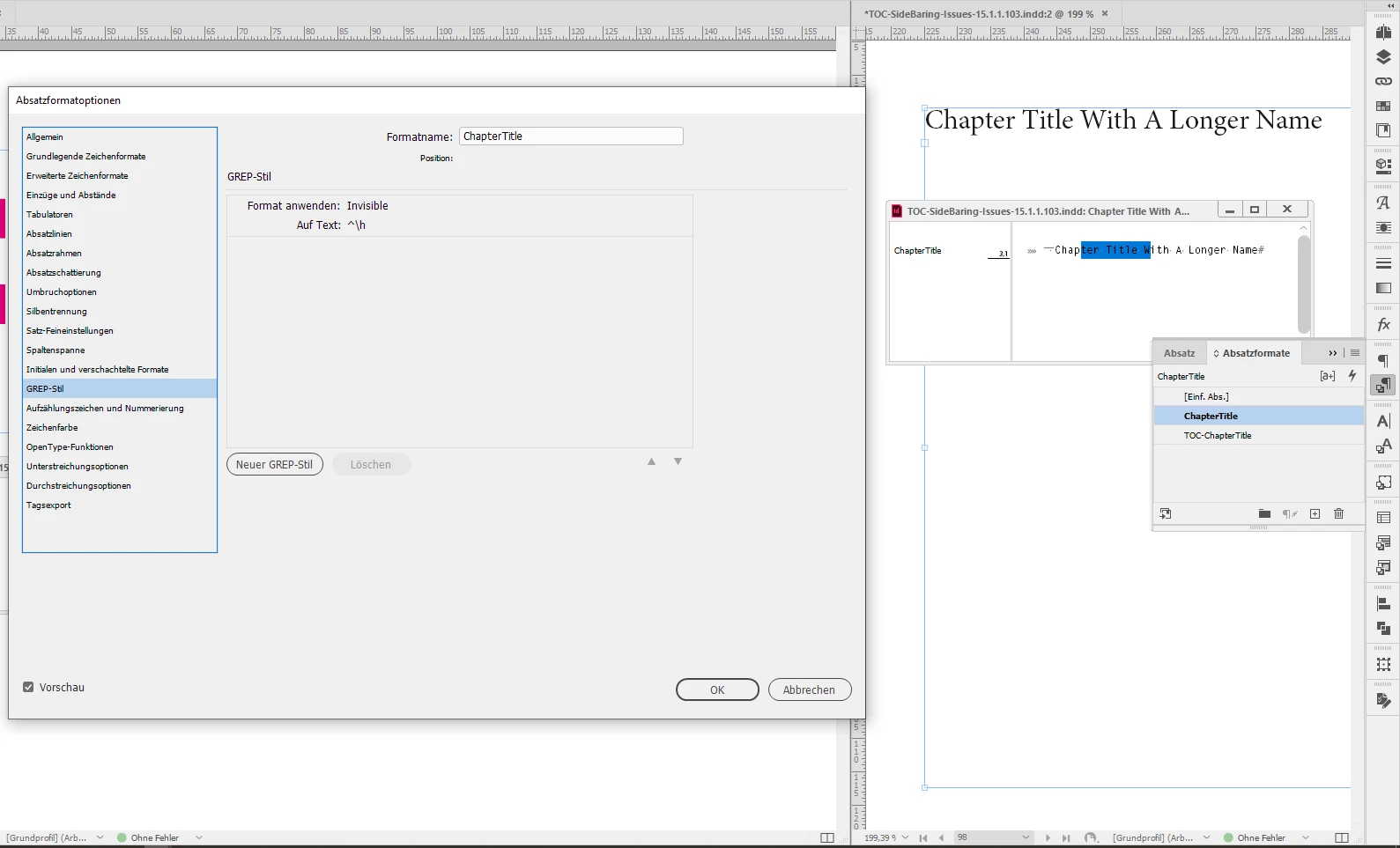
The part with the left side-bearing can be solved if you can add or type a fixed width white space at the beginning of every title in the main story where the TOC pulls the contents from. In my screenshot above I used an EM space character, that I make "invisible" with a GREP style that sets its width to 1%.
In the TOC itself another GREP style changes the width to 50%. That's the way to control the width of the left side-bearing.
Change the width of a character to a percentage with a character style.
For the right side-bearing after the page number I have no easy solution.
We could create a separate special font with 10 digits that are designed to have a fixed right side-bearing and a GREP style that will apply that font to the last digit of the paragraph.
But in the end it would be easier to add a fixed width white space to the end of every paragraph in the TOC. That must be done again every time the TOC is updated. Could also be done with the beginning of every paragraph in the TOC and we forget about the solution I outlined above for the left side-bearing.
Issue [2] could be no issue at all if you do a point size of the text in the TOC that every title can go into one single line of text.
Let's see if others come up with a better solution…
Regards,
Uwe Laubender
( ACP )