Luk Ramon
Inspiring
May 29, 2021
Answered

How to get rid of padding text box

  • May 29, 2021
  • 6 replies
  • 6048 views

How can I get rid of this added padding so it aligns perfectly to the column guides?
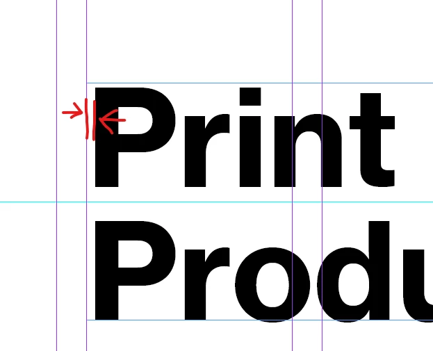
Thanks already,
Luk Ramon


This topic has been closed for replies.
Correct answer Luk Ramon

If you're having troubles with this too, please upvote the feature request here: https://indesign.uservoice.com/forums/601021-adobe-indesign-feature-requests/suggestions/43532502-text-perfectly-aligned-with-text-frame

6 replies

Community Expert
June 2, 2021

Hi lukr69412519,

that's why I used optical kerning with 50 tracking for the left text frame.


Regards,
Uwe Laubender

( ACP )

Community Expert
June 1, 2021

Hi lukr69412519,

the way out for now would be a font without side bearings where optical kerning is applied and a lot of tracking as well.

To proof this I did a font with some glyphs showing the concept. The screenshot below is from my German InDesign 2021 on Windows 10. The font's license allowed me to do what I did.


Left a special font variant done with Jongware's and Marc Autret's IndyScript for InDesign, no side bearings, right the original font with the usual features:


More details in this other thread:

https://community.adobe.com/t5/indesign/how-to-completly-align-in-indesign/m-p/12072063#M431084


BTW: I already voted for your feature request.


Regards,
Uwe Laubender

( ACP )


Luk Ramon
Luk RamonAuthor
Inspiring
June 2, 2021

Yea, I got it, but this will ruin the kerning for sure. 

Luk Ramon
Luk RamonAuthorCorrect answer
Inspiring
May 30, 2021
Willi Adelberger
Community Expert
Community Expert
May 29, 2021

This is part of the font geometry to crate an optical alignment.

Luk Ramon
Luk RamonAuthor
Inspiring
May 30, 2021

I know right, but was thinking if there's no way to ignore this. Moving the text frame is the best solution yet. Thanks for answering!

Bill Silbert
Community Expert
Community Expert
May 29, 2021

All typefonts are created with a bit of whitespace on the left and right of each character. This is done so that the font characters do not bump into one another when the type is set. The amount of white space varies from character to character with curved characters having less white space around them than straight edged characters (see screenshot). This is why the copy you are showing does not sit exactly on the edge of a text frame as you are trying to do. The amount of inherent white space also does vary from font to font so some fonts will be able to get closer to the edge of the frame than others. It is also why the amount of white space relative to the edge will dimish or increase depending on the size that a font is used at. 

If you want your text to align with the column guides you will have to move the text box itself to do so. Make sure that View>Grids & Guides>Snap to Guides is turned off or the text frame will snap to the guide automatically thwarting your intentions.

Scott Falkner
Community Expert
Community Expert
May 29, 2021

You can also insert a space at the beginning of a line then kern the letter back into the space. Do this by adjusting the kerning while the cursor is between the leading space and the initial letter. Usually you don’t want to do this for every line in long copy. But usually this is something you only notice for large type like a headline or a drop cap. Also it is usally something you only notice when you can see guides and frame edges. If you don’t see it when you are in Preview mode you can probably ignore it.

Luk Ramon
Luk RamonAuthor
Inspiring
May 30, 2021

I guess so, but think @Bill Silbert 's solution might be the easiest one. Thanks for the response!

Community Expert
May 29, 2021
Luk Ramon
Luk RamonAuthor
Inspiring
May 29, 2021

Doesn't do anyting, thanks for answering!

Community Expert
May 30, 2021

 Are you sure it does nothing - adjust the numbers