You've just run across the difference between mathematical alignment and optical alignment.
InDesign does perfect things very well. And as Scott outlines above, the "text wrap" takes the entire character height to Top of Caps into account as it decides where alignment is made to the border standoff of the text wrap. So your "perfect" mathematical alignment appears to be a bit off optically.
That's where operator skill comes in to make imperfect fixes where perfect things don't work. In short, we need to screw things up until they work.
If you're experienced with editing paths in Adobe Illustrator, or adjusting clipping paths in Adobe Photoshop, this job will be much easier. If you're not, just click on the link below to learn how to manipulate paths within InDesign, and learn about powerful skills which will make things much easier for you in all three programs:
Edit paths in InDesign
Now, on to messing things up until they work:
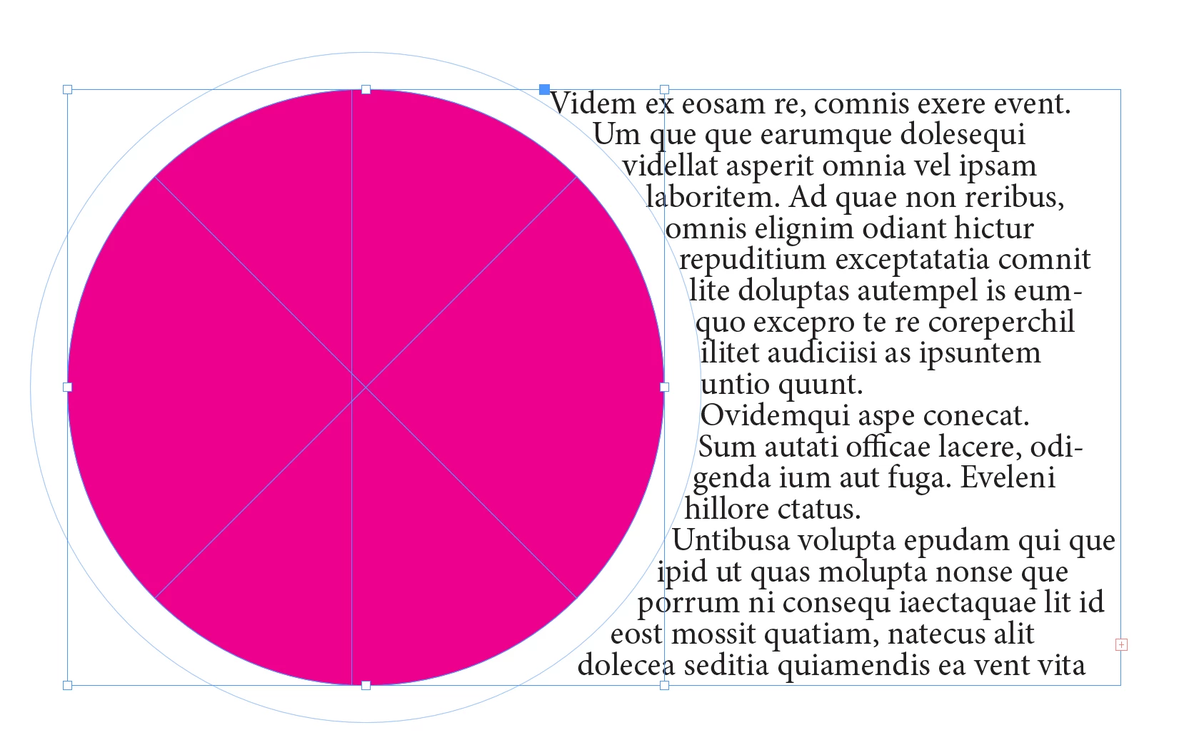
1. Click on your circle with the Direct Selection Tool, which highlights both the circle and the text wrap standoff. Then drop horizontal and vertical ruler guides on the standoff anchor points as shown below:
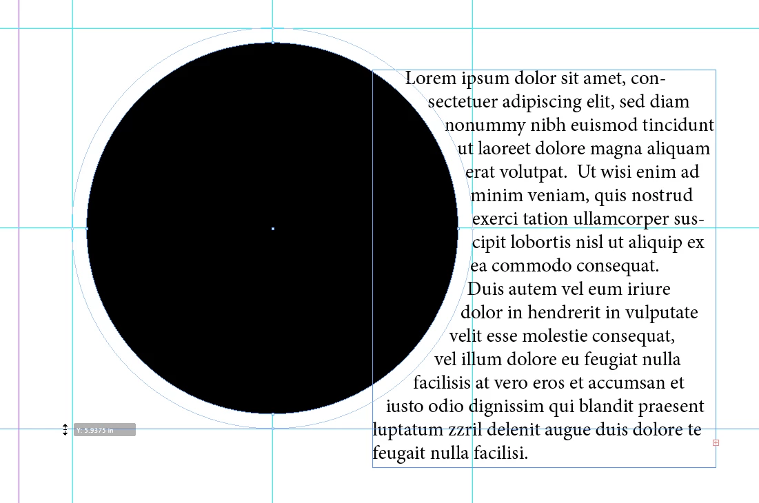
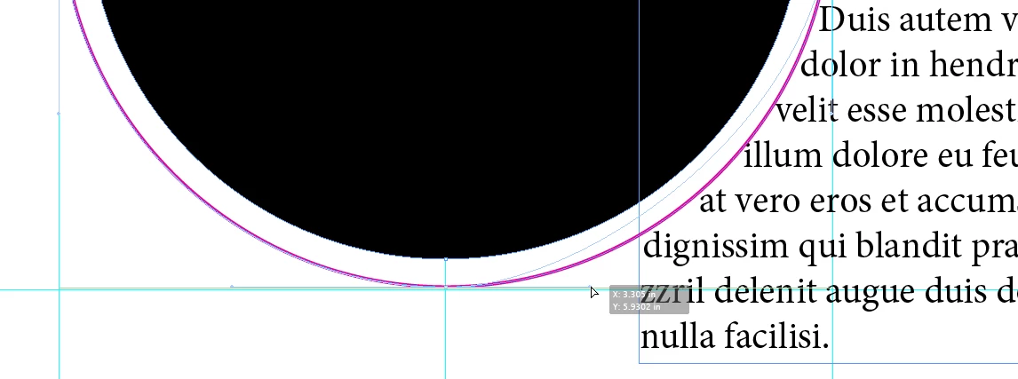
2. Get your Ellipse Tool, hold down the Shift key, and draw a circle within the ruler guides you just laid down. Use the Object>Arrange>Send to Back menu command to place the larger circle behind the smaller one. Then change the circle to another color. In my example below, I changed it to a fill of None and a 1-point stroke of Magenta, to make it easier to see:
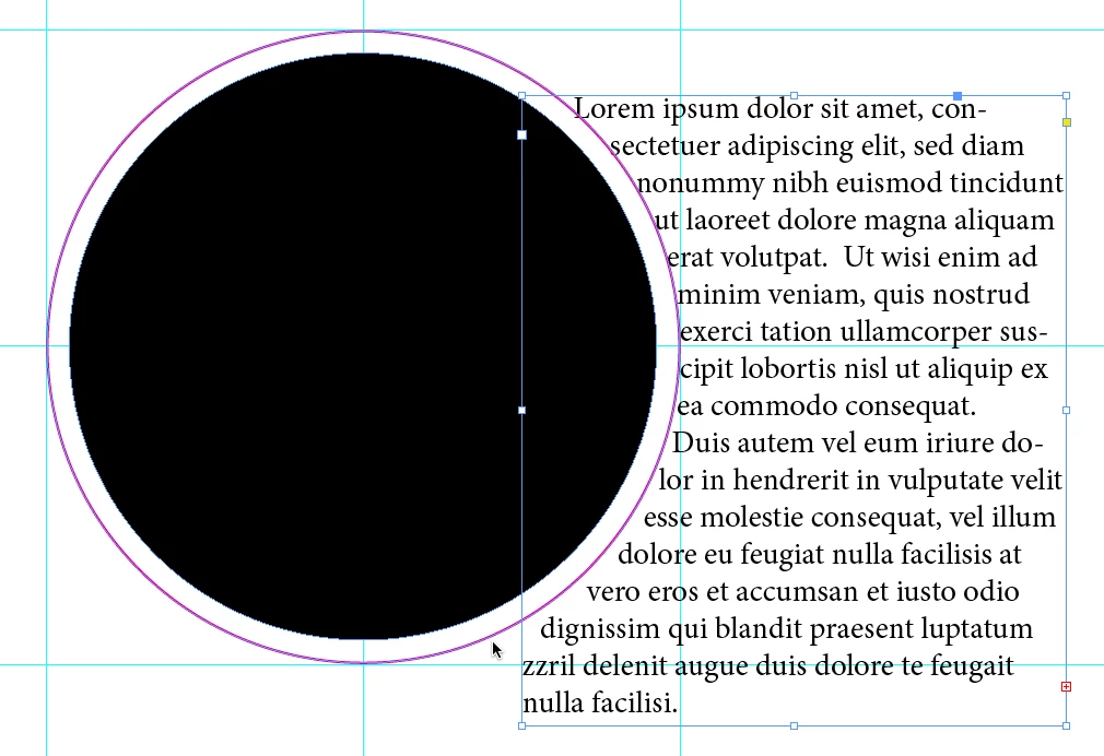
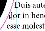
3. Now we can see where things are getting ugly. Right after the capital D in Duis and the lower-case l in (de-)lor, the gap opens up. We're going to fix that.
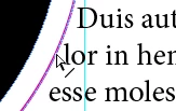
4. Get your Direct Selection Tool again and click on the inside circle, to see both the circle and the text wrap standoff. Put your cursor on the standoff path so you see the cursor with the diagonal line as shown at below left, then hold down the option/alt key (depending on whether you're working on a Mac or Windows system) so you see the cursor with the plus  sign, as shown below right. Click the mouse button to place a new anchor point on the standoff path.
5. Now click on the anchor point at the bottom of the standoff path to select that anchor point. This shows not only the point is selected, but also the curve handles for that point. Put your cursor on the right curve handle and shift-drag the handle in toward the point and adjust the standoff path until the text lines up something like the illustration below.
6. Get your Selection Tool. click away from the text and circles to de-select everything, then click on the outside circle and press the delete key to send it to electronic nirvãna.
By manually applying your imperfect fix, the text wrap now will appear optically correct.
Pretty spiffy, huh?