It looks like the main issue is a colour space mismatch between your new renders and your InDesign export workflow. Redshift, which you’re likely using in Cinema 4D, often renders images in wider or linear colour spaces like ACEScg or Linear Rec.709. Older renders were probably standard sRGB. When these wider or linear images are brought into InDesign without proper conversion, the colours can look blown out or clipped.
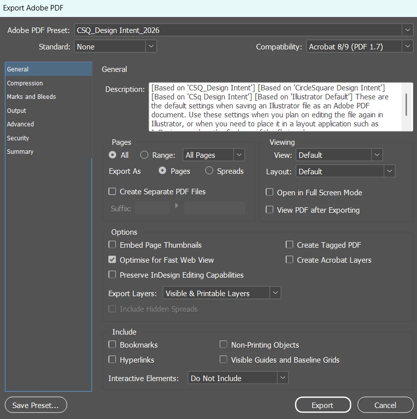
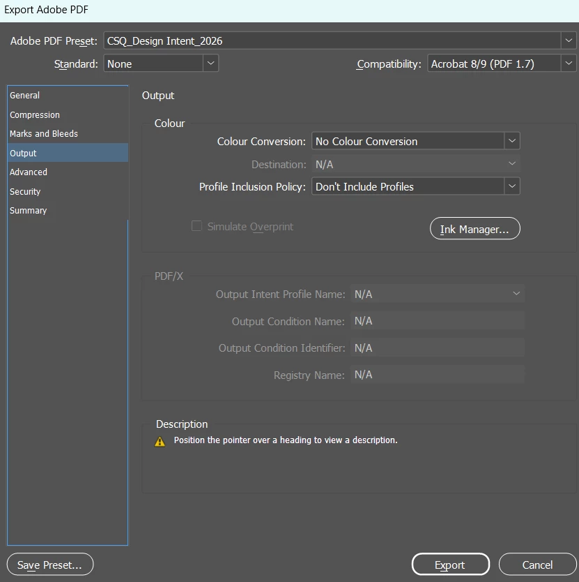
In InDesign, the key setting to check is Colour Conversion. Right now it’s set to “No Colour Conversion.” That works if everything is already in the right space, but if your document is CMYK (typical for print) and your images are RGB, InDesign won’t automatically translate the colours correctly.
A safer approach is to change Colour Conversion to “Convert to Destination (Preserve Numbers)”. Set the Destination profile to sRGB IEC61966-2.1 for digital or web output, or to your print profile (e.g., FOGRA39) if you’re exporting for print. Make sure Profile Inclusion Policy is set to “Include Destination Profile,” so the colour information travels with the file.
It’s also worth checking your Redshift exports in Cinema 4D. If you’re saving high bit-depth formats like 16-bit or 32-bit EXRs or TIFFs, they may still be in a linear colour space. Exporting to 8- or 16-bit PNG or TIFF with the sRGB transform applied ensures that the image appears in InDesign the way it does in the Cinema 4D picture viewer.
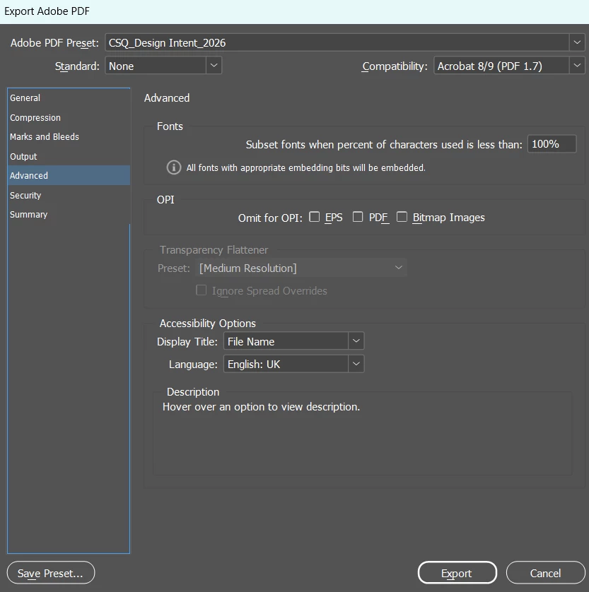
Finally, look at the Transparency Flattener in InDesign. It’s currently set to Medium Resolution, which can sometimes cause subtle colour shifts if there’s transparency or overlapping elements. Switching this to High Resolution usually gives more accurate colour and cleaner results.