Answered
InDesign Top Ribbon UX Design for Tables
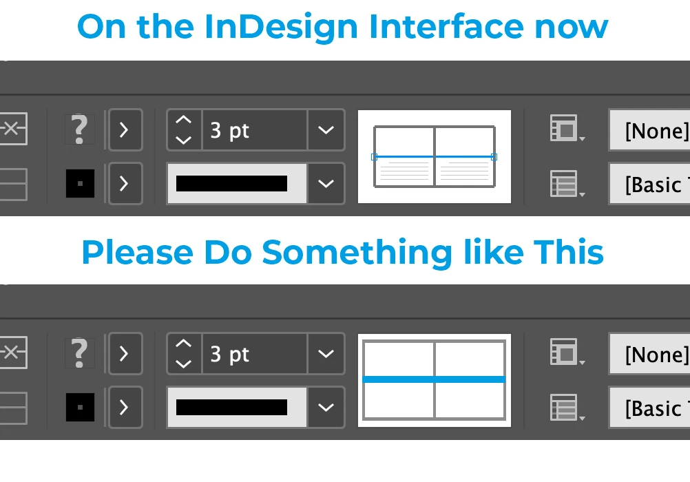
Is it possible to make the table-styling diagram easier to see?
The diagram is too small and the selected and unselected lines in the diagram are indistinguishable.
Something like this:
Thanks

Is it possible to make the table-styling diagram easier to see?
The diagram is too small and the selected and unselected lines in the diagram are indistinguishable.
Something like this:
Thanks
Hi
https://indesign.uservoice.com/forums/601021-adobe-indesign-feature-requests
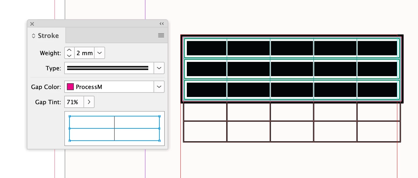
Also, not sure if this helps but, when a table is selected there is also the Stroke panel which has a larger UI
Already have an account? Login
No account yet? Create an account
Enter your E-mail address. We'll send you an e-mail with instructions to reset your password.
