One question: I noticed that the justification is leaving too much space between the words. My guess is that has something to do with the contrains of fitting some different formatting (like the font) on a page with no flow. And this will be solve in InDesign when there is flow among the pages. Is this correct?
By @Ira Glunts
Hard to say without seeing it, but one thing to check is the integrity of text that was generated by optical character recognition. In whatever software you’re editing in (InDesign, Word…), make invisible characters visible and check between printable characters for invisible extra spaces or unexpected characters that might be affecting justification. Also, you might check the font that’s applied and make sure it has professional metrics, and isn’t corrupted. A good professional font should have great spacing right away.
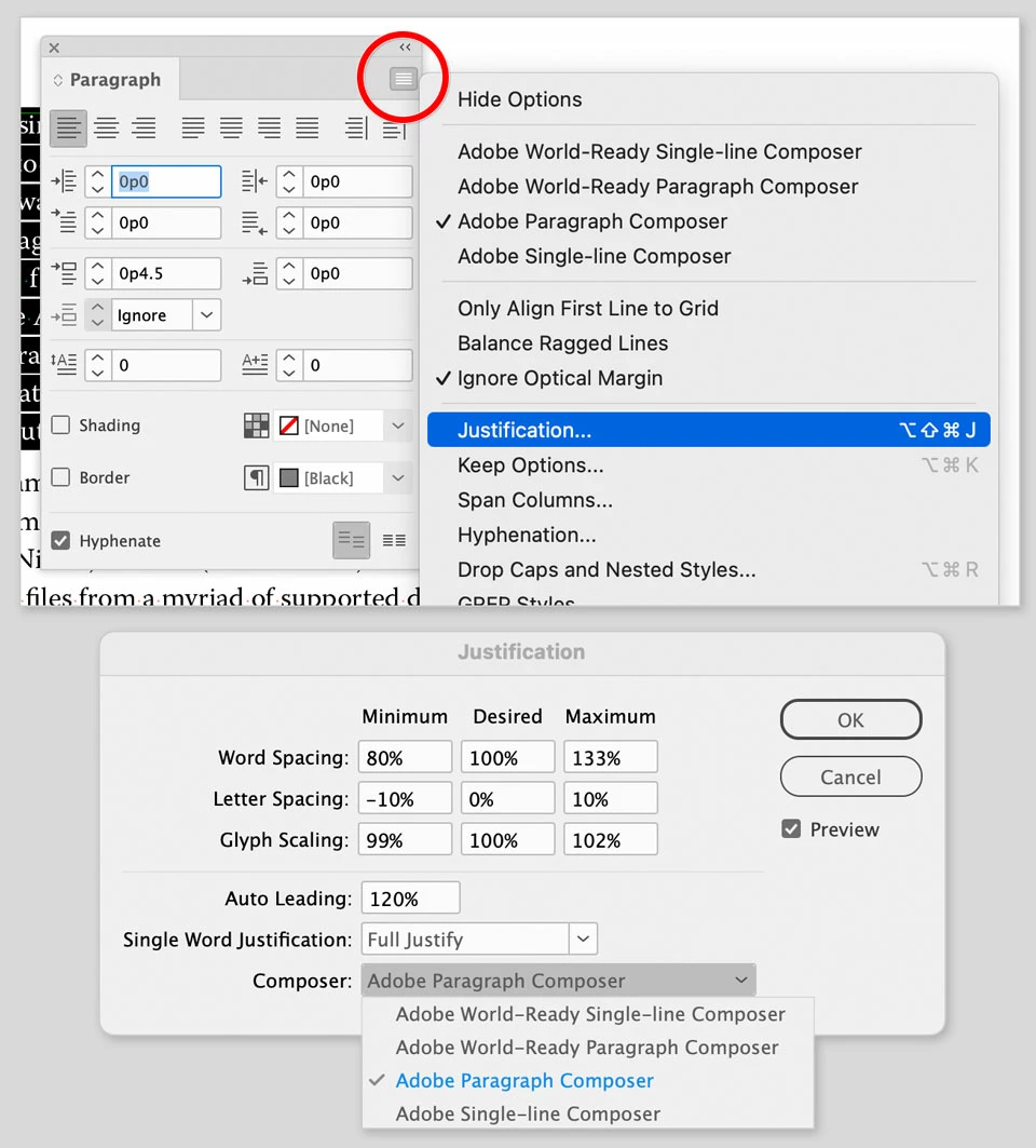
If all of that seems fine but the justfication still doesn’t look good when you flow it onto pages in InDesign, then you can start inspecting justification and composition settings in InDesign, as shown in the picture below. In the Paragraph panel, if you applied a justification option from the row of icons across the top, note that there are four different justification options among the nine icons for alignment and justification there — make sure the justification type that’s applied is the one you intended.
Also double-check any letter or word spacing that’s applied independently of justification, to make sure it’s set to zero or whatever you intend.
As in PageMaker and Word, standardize paragraph formatting using paragraph styles so that justification and other typography is automatically kept consistent throughout the entire book.
The control over typography in InDesign is superior to what was available in PageMaker.