lenen30755035
Participating Frequently
September 27, 2022
Question

kerning in text block - The spacing is awful

  • September 27, 2022
  • 5 replies
  • 1074 views

Hi all,

I am working on a book in Indesign. Normally my spacing between characters is fine.

But in this dokument i looks so bad - I have tried all kinds of settings - with out any luck.

Please look at att. file to see my settings and the text. What is wrong?? 
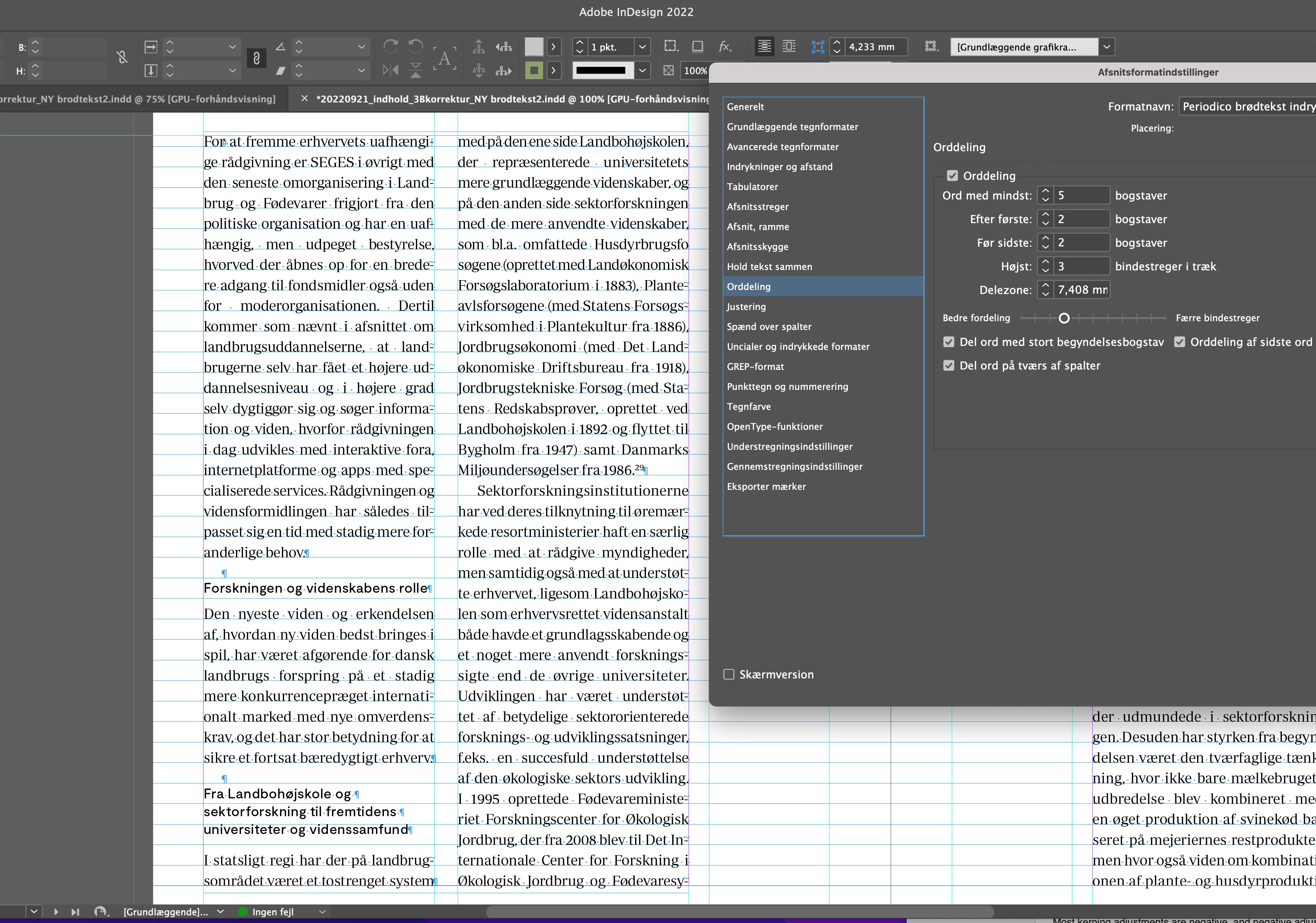
Regards Lene

This topic has been closed for replies.

5 replies

Mike Witherell
Community Expert
Community Expert
September 28, 2022

Tried and true:

Hyphenation:

9,3,4,1, off, off, off

Justification:

80/100/120

-5/0/5

95/100/105

Mike Witherell
James Gifford—NitroPress
Legend
September 28, 2022

Yeahbut...

😄


lenen30755035
Participating Frequently
October 5, 2022

Thank you all - a combination of all your good suggestions did the trick! The book is now done.

James Gifford—NitroPress
Legend
September 27, 2022

As a final suggestion, you might make your columns wider. I'm not sure if the large inner margin is for functional purposes or just layout design... another cm or two on each column, given the long word lengths, would probably go a long ways in easing this problem.


lenen30755035
Participating Frequently
September 28, 2022

I have testet larger columns and smaller text. It only looks good when i make the two columns almost the size of the book. Or only have one column (the same size as the two). I normally in many other books have had columns around this size, with out any problems. I have also change the font, and that did help a little.

I talked to Adobe support who thinks I need on all 480 pages to replace my text in a new textbox without any styles. I did a test and it is not helping?

James Gifford—NitroPress
Legend
September 28, 2022

You know your needs and preferences. The first examples seem to show a very large inside margin, which is unusual; Rob's examples seem more normally proportioned to my eye. Maybe it's all just a function of the precise text and content in this project.


rob day
Community Expert
Community Expert
September 27, 2022

Hi @lenen30755035 , Look at your Justification settings—they affect letter and word spacing:


Default:


Adjusted:

lenen30755035
Participating Frequently
September 27, 2022

Thank you all - I will try all your suggestions. I also think that Indesign has a problems with the hyhenations of the extremely long words in the text.  It also hyphenat some words wrong (a thing I have never tried before?

James Gifford—NitroPress
Legend
September 27, 2022

ID is like most word apps in that it has a dictionary and then rules for hyphenation. Be sure you have the right language set for your text elements, of course. But with some of those jaw-breakers outside the basic vocabulary, ID can only use rules to hyphenate, and that's always an imperfect approach. You may need to add some common words to the dictionary (I think that can be done...) or use discretionary hyphens in the words that are breaking poorly.


lenen30755035
Participating Frequently
September 27, 2022

Great thought - but even with a much smaller font it looks so bad. See the att. ?? arghhhh


James Gifford—NitroPress
Legend
September 27, 2022

It's the simple collision of narrow columns, many long words and full justification. The only fix is to find the optimal font size (perhaps by half-point steps) and then tweak the justification settings, as @rob day notes.


Peter Spier
Community Expert
Community Expert
September 27, 2022

It's because the column width is narrow compared to the size of the text. Try adjusting the Justification setings in your Paragraph Style definition.