Participating Frequently
December 8, 2022
Answered

odd italics

  • December 8, 2022
  • 4 replies
  • 4639 views

Hello! Newbie designer here. I’ve been working with InDesign for about a year, and this is the first time I’ve run into this problem.


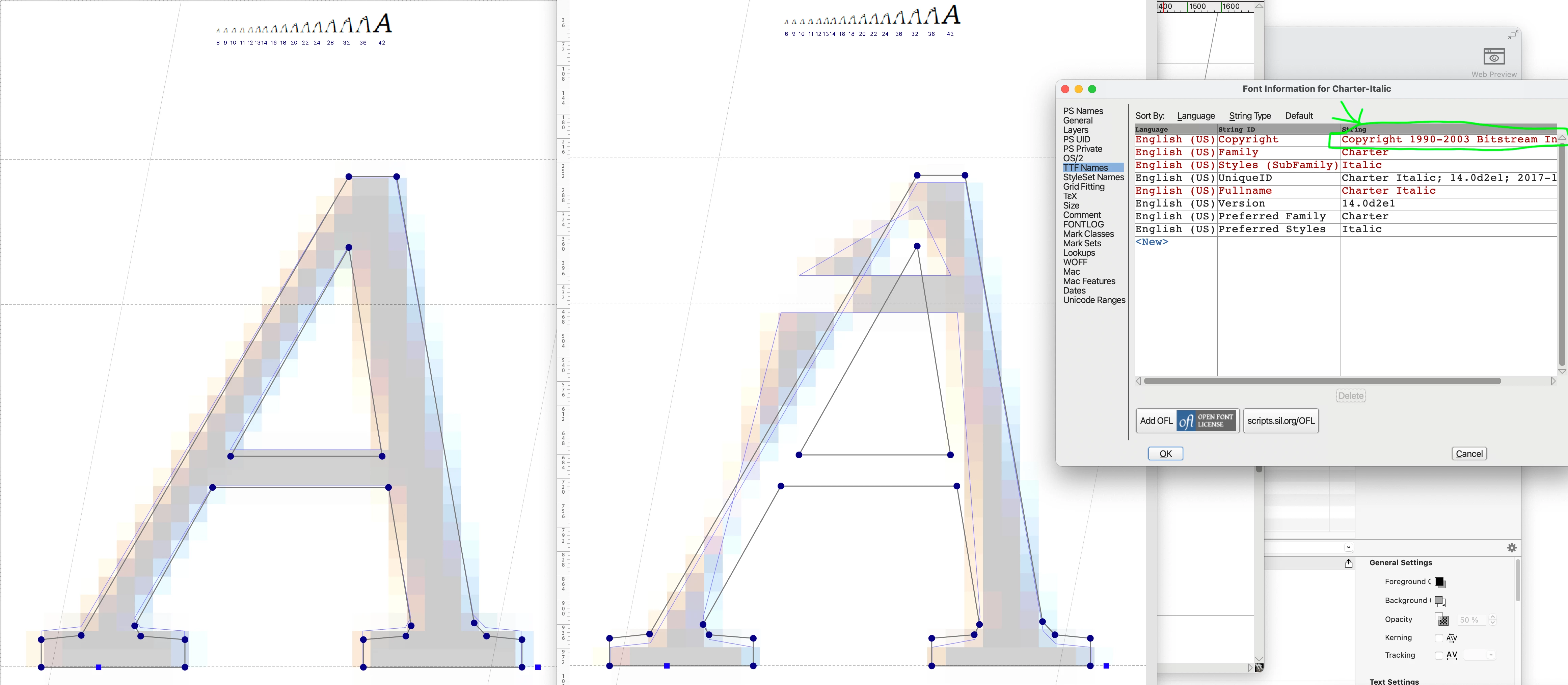
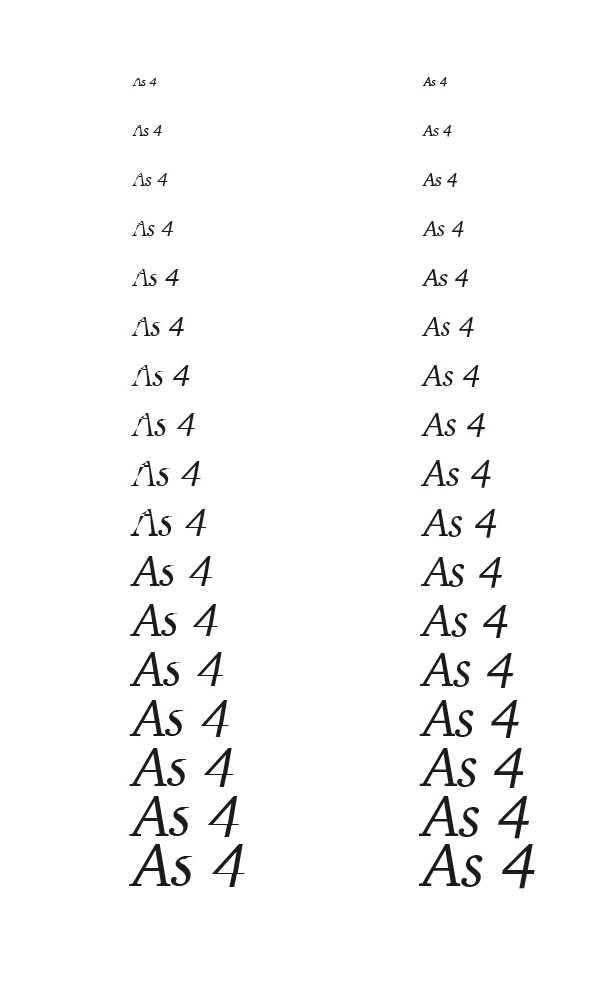
I’m using the font Charter (12 pt) and have noticed an issue with italics: depending on the software and the zoom setting, certain italicized letters lose strokes and definition on the screen. The biggest culprits are uppercase A, B, D, and lowercase S, but there are subtler losses depending on the viewing parameters. I’ve attached some screenshot examples (obvious problem spots are marked with red). 


Acrobat, used to view the print quality PDF, seems unable to render the italics correctly unless zoomed in to about 1,000 percent. InDesign needs to be at about 240%. For comparison, the issue doesn’t happen at all on Preview. The issue also doesn’t happen when the document is printed (even when printed from Acrobat).


Two questions:


  • Do I need to worry about this font printing correctly when I upload the print quality PDF for print on demand? I assume not, given that the issue doesn’t happen with my own printer, but I want to be sure.


  • Any idea what is causing this or how to fix it?


Thank you so much in advance for any help!

Correct answer Brad @ Roaring Mouse

I delved into it a bit deeper. I opened the font in FontLab and found the Charter that is supplied with the Mac OS is in fact Bitstream's outline. And it's hinting is all messed up throughout the Italics.

See attached: at some sizes the hinting is correct (left), but go below a certain value and the wildly incorrect hinting shows up (right).

It only affects the TrueType version and appears to be a mistake when they converted therir library way back when that was originally Type 3/Type 1. It just so happens I have both the TrueType and Type 1 versions from an old Corel CD and, indeed, the TrueType version is identical to the Mac OS .ttc version and also has the messed-up hinting. The Type 1 was totally fine.

I regenerated a new font file correcting the TrueType hinting and it worked fine.

(left original, right regenerated rehinted.)

As far as printing, I did some print tests on two diffrent printers with the original font, although it's not as weird a result as on screen, printout is also affected, depending on the resolution of the printer.

Anyway, what it comes down to is : BAD FONT

4 replies

Brad @ Roaring Mouse
Community Expert
Community Expert
March 3, 2025

I know this is an old thread, and i'm sure the OP has since "moved on", but the issue came up again elsewhere, so I wanted to provide an update:

Bitstream's Charter was donated as an open-source model, so anyone can use and/or modify it for free. To get around the issue of the TrueType version on the Mac being wonky, I suggest replacing it with the OpenType version available here:

https://practicaltypography.com/charter.html

Brad @ Roaring Mouse
Community Expert
Community Expert
December 9, 2022

Are you on a Mac?

I see no evidence that Charter was ever a font offered in the Adobe Font Library. But Corel/Bitstream certainly did have a Type 1 version of it. But my guess is you are actually using the version that is a supplied system font in Mac OS as a TrueType Collection (.ttc) format). What does InDesign say about it in the Find/Change font dialog under More Info?


That being said, there are definite flaws in that Italic font outline as I was able to reproduce exactly the weird effects you are seeing at certain zooms.

I've seen similar issues with the Avenir font in the past (also a .ttc font in Mac).

Still, they print fine, if that's any consolation.

James Gifford—NitroPress
Legend
December 10, 2022

That's really strange. I can only think there is glitchy coding in the actual font outline and definitions. And, frankly, if this originated with Corel... color me unsurprised. 🙂


Brad @ Roaring Mouse
Community Expert
Brad @ Roaring MouseCommunity ExpertCorrect answer
Community Expert
December 10, 2022

I delved into it a bit deeper. I opened the font in FontLab and found the Charter that is supplied with the Mac OS is in fact Bitstream's outline. And it's hinting is all messed up throughout the Italics.

See attached: at some sizes the hinting is correct (left), but go below a certain value and the wildly incorrect hinting shows up (right).

It only affects the TrueType version and appears to be a mistake when they converted therir library way back when that was originally Type 3/Type 1. It just so happens I have both the TrueType and Type 1 versions from an old Corel CD and, indeed, the TrueType version is identical to the Mac OS .ttc version and also has the messed-up hinting. The Type 1 was totally fine.

I regenerated a new font file correcting the TrueType hinting and it worked fine.

(left original, right regenerated rehinted.)

As far as printing, I did some print tests on two diffrent printers with the original font, although it's not as weird a result as on screen, printout is also affected, depending on the resolution of the printer.

Anyway, what it comes down to is : BAD FONT

Mike Witherell
Community Expert
Community Expert
December 9, 2022

Charter appears to be an ITC font. Interestingly, someone else had printing/inking problems:

https://discussions.apple.com/thread/251111480


There seems to be many versions of Charter. Why not investigate which version you have and see if you can replace it?

Mike Witherell
James Gifford—NitroPress
Legend
December 9, 2022

That was my next suggestion. It's very uncommon to run into buggy fonts these days, other than from freeware/junk sources. But if clearing the cache etc. doesn't fix this, it does look like the font files themselves are to blame. Odd!


James Gifford—NitroPress
Legend
December 8, 2022

ETA: Modern screens, and Acrobat, are very very much WYSIWYG. You would have to be on a very old, inferior screen to have poor text display that was actually fine in the document and would print normally. So I'd say the problem is real.


Do those letters always show the fault? Or does it vary, with the letter sometimes formed correctly and sometimes faulty?


Are you using an actual italics face? That is, do you have Charter regular, italic (and bold and bold-italic)? Or are the italic faces a mod of the roman ones (using skew, etc.)?


Where did you get your Charter font files? Is it a download set of unknown provenance? Have you checked to see if you have or can use font files from a known source/quality foundry?


Participating Frequently
December 9, 2022

Thank you so much for your response, James! To answer your questions:


  • No, the letters do not always show the fault. The fault only shows when I am zoomed out beyond a certain threshold. This threshold varies depending on the letter in question. (For instance, the issue in the capital B disappears at actual size (100%) in Acrobat. But the issue in the lowercase S persists up until about 1000%)
  • Yes, I am using an actual italics for Charter, not skewing the roman.
  • The Charter font was downloaded from Adobe.


I should add that I am on a MacBook Pro (2019).

James Gifford—NitroPress
Legend
December 9, 2022

Have you printed the pages, either from ID or Acrobat? Do the flaws show up when printed on a reasonably good printer?


This all sounds like a display issue, but I can't put a finger on what the problem might be. It's been a long, long time since I saw a display fail to render a highly WYSIWYG image of quality fonts.


This all may be another of the odd faults that come from a corrupted cache or ID preferences, although that's a stretch. Try clearing and resetting both — here's a summary of how to.