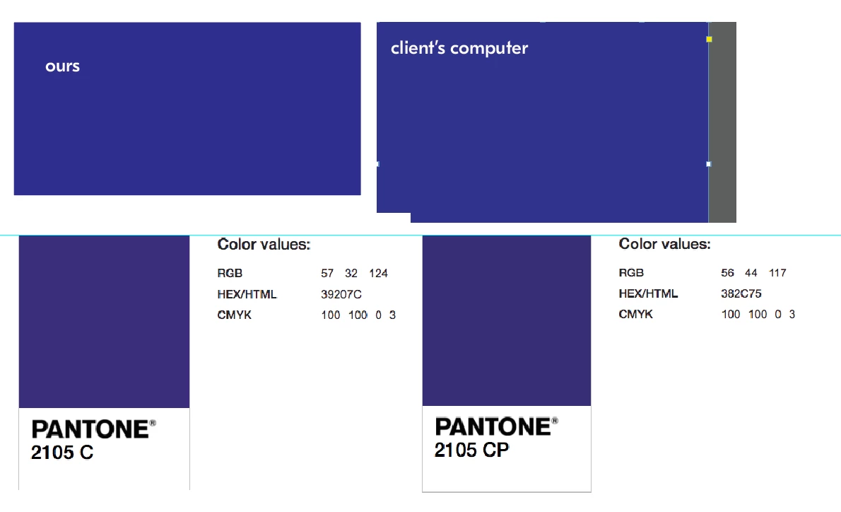
I don't really think there is a problem. It's never going to be exactly the same. |
It might be a problem if your client is fussy.
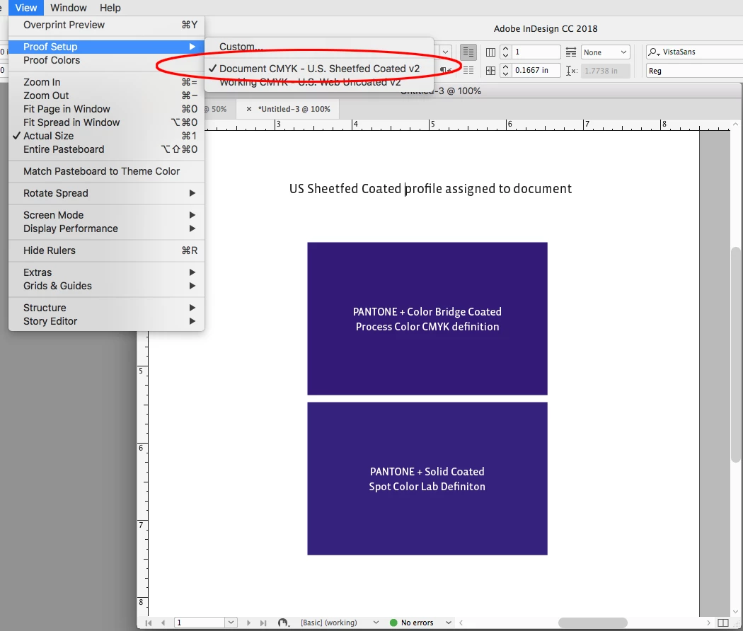
And it would be important to know if the color is printing as process or a spot. Starting with CS6 Pantone created separate libraries for spot color output vs CMYK process simulations of their solid ink spot colors.
The PANTONE + Color Bridge libraries are defined as CMYK Process, while the PANTONE + Solid libraries are defined as Lab Spot colors. Same colors from the different libraries can preview (and print) differently. The Color Bridge swatches respond to the document's CMYK profile assignment because they are CMYK colors, while the Solid ink swatches are device independent Lab definitions and produce better color previews for solid inks, which are neither RGB or CMYK colors.
So here's 2105 CP Color Bridge on top and 2105 C Solid Ink below. The Bridge color's preview, which is a single CMYK definiton, is being affected by the default US Coated SWOP profile assignment, while the Solid ink swatch is not
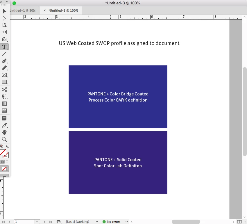
If I change the document's profile to US Sheetfed Coated, the Bridge color changes in appearance, while the Solid color does not. Whether the Bridge color prints that way on press depends on whether the press is printing close to the US Sheetfed profile. This is why the CMYK/RGB breakdowns showing in your #1 post are mostly useless because we don't know what CMYK or RGB space profile is assumed: