Problem With Kerning Around Commas
I've just switched fonts in a document from Joanna to the newer cut Joanna Nova Light.
Although Joanna Nova is a marked improvement on the Monotype cut, I'm having problems with the way it's displaying. It seems to render commas with far too much spacing around them - to the point it almost looks like they are followed by double spaces. The problem is obvious, no matter what letter the comma follows, though it is worse with some than others. Looking at the same font in Illustrator or online on the fonts.com website.
Kerning is set to Optical, and tracking is at 0. Note that it appears that extra space is added both before and after the comma.
I can't see any settings that might be effecting this so any help would be appreciated. The font is made available to my local machine via Skyfonts, though that shouldn't make a difference.
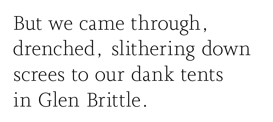
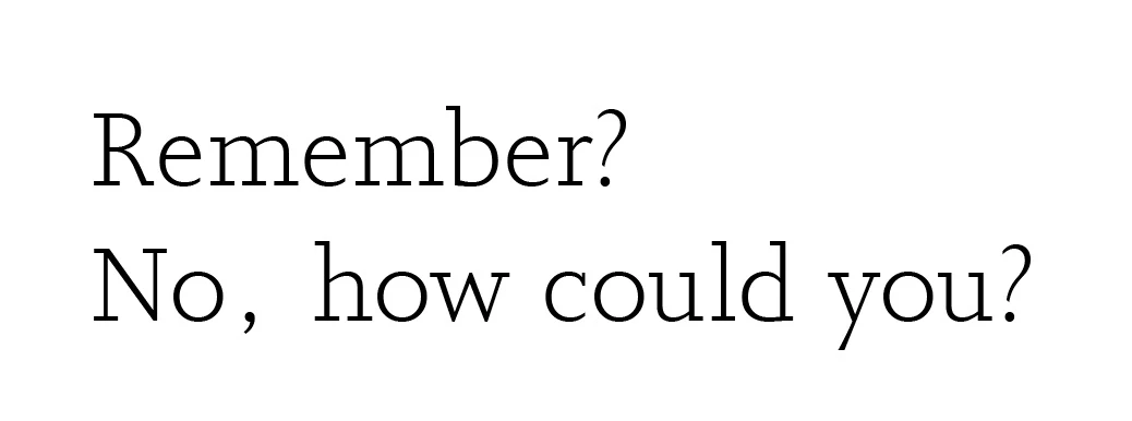
Here are two examples - screen caps from inDesign.
And