Answered
Ridiculous Gradient Process inDesign
The process to make a color gradient is so ridiculous in inDesign that it is not even funny. I don't think I am stupid, but nothing seems to be intuitive and it does not work.

The process to make a color gradient is so ridiculous in inDesign that it is not even funny. I don't think I am stupid, but nothing seems to be intuitive and it does not work.
I would not use the adjectives you're using to describe creating gradients in InDesign. It's neither ridiculous nor funny.
Compared to lllustrator's gradients, it's just very simple-minded. Illustrator has very powerful gradient features.
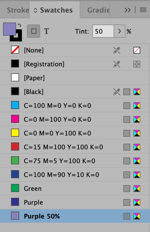
It's more accurate to start by creating swatch colors for the colors your want to include in the gradient. I created swatches which are Green, Purple and a Purple Tint (using New Tint Swatch):
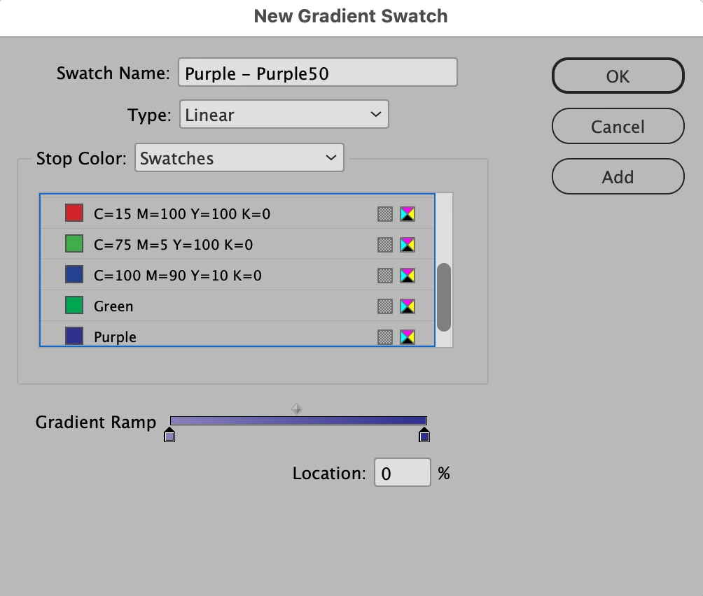
When you choose New Gradient, you're applying color swatches to the Color Stops on the Gradient slider at the bottom:
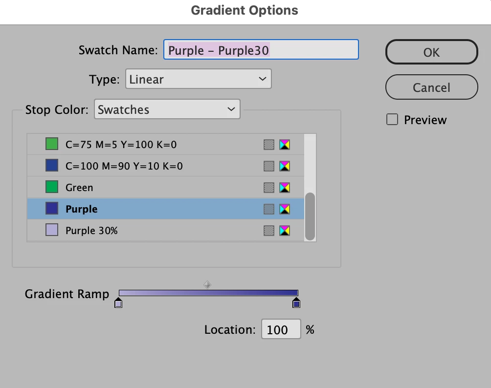
I changed the Purple tint to 30%:
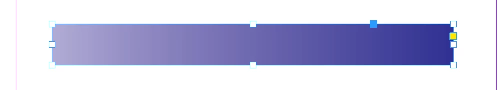
Result:
Already have an account? Login
No account yet? Create an account
Enter your E-mail address. We'll send you an e-mail with instructions to reset your password.
