Known Participant
August 24, 2017
Answered

Same line looks different in two different places

  • August 24, 2017
  • 5 replies
  • 1036 views

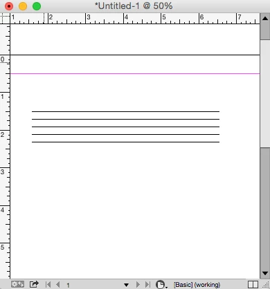
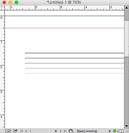
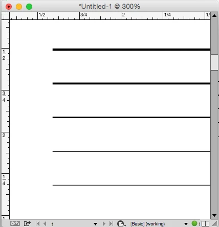
Here's a conundrum:  I use the exact same line in multiple places in my newsletter and it looks different in different places.  It is driving me CRAZY.  Whether I copy and paste the same line or redraw it with the same specifications (black, .5), sometimes it looks thin and black like it is supposed to and other times it looks thicker and gray.  Can you help me before I tear my hair out? 😉  Many thanks.

Here's the line like it's supposed to look:

Here's what it looks like sometimes, for no apparent reason:

    This topic has been closed for replies.
    Correct answer rob day

    FYI, in case anyone else has this problem in the future:  I changed the line weight to .25 and now all the lines look the same.

    The change in weight appearance is because your display doesn't have enough resolution to accurately draw subtle changes in thinner line weights. How the line is drawn displayed on your display settings and the zoom level. Your audience will have the same issue when the PDF is viewed—the line display will depend on the browser/reader capabilities, screen resolution, and zoom level.

    These 5 lines have different weights but they appear the same because I'm zoomed out to 50% and anti-aliasing is turned off (Fast Display):

    With anti-aliasing turned on some of the lines appear gray:

    Zoomed in to 300% you can see that the lines are actually all different weights

    5 replies

    rob day
    Community Expert
    rob dayCommunity ExpertCorrect answer
    Community Expert
    August 25, 2017

    FYI, in case anyone else has this problem in the future:  I changed the line weight to .25 and now all the lines look the same.

    The change in weight appearance is because your display doesn't have enough resolution to accurately draw subtle changes in thinner line weights. How the line is drawn displayed on your display settings and the zoom level. Your audience will have the same issue when the PDF is viewed—the line display will depend on the browser/reader capabilities, screen resolution, and zoom level.

    These 5 lines have different weights but they appear the same because I'm zoomed out to 50% and anti-aliasing is turned off (Fast Display):

    With anti-aliasing turned on some of the lines appear gray:

    Zoomed in to 300% you can see that the lines are actually all different weights

    Known Participant
    August 25, 2017

    Thank you so much, rob day.  That makes sense, but I never would have thought of it.

    Known Participant
    August 24, 2017

    FYI, in case anyone else has this problem in the future:  I changed the line weight to .25 and now all the lines look the same.

    Known Participant
    August 24, 2017

    I just used the Paragraph Rules feature and it worked great.  However, the lines still look different in different places.

    Jeff Witchel, ACI
    Community Expert
    Community Expert
    August 24, 2017

    It would also be a good idea to print your layout on a desktop printer to see if the same line weight issue exists when printed.

    Sometimes what you're seeing on your monitor, may not be an issue when printed. Try zooming in on your lines, and they will all probably appear to look the same weight.

    Known Participant
    August 24, 2017

    Thanks, Jeff.  Unfortunately, this is a newsletter that is viewed online.  It is not printed.

    Legend
    August 24, 2017

    I don't think I have enough information to figure out why your line sometimes looks different, but for lines like the ones shown, it would be easier to add a Rule Under to the Paragraph Style, instead of copy + paste + manually position for each instance.

    Known Participant
    August 24, 2017

    Thanks, SJRiegel.  I looked into rules when I started the newsletter and they didn't work for some reason.  I'll look into them again.