Answered
Seeking tips for making the overset indicator appear more obvious?
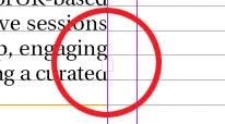
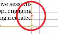
Hi, recently we updated the ID and IC to higher version, and find that the indicator for overset content in text frame is now by default transparent, rather not visible. Until we select and focus on that particular text frame, the indicator turns red. But the default indicator color could cause designer miss out the error.
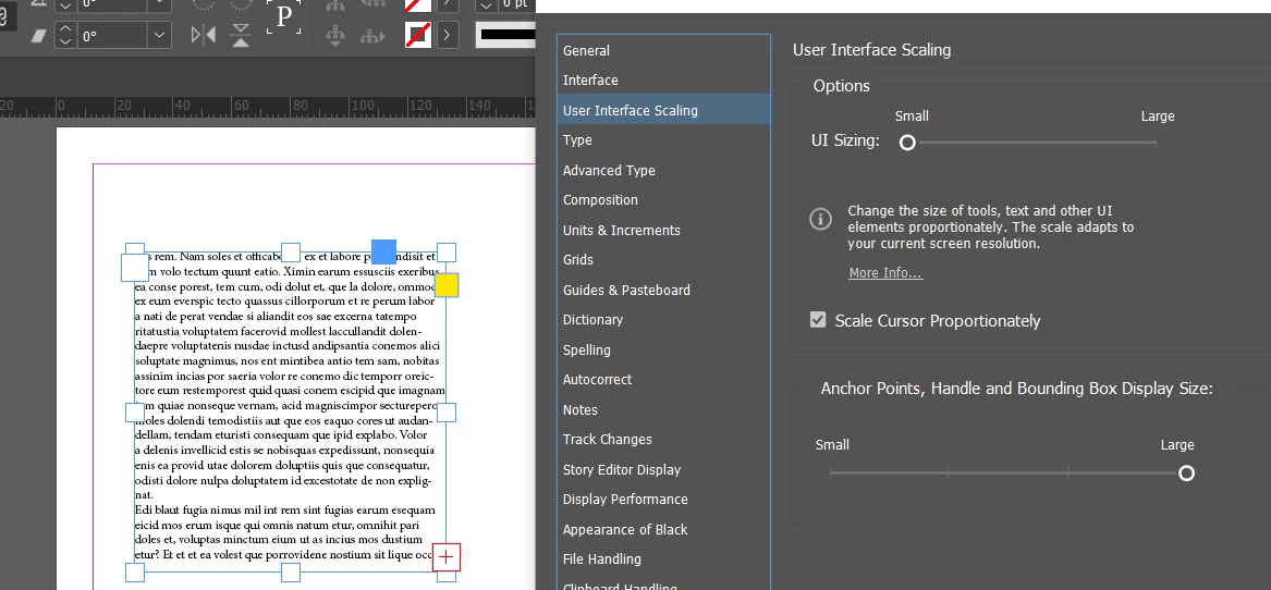
May I know if any tips on preferences or other settings for adjusting the indicator presentation?
Please find the screenshots below for references of before/after selecting the text frame and how the indicator appears. Thanks.