
Question
Text appears jagged, unless zoomed into 100 percent.
I am having the same or similar problem as Steve [Edit: branched from Indesign 5.5 displays text with ragged edge.]. I have done my best to research this but I cannot figure it out. I am using a Macbook Pro, 15 inch (late2011) with the normal display. I have Leapord 10.7.3. My InDesign is 7.5.2.
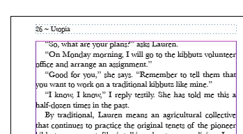
The text appears jagged, unless zoomed into 100 percent. Here is a screen shot of the problem at 300 percent:
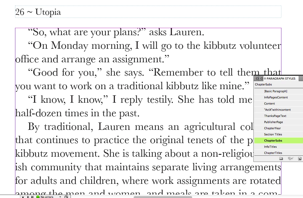
And here is the exact same file when I zoom into 100 percent:
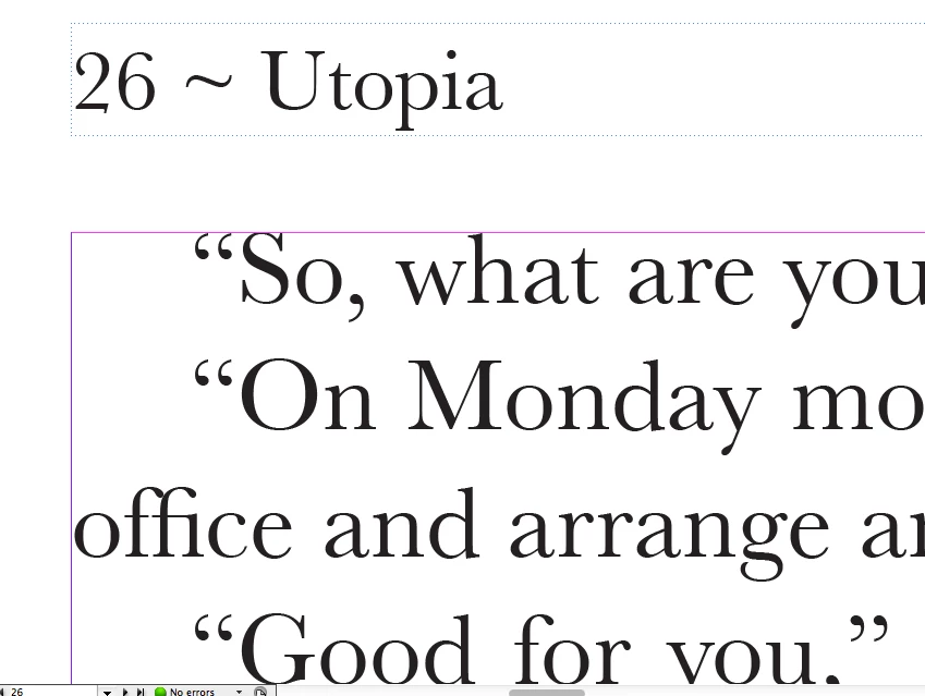
here is the same text zoomed even more:
The typeface is Baskerville. It prints properly, no jagged edges.
I have tried all the display and text options
Any ideas?
Thanks. Also, do you guys think I should I post a new topic?
Message was edited by: John Hawkinson