renee70853350
Participant
March 11, 2019
Question

Text wrap error in multi column layout

  • March 11, 2019
  • 5 replies
  • 2998 views

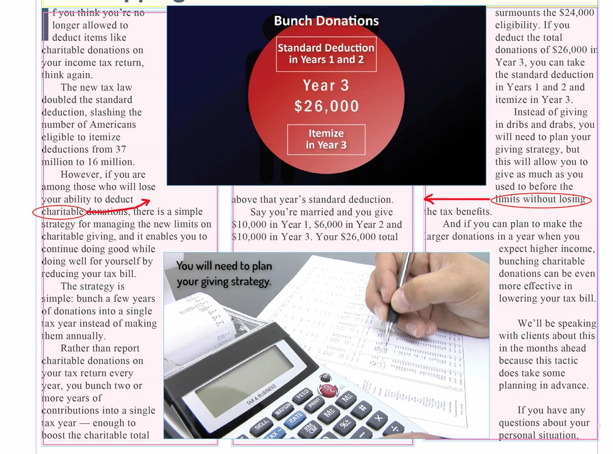
In attached image you will see the 2 outside columns are leaving too much blank space from the image frame's wrap. Frm research this appears to be a very long known about issue with InDesign. Is there a fix or known solution that will correct the text being offset too far and leaving so much blank space. The middle column shows the line of text at the top is outside the wrap so going straight across in either column should not leave huge spaces.

Also note the issue is not present with the bottom image and the lines above it. That one works. Just the bottom of a wrap seems to have the problem.

This topic has been closed for replies.

5 replies

renee70853350
Participant
March 12, 2019

Thanks to everyone for the thoughtful ideas. Just some points of clarification. Yes I had 3 separate text frames as opposed to a single 3 column frame - but it happens either way. See screen shot below. the issue is not because the baselines in the other 2 columns are slightly higher as the new screenshot will prove. Those 2 lines are now clearly lower than the middle column and still break too soon. In fact, you'll see the bottom of the image frame (wrap offset) is high enough to not touch any part of those lines of text (while cutting through the ascenders of the middle line without causing a problem), so reducing the bottom offset is not a solution (I have adjusted that setting in tiny increments already to try and it doesn't work and you can now see why). That's what makes this issue so puzzling. Thanks for the tips Vinny! You've posted some great ideas that I'm sure other readers will also find helpful and good to use as 'best practices'. It's just a shame Adobe doesn't fix what is clearly a bug that has been in many past versions. It is is not the the offset running into those lines that is causing the breaks. See below.

BobLevine
Community Expert
Community Expert
March 12, 2019

As you have already pointed out, this type of thing has been reported forever. I've seen it myself and the only thing I could do was manually adjust the wrap.

renee70853350
Participant
March 12, 2019

I am able to add points to the frame and make 'cutouts' in the corners to address it but it's not a great solution as this is a newsletter that will change frequently. I was just hoping with newer releases, and more time, somebody had come up with a better way to address it.

vinny38
Legend
March 12, 2019

Hi Renee,

As you pointed out, it is in fact a long standing issue in Indesign.

I don't think it's a multi-column frame vs threaded frames related issue, since I can reproduce it in both cases.

I am not aware of a specific fix for it, but still, I can throw a couple of suggestions:

Important note for visitors from the future:

these suggestions will work only if baseline grid increment equals to text leading value. You can't use paragraph Space After half of leading value (which is something very usual and good-looking in my opinion). But as we can see in her screenshots, the OP doesn't use Half-leading Space After, so she should be OK.

First, start by using baseline grid. In your preferences, set the baseline grid as per your paragraph leading value. And of course set your paragraph style to have your text aligned on baseline grid.

Example:

From there, you have two options:

- Option 1: Go to Text Frame options > Baseline options and set the first line offset to Leading.

Pros: This will fix the issue, whatever text wrapping values you give to your graphic, or wherever it is positioned.

Cons: You obviously need to set the same baseline options setting to all your text frames in your document.

And what's worst, you won't have consistent spacing around your graphics.

- Option 2 : (my preferred)

This time, you don't have to change Baseline options.

Instead, select your graphic frame, open the Text wrap panel and set the offset value as per the baseline and paragraph leading (or any multiple). In my example: 14,4pt. (Note: I highly recommend using Object styles.)

Now, when you position or expand your graphic, make sure the bottom is snapped on the baseline grid.

Pros: Your document will look great, spacing is consistent.

Cons: It will require to be disciplined and meticulous when positioning the graphic frames, but that's what a good graphic designer should be, shouldn't (s)he?

Hope that helps

Vinny

Barb Binder
Community Expert
Community Expert
March 12, 2019

The other option, Renee, is to select the black and red graphic and decrease the bottom offset value.

~Barb

~Barb at Rocky Mountain Training
Scott Falkner
Community Expert
Community Expert
March 11, 2019

A close examination of the attached image shows the baselines of the columns don't line up. The middle column baseline is lower, probably because the text starts as high as it can, due to the text wrap.

The two other columns start at a higher point and the text wrap cuts into the top of that line of text just enough to apply to it. You can reduce the bottom offset of the net wrap to make room for the tea you want to move, but you will still be left with unaligned baselines. This is probably because you re using three one-column text frames. Try using one three-column frame.

maxwithdax
Community Expert
Community Expert
March 12, 2019

Scott you stole my thunder!! LOL... Yep. I am betting you are exactly right. I was getting there, was just waiting for her reply. <3

- Dax

maxwithdax
Community Expert
Community Expert
March 11, 2019

Is this one frame with a 3 column setting or 3 separate frames? I am hazarding a guess that it is 3 separate threaded frames, right?

-Dax