walter_3753
Known Participant
June 9, 2026
Answered

Unterschiedliche Glyphen für den denselben Buchstaben in einem Wort. Wie kann ich das abstellen?

  • June 9, 2026
  • 9 replies
  • 36 views

Ich habe ein Problem in einer Indesigndatei.
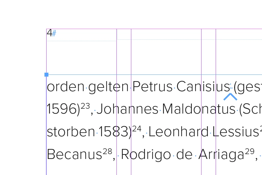
Hier ein Beispiel:

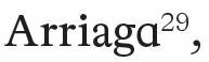
Das Wort Arriaga wird mit 2 unterschiedlichen Glyphen für das kleine "a" dargestellt.
Ich hätte aber gerne nur die Version, die links offen ist.
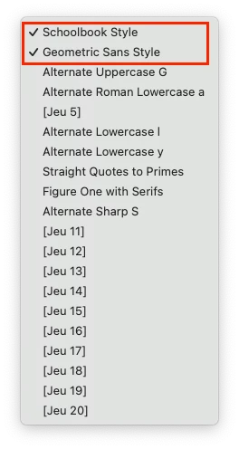
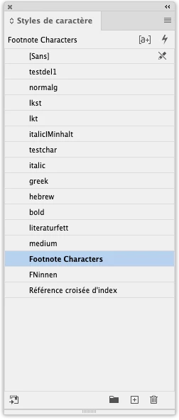
Ich verstehe nicht, warum Indesign das macht!
Ich habe schon an allen möglichen mir sinnvoll erscheinenden Einstellungen rumgeschraubt, aber nada.
Kann mir da jemand weiterhelfen, bitte?
Walter

    Correct answer jmlevy

    The problem comes from the OpenType options of the “Footnote Characters” character style. If you remove the 2 stylistec sets of this character style, the last a remains as you wish. But I don’t understand why this has an impact on the character that precedes the footnote.


    9 replies

    Lordrhavin
    Inspiring
    June 9, 2026

    Check the font in Fontforge (Ctrl+Shift+F)→Lookuptables→GSUB. It might be a positional substitution.

    Überprüfe den Font in Fontforge (Ctrl+Shift+F)→Nachschlagetabellen→ GSUB. Kann eine Positionssubstitution sein.

    walter_3753
    Known Participant
    June 9, 2026

    Okay, here is the example file. You find the Problem on page 4 in the 3rd and 4th line.
    Sorry, it took some time, but I could not upload a zip here.

    Beispieldatei

    jmlevy
    Community Expert
    jmlevyCommunity ExpertCorrect answer
    Community Expert
    June 9, 2026

    The problem comes from the OpenType options of the “Footnote Characters” character style. If you remove the 2 stylistec sets of this character style, the last a remains as you wish. But I don’t understand why this has an impact on the character that precedes the footnote.


    walter_3753
    Known Participant
    June 9, 2026

    Yes. Thats it! Thank you very much, for helping with this. That is very kind.

    walter_3753
    Known Participant
    June 9, 2026

    Now I found out, that this only appears, when the “a” is followed by a footnote!
    If I separate the word “Arriaga” from the footnote number with a space, the “a” is still closed.
    But when I write another character after the space, then the closed “a” changes to an open “a”.

    jmlevy
    Community Expert
    Community Expert
    June 9, 2026

    If you use Adobe fonts, any InDesign subscriber will have access to the same fonts. If not, just package the file and post a link.

    walter_3753
    Known Participant
    June 9, 2026

    I think it has to do with the OpenType Functions (Features). The last option in this menue “german: Formatsätze” gives a lot of choices, witch are basically all in brackets. If I select the first choice “Satz 1” ALL the “a”s change to the closed version. But when I disable it again, then the fault with the 2 “a”s comes back.

    jmlevy
    Community Expert
    Community Expert
    June 9, 2026

    Yes, possibly. That’s why I asked you to share a file.

    walter_3753
    Known Participant
    June 9, 2026

    The language of the version of Indesign is German. The exact version number is 21.4.

    walter_3753
    Known Participant
    June 9, 2026

    Um die Sache noch komplizierter zu machen: in dem "echten Satz" mit dem ganzen Buch wird das Aussehen der beiden "a" umgekehrt dargestellt.
    Ich habe dann zwecks Erstellung einer Beispieldatei einfach den Rahmen der Seite kopiert.
    Als ich dann nur diese 4 Zeilen von Seite 4 und die Fußnoten in der Datei hatte, wurden die beiden "a" identisch und richtig dargestellt.
    Sobald ich dann mehr Text davor und dahinter einkopiert habe, erschien dann wieder dieser Effekt das ein "a" anders dargestellt wird, als das andere.

    Can you read this?

    Abhishek Rao
    Community Manager
    Community Manager
    June 9, 2026

    Hi@walter_3753

    Thanks for reaching out and sorry to hear that you experience this. Could you please provide the information requested by the expert, including your exact InDesign version, operating system version, the language version of InDesign you're using, and whether this behavior occurs only with this specific font or with other fonts as well?

    In the meantime, please try the suggestion discussed in this similar community thread and let us know if it helps resolve the issue:

    https://community.adobe.com/questions-671/character-style-that-picks-alternate-glyph-873693?postid=3390820#post3390820


    Looking forward to your update.

    Abhishek

    Bill Silbert
    Community Expert
    Community Expert
    June 9, 2026

    Is this happening with just a particular type font or with any font that you apply to the word? I tried to duplicate this behavior using the English language version of InDesign but did not get the same result that you did. Please provide as many details as to how you got this result as possible. Include also the exact version of both InDesign (including the language that it is set for) and your operating system.

    walter_3753
    Known Participant
    June 9, 2026

    I have at least 3 different Fonts, that show this behaviour. They seem to be all OTF-Fonts, but I am not shure. One of them shows a name in the menu, that I can’t find in the fonts-folder.
    This behaviour happens not often (actually seldom) in the Indesign-file and it does not show within a lot of other words that have 2 or more “a”s.

    walter_3753
    Known Participant
    June 9, 2026

    I use the latest Indesign-Version of the Abonnement. Platform is Windows 11 with latest Updates. A font, that shows this behavior is for Example Source Sans Pro.