Community Expert
January 14, 2021
Answered
White window title bars on Big Sur vs. InDesign / Illustrator
- January 14, 2021
- 1 reply
- 564 views
This is Apple's issue, not Adobe's.
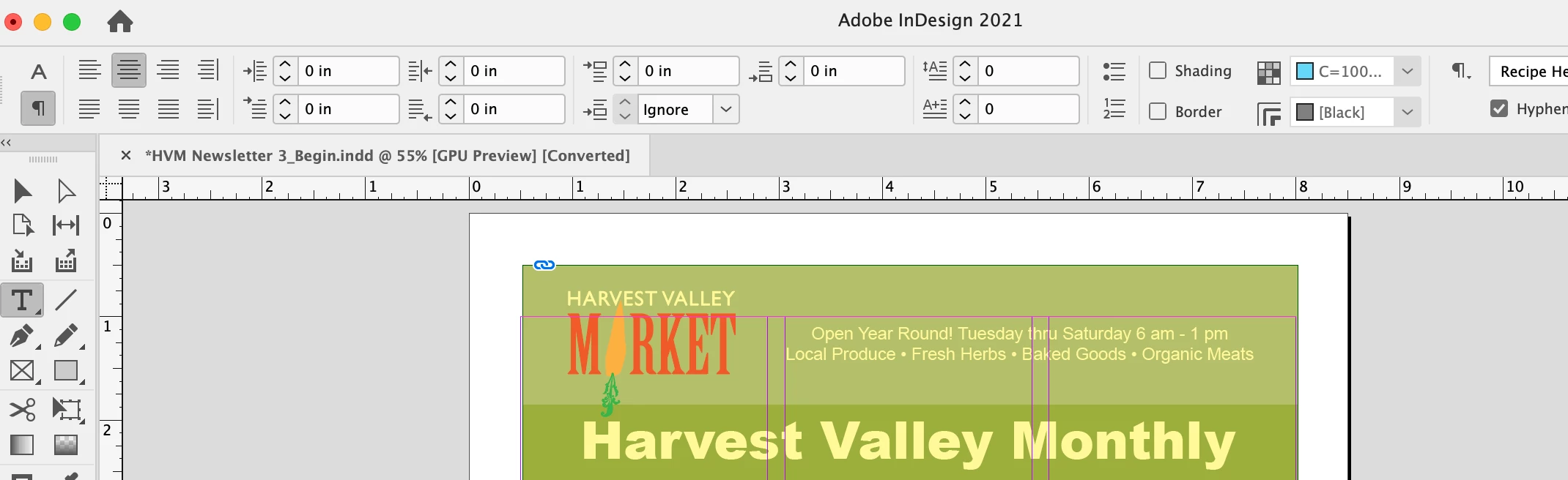
Is it just me, or the new white title bars on Big Sur are a bad idea in general - and in particular in combination with InDesign/Illustrator (and similar products)?
I attached two screenshots. The title bar now can totally blend with the page itself, which creates undesirable effect and is in general poor UI and UX, in my view.
Granted it only happens when there are no tabs or rulers open, but still. With gray title bars on previous systems the title bar was always clearly separated from document's contents.
I submitted feedback to Apple to restore gray title bars. I wonder if other users feel the same.