Participating Frequently
December 26, 2018
Question

Oversaturation after export (I've followed every step)

  • December 26, 2018
  • 2 replies
  • 865 views

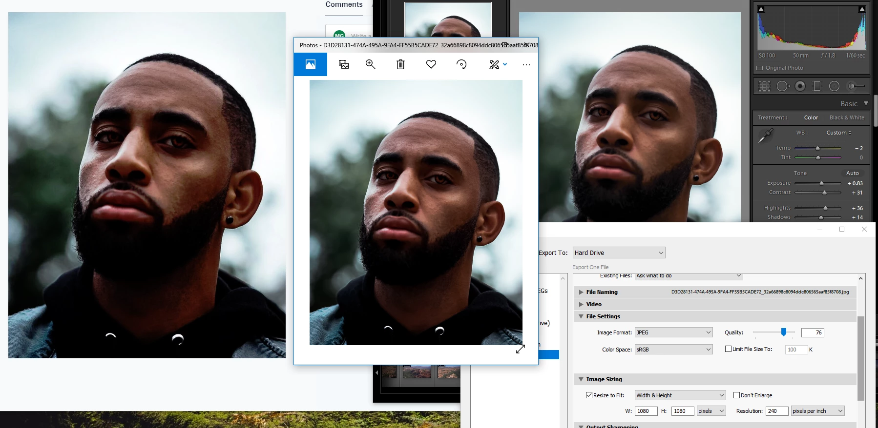
Below and aboveare a continual issue I've been running into and haven't notice a serious problem until i started doing portraits. As you can see from light-room, Windows photo view, and dropbox/googlephtos, the saturation and contrasts deepens more and more or it will do the opposite and lighten it. For some reason it is more so on reds and oranges than anything else  Does anyone have a solution? I've done all the steps with changing the settings and attempting to calibrate my monitor. I have a BENQ  GL2460.

(even posting to this sight makes the bottom one look even, when its not the right should be more golden than the left)


Thanks,

This topic has been closed for replies.

2 replies

Per Berntsen
Community Expert
Community Expert
December 26, 2018

Johan is right, this caused by using non-color managed software to view your work.

The Windows Photo Viewer is color managed (it's hidden away somewhere on Windows 10) – you are using the Photos app, which is not color managed. The Edge browser and Internet Explorer are also not color managed, so stay away from these. Any other web browser – Firefox, Chrome, Opera – will be fine.

Irfanview is a free color managed image viewer (you have to enable color management under Options > Properties/Settings)

You can also use Bridge.

maalekgAuthor
Participating Frequently
December 26, 2018

https://forums.adobe.com/people/Per+Berntsen  wrote

Johan is right, this caused by using non-color managed software to view your work.

The Windows Photo Viewer is color managed (it's hidden away somewhere on Windows 10) – you are using the Photos app, which is not color managed. The Edge browser and Internet Explorer are also not color managed, so stay away from these. Any other web browser – Firefox, Chrome, Opera – will be fine.

Irfanview is a free color managed image viewer (you have to enable color management under Options > Properties/Settings)

You can also use Bridge.

My issue bleeds into instagram and social media plat forms. I'm not getting the same result from what I see in Light Room when i go to post the photo and obviously my audience isnt see it either. Is there a way for me to see what my post is going to look like so I can edit accordingly or is there something I'm missing in my settings?

Per Berntsen
Community Expert
Community Expert
December 26, 2018
I'm not getting the same result from what I see in Light Room when i go to post the photo and obviously my audience isnt see it either.

So what web browser are you using? Edge and Internet Explorer are not color managed, and must be avoided.

You have no control over how photos display on other people's computers, and what you see on your screen is not in any way related to what they see on their screen.

But you seem to be using a wide gamut monitor (or at least semi wide gamut), which means that you have to use only color managed applications to view your work. If you don't, over saturation is unavoidable. So again, what web browser are you using?

JohanElzenga
Community Expert
Community Expert
December 26, 2018

AFAIK, Windows Photo Viewer is not color-managed. That means it will not show photos with the correct colors. Same for a non-color managed web browser. There is nothing you can do about it except not using this crappy software.

-- Johan W. Elzenga