February 26, 2018
Answered

Photos look different (less colorful) in Lightroom and Photoshop

  • February 26, 2018
  • 1 reply
  • 3744 views

Hi

I have this problem , when i edit in lightroom the pictures look different than the exported ones , they have less contrast . Exported photos look the same in different photo viewers , even on my iphone

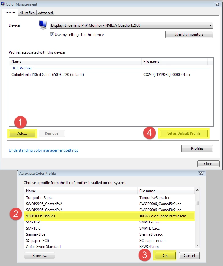
I tried to connect my laptop with lightroom to my monitor and it was fine , all looked the same . Then i connected a different monitor to my pc and the problem was there again , so i guess its not the monitor .

Is there any settings that could affect the lightroom viewing quality ? Or any settings on my graphics card ?

I took a screenshot so you can see the difference between lightroom and a viewer .

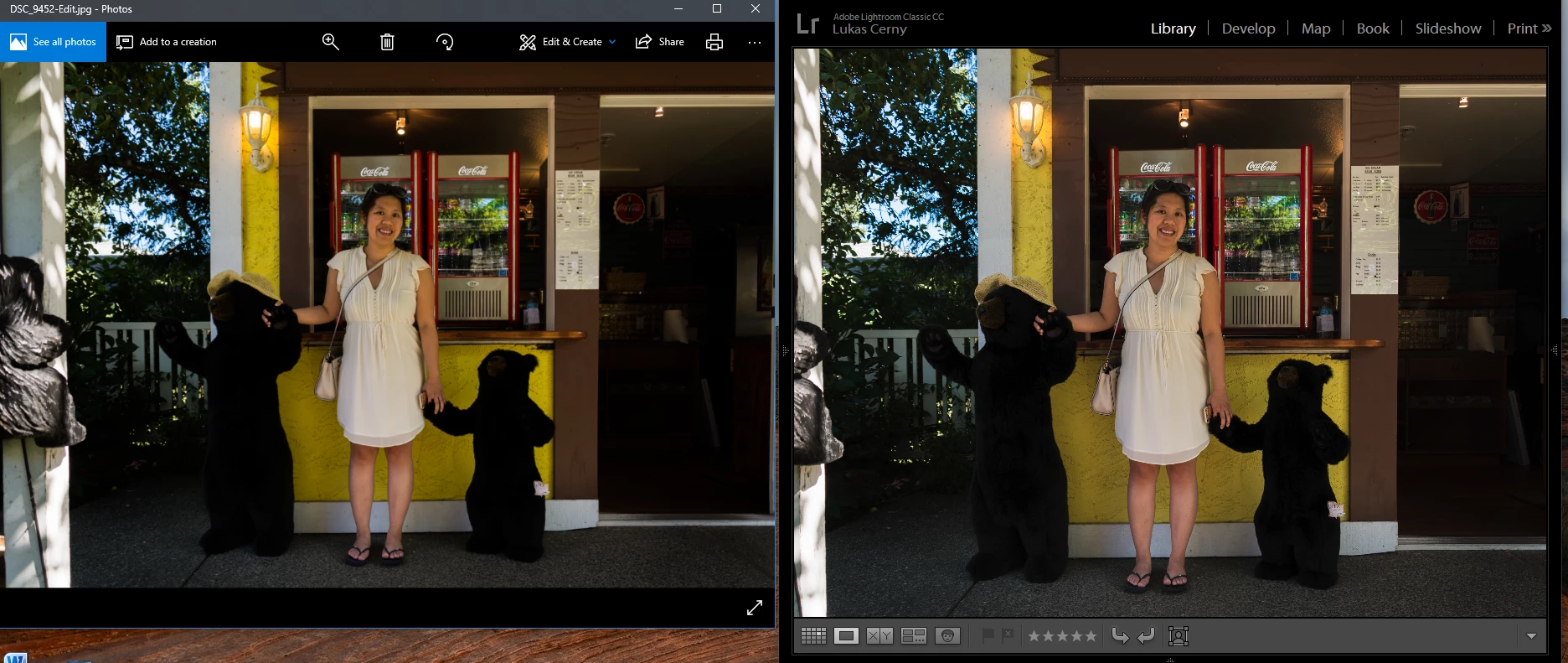
Thanks for your answers

    This topic has been closed for replies.
    Correct answer Per Berntsen

    There seems to be a small difference in yellow saturation, but the main difference is again in the shadows.

    It's hard to evaluate, because you are displaying the image at different magnifications in Photoshop and Bridge.

    A difference between a color managed and non-color managed application is to be expected, but when two color managed applications (Photoshop and Bridge) don't display identically, there is something wrong with the monitor profile. (defective, corrupted, or incompatible)

    You also seem to be on Windows 10, which is known to install low quality monitor profiles when doing updates.

    I suggest that you calibrate all your monitors with a hardware calibrator, which will create new, accurate profiles.

    If you connect your monitors to different computers, you have to calibrate each computer/monitor combination individually.

    If you don't have a calibrator, you can try setting the monitor to profile to sRGB (Adobe RGB if you have a wide gamut monitor).

    This will probably not be entirely accurate, but should make Bridge and Photoshop display identically.

    Go to Control Panel > Color management.

    Add the sRGB profile, and set it as Default.

    Make sure that Use my settings for this device is checked.

    1 reply

    Per Berntsen
    Community Expert
    Community Expert
    February 26, 2018

    Lightroom and Photoshop are color managed - which means that they use the monitor profile to display images correctly.

    Most other applications (like the Windows 10 Photos app) are not color managed, and will not display images correctly.

    So Lightroom is right, and the others are wrong.

    The solution is to view the exported images in color managed managed applications only.

    The Windows Photo viewer (not Photos) is color managed, as well as the free Irfanview viewer. (you need to enable color management under Settings) You can also use Adobe Bridge.

    As for your screenshot, the only difference I can see is that there is more shadow detail in Lightroom.

    February 26, 2018

    It is not the program that i view it in , when i connected a laptop to my monitor , i used exactly the same programs as on my desktop .

    I tried to view it in adobe bridge and other color managed programs but the problem remains .

    If you look at the yellow it has much more contrast , but the difference is stronger when i open it in a viewer

    Thanks

    Per Berntsen
    Community Expert
    Per BerntsenCommunity ExpertCorrect answer
    Community Expert
    February 26, 2018

    There seems to be a small difference in yellow saturation, but the main difference is again in the shadows.

    It's hard to evaluate, because you are displaying the image at different magnifications in Photoshop and Bridge.

    A difference between a color managed and non-color managed application is to be expected, but when two color managed applications (Photoshop and Bridge) don't display identically, there is something wrong with the monitor profile. (defective, corrupted, or incompatible)

    You also seem to be on Windows 10, which is known to install low quality monitor profiles when doing updates.

    I suggest that you calibrate all your monitors with a hardware calibrator, which will create new, accurate profiles.

    If you connect your monitors to different computers, you have to calibrate each computer/monitor combination individually.

    If you don't have a calibrator, you can try setting the monitor to profile to sRGB (Adobe RGB if you have a wide gamut monitor).

    This will probably not be entirely accurate, but should make Bridge and Photoshop display identically.

    Go to Control Panel > Color management.

    Add the sRGB profile, and set it as Default.

    Make sure that Use my settings for this device is checked.