I am am having a hard time with the camera profiles for Canon 5d Mark iv as the color saturation is too intense (red/orange)-especially in the shadows (look near hairlines) and/or the curves are too strong and my shadows get clipped and appear muddy. I downloaded and tried Trshaner's Camera Standard Profile (MKIII BASE...)-THANK YOU!!- and while I see a slight improvement in the color, it doesn't solve the issues I'm seeing. I've had Canon cameras and Lightroom/PS for as long as I can remember and while no profile has ever been perfect, I have never had as hard of a time as I have been having with this one. In fact, what I once thought was a bad profile match with my 5D Mark ii, I would GLADLY take in place of my options now. I find I am forced to start with Adobe standard, which lacks any contrast and depth and while I believe it is too red, it seems brighter and generally easier to add to it than try to take away from the other clown-ish saturation I get from camera portrait and even camera standard. Camera standard is better (less red) than camera portrait with regard to Caucasian skin tones, but the color in the shadows looks like I just upped the contrast and didn't care that faces/dimples/creases/hairlines are now tinted orange like a badly blended makeup job. I can't seem to get rid of the tint in the shadows without affecting the entire image. I really need to solve this at the Profile level and I can't figure out how. I also can't find a place where people create-and share- "normal" camera profiles (without special tints/tones/cinema effects...). I can't be the only one, and there must be someone smart enough to help??? I guess I should start by hoping you see the same problem I do...
I take portraits of people, so comparing images of fall colors or products isn't helpful or equal when it comes to getting colors accurate for people. I included 2 RAW files (I kinda wish I knew I was going to share my experiment and I'd have used more exciting pictures, haha) that you can use to compare as you'd like and then lots of screenshots that hopefully will convey the differences that I see (the file names tell what type of image is being compared. Note: the mac preview cr2 file is simply showing the camera generated jpg). I am working with a calibrated monitor (Spyder 5 Elite) and my unadjusted professional prints match in color and density. I recognize that there will inevitably be color differences between my monitor and yours, but hopefully the screenshots will convey enough that you can see my problem in contrast and color choices. I'm not asking if you like the colors from the profiles that lightroom offers, obviously the people at Adobe don't mind them either, but am more curious if you notice AS MUCH of a difference between your camera's jpg/your monitor's preview of a RAW file (that's from the jpg), and/or DPP4's standard camera preview and the options given in Lightroom as far as profiles go. Does every camera profile vary as much as I think this one does?? Does every photographer have to choose between 3 terrible profiles? Do you guys see what I see or am I being a perfectionist? I really do struggle and spend a lot of time trying to get white balance perfect out of camera-mainly with an expoDisc- only to have it all messed up in post-production options.
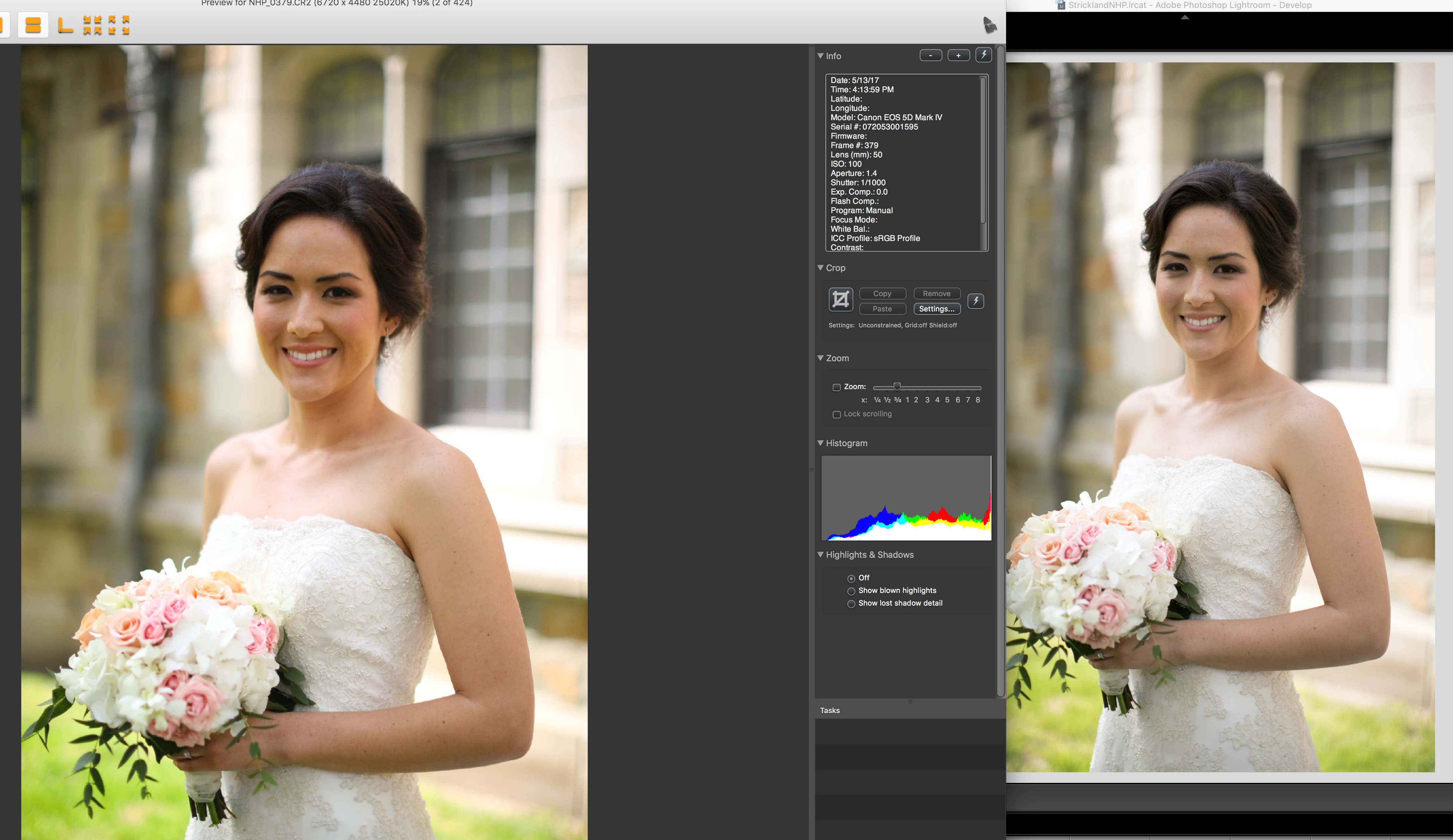
Pay attention to the histogram in the DPP camera standard vs. Adobe camera standard and it shows the clipping of the shadows. I find that I generally need to shoot at least 1/3 stop up to counter-act what lightroom does to the images that I see in my previews. Look at the histograms from DPP to lightroom and you can see that lightroom clips my shadows that were otherwise fine on my iin-camera histogram. The answer isn't to shoot 1/3 stop up, however, because the curve applied in the camera profiles doesn't evenly shift the histogram to the left, my highlights get blown and my shadows clipped in outdoor scenes. AGAIN, this is when the histogram on my camera shows a decently exposed image and changes when imported into Lightroom.
I would love to have images straight out of the camera look like they do in the jpg previews, but I am learning that that is too much to ask. I WOULD love at least an OPTION that doesn't take out all contrast and mess up the color completely. I am so intimidated by the dng editor, and my spyder checkr doesn't help with creating a custom profile-I can use it to adjust the hue/saturations as a preset, but the results are so random that I don't trust them either. I just want to be able to deliver consistent color and contrast and I'm re-inventing the wheel every session. I realize editing is subjective, and often times I'll think my edits look great as far as contrast/color goes, and then I get ready to export and compare my finished session to another session and I realize one looks better than the other and I want to re-edit one of them. It's never ending and I feel like part of it is because my baseline-the profiles I am forced to start with-are soo off that I have to play around with lots of settings even if I start with a perfect histogram. My intention is not to complain about my job; I love what I do, I just want a good baseline to start editing from and I'm not trusting Adobe with my Canon Profiles right now. I also recognize that shooting in RAW should be bland-it's like a blank canvas that I can build on... But when bland changes my histogram and makes my images dark, muddy and tinted orange, I get frustrated. Any help is appreciated!!
If you are experienced with making custom profiles, I'd love any tips (basic curves points to try) so I might be able to tackle it if there isn't someone better who already has...
Dropbox - Lightroom Profiles
To everyone landing here with Canon 5D MKIV raw file rendering issues please provide your comments and 'Me To' vote at the below Problem Report link. This is the best way to get Adobe's attention. Thank you! 
Camera Raw/Lightroom: 5D Mark IV, wrong dcp profile from adobe | Photoshop Family Customer Community