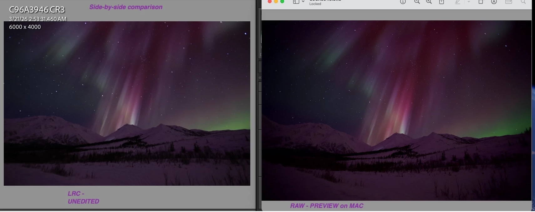
Hello, Community. I'm a photography hobbyist who chases the aurora. Novice-level LRC user. Mostly illiterate when it comes to the details of monitors/sRGB color space. You guys will be lightyears ahead of me in technical acumen, but I’m hoping you will be able to point me to on-line resources or provide “Dummies” level info to help me understand the image discrepancy I find between the RAW image and what I import into LRC. Currently working on an older MAC (newer more robust MAC sitting here waiting to be unpacked). When I started post-processing RAW image from my 2026 aurora trip I immediately noticed a SIGNIFICANT difference between the intensity of the RAW image colors (MAC Preview app) compared to the image imported into LRC Develop module. (both displayed on 5-6 year-old DELL monitor, with same discrepancy seen on husband’s newer DELL monitor) LRC import images are 1:1. Is it my monitor settings? Any information or resources for a novice LRC user to help me understand what is causing the muted image colors in LRC and how to mitigate will be very much appreciated!
Correct answer Conrad_C
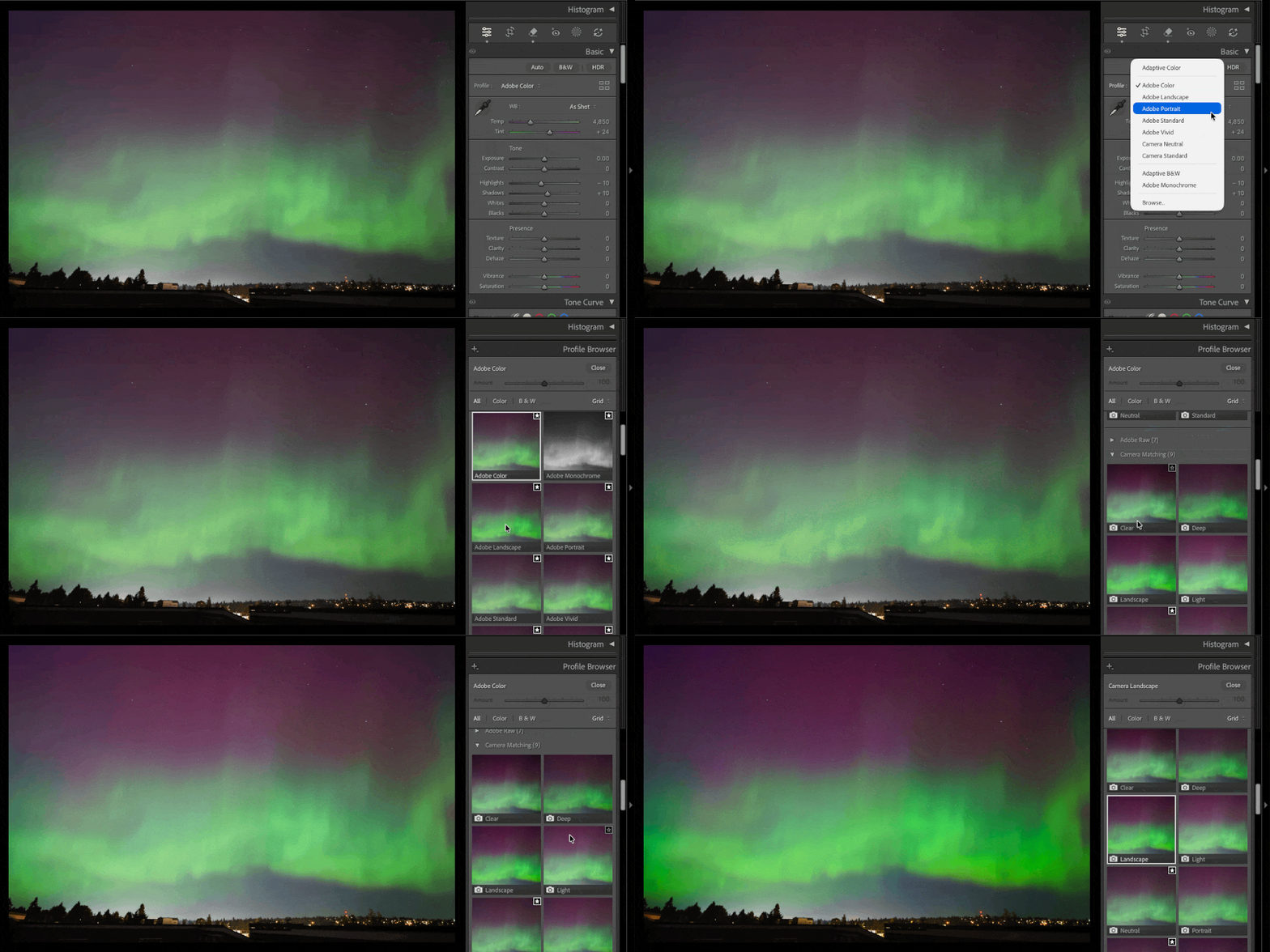
The short answer is, see if it matches better if you go into the Profile Browser as shown in the demo below, and in the Camera Matching section, set the Profile to a name similar to whatever picture style was set in your camera when you were shooting. Or, just choose an Adobe or Camera Matching profile that looks the most like what you remember seeing or how you want it to look. The profile sets the baseline for edits. You can hover the pointer over profiles to preview them without applying them. Clicking a profile applies it.
The profile names that start with Camera might interpret the raw data more closely to how the camera maker chooses to interpret the raw data into colors, that’s the intention behind how Adobe designed those profiles. The profiles starting with the name Adobe are designed around how Adobe chooses to interpret the raw data into colors.
The long answer is, it’s about comparing apples to apples. Yes, you see an image of that raw file in Apple Preview and on the desktop. It’s a preview embedded in the raw file by the camera. But the look of that preview is not necessarily the “truth.” As with the profiles above, it’s just one version of the image, rendered by the camera’s internal color engine, based on the camera maker’s opinion combined with whatever the current color settings are in the camera. The way you see it in Lightroom Classic is the Adobe opinion of how it should look, by the Adobe color engine combined with whatever the current color settings are in the Develop module.
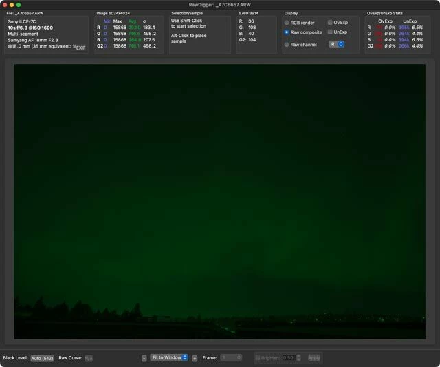
At this point you might be thinking, why doesn’t the camera preview or Lightroom Classic just show the unaltered raw file? The problem is, being raw sensor data, if you show it with no interpretation (no assumed color space, no assumed settings, etc.) then it can look like the picture below, from the image analysis software RawDigger. Why does an un-interpreted raw image look dark? Because no gamma correction is applied yet (the camera preview and Lightroom Classic both apply that). Why does it look green? Because a Bayer camera sensor has two green photosites for every red and blue one. The human eye is more sensitive to detail in green, so image quality is better if a camera samples more green; a raw processor decides how to interpret real world color and detail out of that. This is the closest we get to an “objective” or unbiased image of a raw file. Anything that shows a “real” looking picture of a raw file, like the camera preview, is an opinionated interpretation of it, with many aesthetic judgments applied along the way.
In the end, you don’t have to think of the camera-made preview of a raw file as the preferred/reference look of an image. If you do, that leaves the art up to to the machine, the camera’s programming. It’s often better to use raw editing software (like Lightroom Classic) to make the image how you want it to look.
If you really do want the image to look exactly like the camera preview, use software with the same color engine that’s in the camera. If this is a Canon raw image, then that software is Canon Digital Photo Professional. Raw software by any other company may render raw images differently, because each company has its own color engine designed around its own opinions of what looks best.
(About what you see in Apple Preview: It may show the camera embedded preview by default. If any Apple software is used to edit the raw file, such as Apple Photos, image color will be re-rendered through the Apple raw color engine and settings, producing a third look: Not the camera maker’s look or the Adobe look, but Apple’s.)
The short answer is, see if it matches better if you go into the Profile Browser as shown in the demo below, and in the Camera Matching section, set the Profile to a name similar to whatever picture style was set in your camera when you were shooting. Or, just choose an Adobe or Camera Matching profile that looks the most like what you remember seeing or how you want it to look. The profile sets the baseline for edits. You can hover the pointer over profiles to preview them without applying them. Clicking a profile applies it.
The profile names that start with Camera might interpret the raw data more closely to how the camera maker chooses to interpret the raw data into colors, that’s the intention behind how Adobe designed those profiles. The profiles starting with the name Adobe are designed around how Adobe chooses to interpret the raw data into colors.
The long answer is, it’s about comparing apples to apples. Yes, you see an image of that raw file in Apple Preview and on the desktop. It’s a preview embedded in the raw file by the camera. But the look of that preview is not necessarily the “truth.” As with the profiles above, it’s just one version of the image, rendered by the camera’s internal color engine, based on the camera maker’s opinion combined with whatever the current color settings are in the camera. The way you see it in Lightroom Classic is the Adobe opinion of how it should look, by the Adobe color engine combined with whatever the current color settings are in the Develop module.
At this point you might be thinking, why doesn’t the camera preview or Lightroom Classic just show the unaltered raw file? The problem is, being raw sensor data, if you show it with no interpretation (no assumed color space, no assumed settings, etc.) then it can look like the picture below, from the image analysis software RawDigger. Why does an un-interpreted raw image look dark? Because no gamma correction is applied yet (the camera preview and Lightroom Classic both apply that). Why does it look green? Because a Bayer camera sensor has two green photosites for every red and blue one. The human eye is more sensitive to detail in green, so image quality is better if a camera samples more green; a raw processor decides how to interpret real world color and detail out of that. This is the closest we get to an “objective” or unbiased image of a raw file. Anything that shows a “real” looking picture of a raw file, like the camera preview, is an opinionated interpretation of it, with many aesthetic judgments applied along the way.
In the end, you don’t have to think of the camera-made preview of a raw file as the preferred/reference look of an image. If you do, that leaves the art up to to the machine, the camera’s programming. It’s often better to use raw editing software (like Lightroom Classic) to make the image how you want it to look.
If you really do want the image to look exactly like the camera preview, use software with the same color engine that’s in the camera. If this is a Canon raw image, then that software is Canon Digital Photo Professional. Raw software by any other company may render raw images differently, because each company has its own color engine designed around its own opinions of what looks best.
(About what you see in Apple Preview: It may show the camera embedded preview by default. If any Apple software is used to edit the raw file, such as Apple Photos, image color will be re-rendered through the Apple raw color engine and settings, producing a third look: Not the camera maker’s look or the Adobe look, but Apple’s.)
Many, many thx for providing this much information, Conrad. It gave me a good overview plus much additional detail I can delve into to more deeply understand the parameters of the environment. I am very appreciative!



 AdChoices