Participating Frequently
July 12, 2025
질문

B&W Images Washed Out for Book Printing

  • July 12, 2025
  • 2 답변들
  • 820 조회

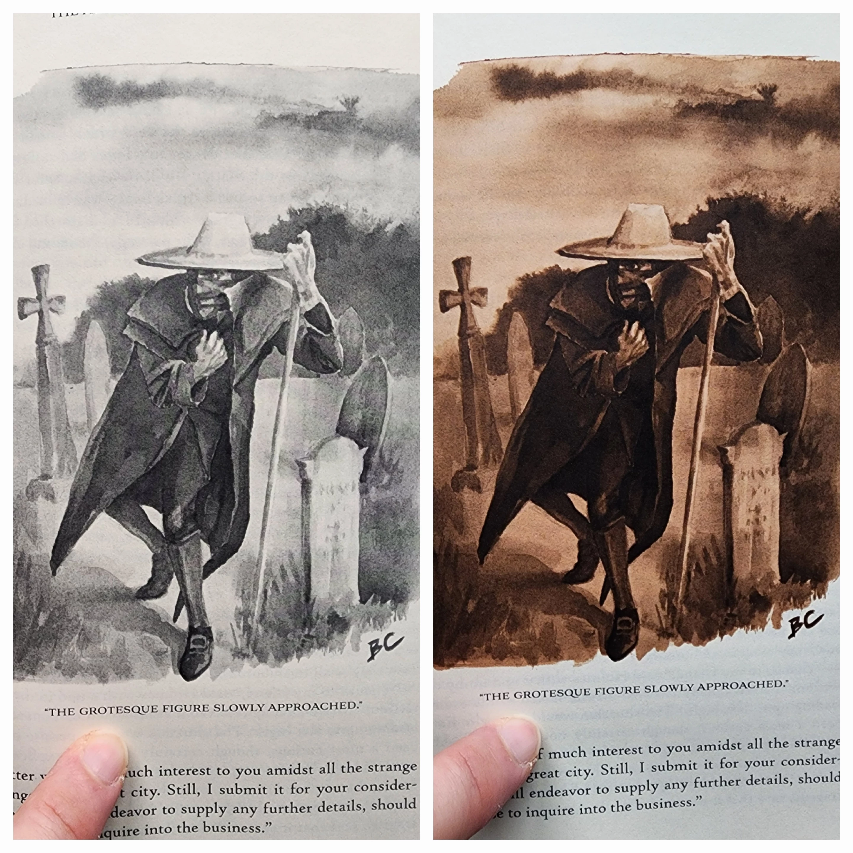
I have recently had two proofs made for a book that I have written and illustrated. I would like to print in black and white if possible to keep costs down, however I've been having trouble with the grayscale images losing their contrast and rich blacks. The second proof was done in color, and the sepia images look great. I've put them side by side for comparison (the b&w appears more washed out in person). Is there something I should be doing to the b&w files to avoid the loss of values? I edited them in photoshop, converted to grayscale, increased contrast, saved as PNG's, dropped into my InDesign book file, and then exported for print. Thanks!


2 답변

Stephen Marsh
Community Expert
Community Expert
July 12, 2025

Presuming a single/short run PoD book publishing service.


Mono/Black & White printing will use a single toner/ink, therefore it will naturally have lesser density. It costs less to print and doesn't have concerns with maintaining neutrality.


Full colour print will offer greater density due to having four toners/inks buiilding the shadows. You may have issues with maintaining neutral tones.


For the sepia or colour images, were these supplied as RGB or CMYK files? What ICC profile or conversion did the images or PDF conversion use?


Are the proofs close to what you see on screen for both mono and sepia/colour, particularly density and detail?


Are the proofs inkjet proofs or actual prints from the digital press used for production on the final stock?

Participating Frequently
July 12, 2025

This may help-apologies, as I am somewhat new to this

Stephen Marsh
Community Expert
Community Expert
July 12, 2025

You need to soft proof your images using your working CMYK with black simulation and/or paper white simulations for the colour images. Use a custom proof setup for Working Gray.


https://helpx.adobe.com/au/photoshop/using/proofing-colors.html


It could just be the photo, however, the paper white appears quite dark, which reduces the visual contrast compared to a monitor. Same for the blacks. Having a calibrated and characterised/profiled monitor and using softproofing will provide a much closer preview. I also notice that the photo of the colour/sepia version appears to have lost a lot of shadow detail, which if accurate, may need to be compensated for.


EDIT: Now that I know that they use a 300% ink limit version of GRACoL 2006 Coated, use that and not your default Working CMYK.

pixxxelschubser
Community Expert
Community Expert
July 12, 2025

How about with a Black&White adjustment layer?
I've added one default setting and one custom setting


Participating Frequently
July 12, 2025

I haven't done much with B&W adjustment layers in the past, but I can certainly give it a try. Would the correct usage be to edit the color image this way and then save in CMYK? Or should I still convert to grayscale?

pixxxelschubser
Community Expert
Community Expert
July 12, 2025

I would probably convert the file to greyscale in Photoshop. Or, depending on your workflow, work media-neutral in RGB in your layout programme and convert to CMYK when outputting the print file with Device Link Profile.