Kaiser101
Participant
May 21, 2026
Question

Extract hand drawn lines from an image

  • May 21, 2026
  • 3 replies
  • 50 views

I’m an occasional Photoshop user  accessing  instructional videos on Youtube when I need to do something specific.  In this case after four tries I’m not getting to my goal and need some help.

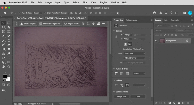
I took several photos of art drawn by son on  his bedroom walls.  I want to extract the drawn images from the wall background.  I’ve tried selecting a color range, converting image to greyscale and other approaches.  None of the approaches are satisfactory. 

My latest approach is to select a color range , create a mask and then apply a solid color to the drawing. But the drawing is not dark because it is missing some pixels.  If I feather the selection it picks up other parts of background.

To replace the background I  use color range to select the drawing, invert, create a mask and then add a solid color.  This seems to work but the drawing does not stand out as described above.

Ideally I would like to make the selection of the drawing with low fuzziness and expand the selection somehow it to darken it , perhaps by blurring it.  I have not  figured out how to do this step.  

Any assistance would be appreciated.  

    3 replies

    Kaiser101
    Kaiser101Author
    Participant
    May 22, 2026

    Thanks for the suggestion.  My procedure was: 1: select color range, 2. select focus area.  When I did, it also selected the pixels within the letters “Andy”.  See below.  I’m not sure why I didn’t get the same result as you did.  

    Conrad_C
    Community Expert
    Community Expert
    May 22, 2026

    My idea (demo below) is definitely not the only way, but it’s relatively simple. To help show the result, I added a different blue background in advance, at the back of the layer stack. These are the steps I used:

    1. Select the layer, and then click the Remove Background button in the Contextual Task Bar. Zooming in reveals some areas are not fully black, so that needs another step.
    2. In the Adjustments panel, click Threshold to add a Threshold adjustment layer. The reason I picked this is that it forces pixels to black or white, no gray. Move the Threshold Level slider until all gray pixels are forced to black.
    3. The current result is black and white (no transparency), so clip the result to the non-background pixels by converting it to a clipping mask: Choose the menu command Layer > Create Clipping Mask. A shortcut is to Option-click (macOS) or Alt-click (Windows) the line between those layers in the Layers panel.

    These steps don’t make the outline any sharper, they only make the result solid black against a transparent background. If sharpening the outline is part of your goal, you could explore various smoothing techniques and maybe increase edge contrast, but if you want all fuzziness gone and a uniform hard edge, you probably want to convert it to a vector graphic using something like Image Trace in Adobe Illustrator.


    Kaiser101
    Kaiser101Author
    Participant
    May 22, 2026

    Your approach worked great for this image.  I tried it on the next image but it didn’t separate the background within the box.  Here is the image.  Any suggestions are appreciated.

    Conrad_C
    Community Expert
    Community Expert
    May 22, 2026

    For Remove Background, the problem with this second image is probably the box around the art, which wasn’t in the first image. Remove Background is really Select Subject inverted, and when the machine learning model first identified the subject, I guess it thought it had to stop at the edge of the box. So Remove Background doesn't work as well here and we have to try something else. After I did the steps below, the Threshold method wasn’t helping much either. It’s a more challenging example.


    One idea I had was to look at the channels. Again, not saying this is the ultimate solution or the only way, just showing another way to look at the image based on its color “anatomy.” These are the steps I did in the demo below: 

    1. I display the Channels panel and view each RGB channel on its own. I notice there’s better contrast in some channels, so…
    2. I add a Channel Mixer adjustment. I click the Monochrome button because the color in the image isn’t really needed, then I adjust the proportions of the RGB channels until I manage to drop out a lot of the background.


    More manual steps would be needed to clean it up further, for example the resulting line work is very rough. The thing is, we keep running into the major issue that LAMY2017 mentioned: The image quality of the original images is very difficult to work with. Dropping out the background would have been much easier and faster if the image was not so dark and low-contrast, and if it was evenly lit from edge to edge. In digital images, image quality in darker tones is lower than in the brighter tones, so dark images tend to be more difficult to edit because there’s so much noise and banding to deal with.


    The low contrast means it’s even more difficult to separate the graphic from the unwanted tones. At the end of the demo you can see that the right corners of the background are actually dark enough to be similar in value to the lines you want to keep; that means you can’t fully separate the lines from the background using a luminance range mask alone.


    The background is unevenly lit both from left to right and from center to edge, so part of what the additional manual steps would need to do is even those out. Clever use of gradients could help there.


    It’s understandable if these were just quick phone snaps. If that wall hasn't been painted over yet, going back and photographing nice, evenly lit, normal contrast source images of the artwork would save a tremendous amount of work in editing. It’s because of the difficult nature of those images that we have to go deep into “advanced techniques” territory, which makes it even harder for a non-expert user. That’s a big reason to try to get the best quality original images you can.

    Legend
    May 22, 2026

    @Kaiser101, several problems with that file

    • poorly shot/scanned
    • wall texture adds variation to the background

    Different ways to work this -- Select Color Range, Select Focus Area. I had good experience with the latter method.

    Once I selected the text, I promoted it to its own layer. I’d adjust sharpening, add a new background.

    Additionally, you could use the Paint tool to pretty up the lines.


    Larry