Participating Frequently
April 2, 2026
Question

Looking to recreate this distressed dink effect with displacement maps?

  • April 2, 2026
  • 2 replies
  • 22 views

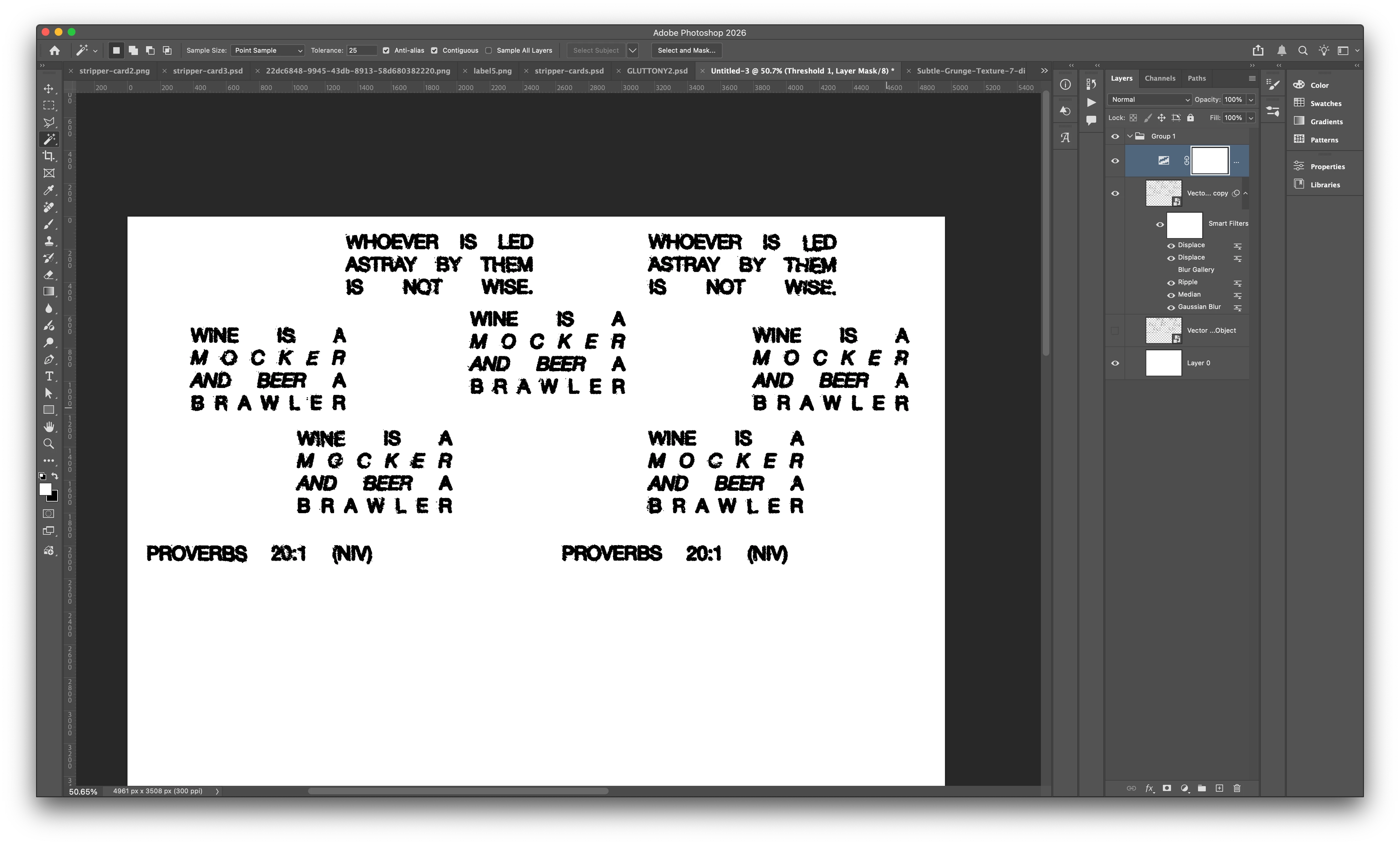
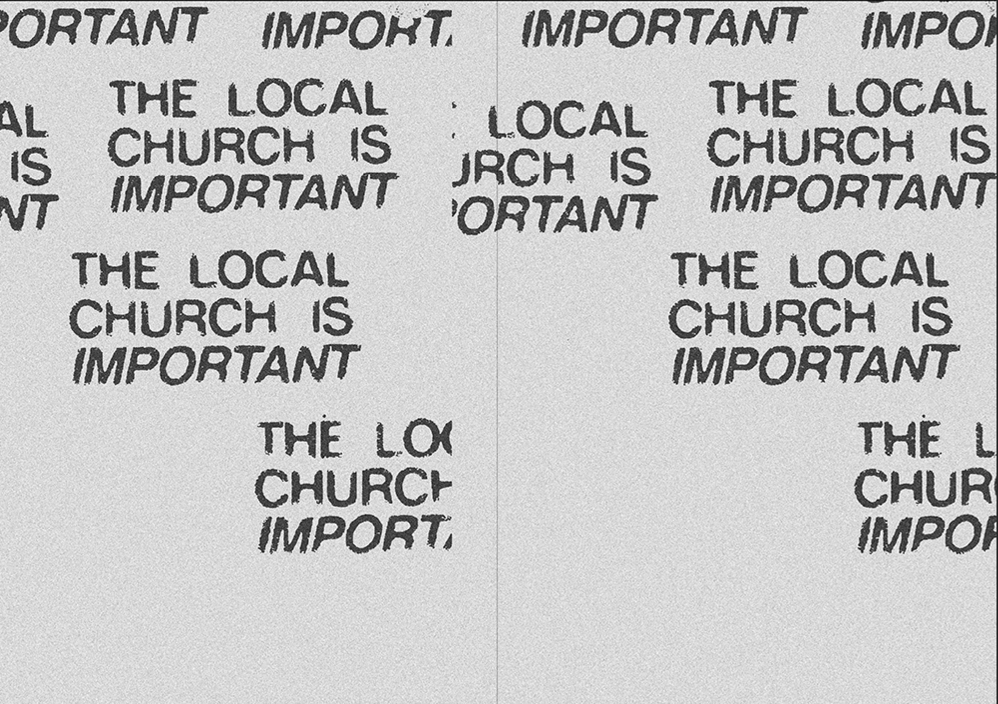
I am Looking to recreate this distressed ink effect with displacement maps? I have had a go in photoshop but I am looking for the distressing on the edge of letters? 


    2 replies

    Trevor.Dennis
    Community Expert
    Community Expert
    April 2, 2026

    To distress the text outline.

    Go Type > Create Work Path

    Add a layer mask to the type layer.

    Find a brush that when applied to the text layer mask (with black) gives a suitable result.

    Note: I searched brushes with Distressed and adjusted scatter jitter and spacing in my example.

    With the layer mask selected, right click the Work Path and chose Stroke using the Brush tool.  This will cause the brush to paint out the outline of the text.

    I found that even after modifying the brush preset, I still had to apply the stroke a couple of times, but once the Brush is selected for the ‘stroke work path’ you can reapply using the icon I have highlighted at the bottom of the Paths panel.


    Good luck.

    Trevor.Dennis
    Community Expert
    Community Expert
    April 2, 2026

    This is the brush preset I used.  It’s in the legacy default brushes.

    I set spacing to 10%


    davescm
    Community Expert
    Community Expert
    April 2, 2026

    Have you thought about using one of the many downloadable typewriter fonts. I used three here from Adobe fonts.

    The top 3 are the fonts as downloaded.
    The middle three are the same but with dissolve blend mode

    The bottom three are the same with dissolve blend mode and a mask added filled with a pattern ( Grayscale paper Kraft Waffle) and the mask density reduced to 10%. 

    Click on the image below to see at 100% view


    Dave

    Participating Frequently
    April 2, 2026

    It is not the font, it is the style of displacement map, I cannot get the extra worn deteriorated edges on Helvetica all caps which is the font, it just is not deteriorating it enough? maybe it is a brush?