Neomania
Known Participant
November 8, 2019
질문

Photoshop CC2020 UI

  • November 8, 2019
  • 2 답변들
  • 1258 조회

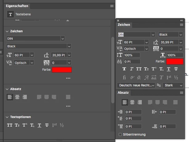
The new property panel for type layers ("Eigenschaften" in german) is good, but how come the UI uses so much blank space?

The original panels are more compact and now you have to scroll down to get all informations or enlarge the property panel.

I thought it would be usefull and I could close the other type panels, but not yet.

The same with the transform function. The spacing of all input fields is way bigger than in all other panels.

이 주제는 답변이 닫혔습니다.

2 답변

Neomania
Neomania작성자
Known Participant
November 9, 2019

For me the properties panel is an "always on" panel to check the correction layers and since it contains the typographic informations too, I could close those panels when I'd get the same informations at the same place. I made a layout to show how much space could be saved by just using the same layout as in the specific panels.


Yes, I could collapse the scections and open them when needed and close them when not... But then I rather keep the specific type panels open and don't use the properties panel for type layers at all. The "quick action buttons" at the end of the panel make more sense in the menu bar?

Semaphoric
Community Expert
Community Expert
November 8, 2019

You could collapse all the sections, and expand them when you need a particular one:

silk-m
Community Expert
Community Expert
November 8, 2019

The wasted space on the Properties panel has the same problem in Japanese.

     UI font size: Small,      UI font size: Small,      UI font size: Large,      UI font size: Large

    Language: Japanese,     Language: English,     Language: Japanese,     Language: English 


https://www.adobeprerelease.com/beta/0CDC5762-D849-4D38-CCFC-FF60F5A41543/feedback/item/PSJ-130#


Wasted space for Properties panels
Posted by Silk-m on Sep 2, 2019, 9:29 AM
 
Product     Photoshop Japan
Build     Mainbuild 21.0 Build 15
Platform     Mac 10.14
Locale     Japanese
State     In test
Status     Open
Component     UI / Translation
 
Description Problem Description:
When using the interface in Japanese, there is a useless space on the right side. I would like you to eliminate this like the English interface.
 
Steps to Reproduce:
1. Open the Properties panel
2.
3.
4. 
 
Actual Result:
There is wasted space on the right side of the Properties panel
 
Expected Result ::
The panel interface should be as compact as possible without compromising ease of use.
 
Any Workarounds:
 
Adobe
Thank you for the bug report. As you said, it is best to make the panel compact so that it does not take up space. I immediately told the team. Thank you, continue.
--Susumu Iwasaki