
Answered
Kerning in PSE 14
I upgraded from PSE 11 to PSE 14 last fall and noticed that the letters in my Text are much further apart than they should be no matter what font I use. I added the Show Asian Text Option to my tools thinking that the kerning was changed somehow. I have turned on Mojikumi and while that has brought the letters closer together they are still abnormally too far apart and I don't think I should have to activate this every time I use the Type tool. Anyone have a solution or know why this is different in PSE 14? Thank you in advance for your help!
 to open the menu in Tool Options.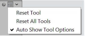
 AdChoices