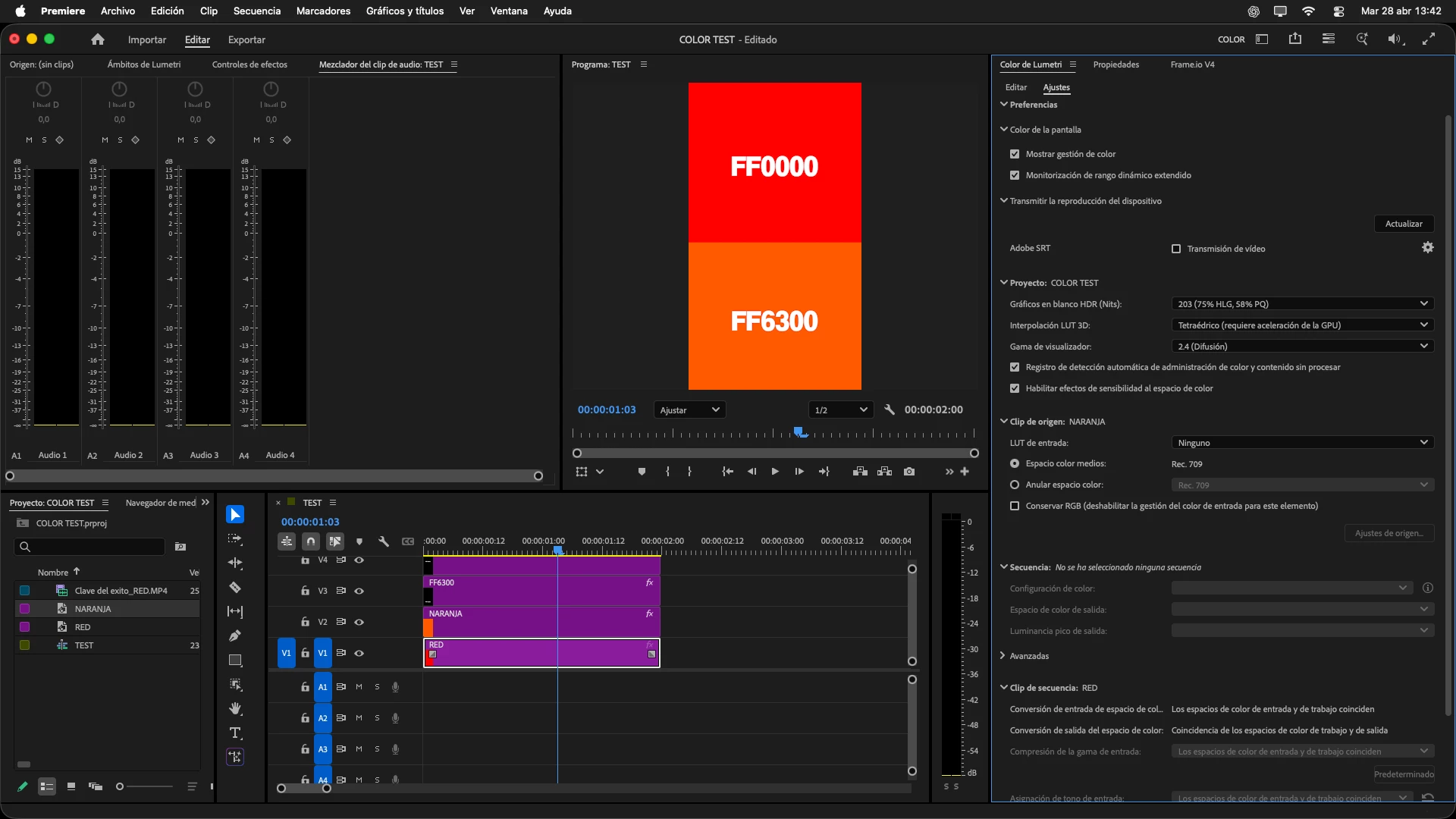
First, there isn’t any such thing as “correcct” or “uniform” color. And really, there can’t be.
Every capture device records brightness only, no capture device ‘sees’ color. They use a pattern of color filters over the recording sensors and a ton of incredibly math to manufacture from whole cloth data that can look like color when viewed on a screen.
And we can’t make identical anything ... those screen panels you view on, whether in your iPhone or computer or TV? Every one of them measures differently. The new QD-OLED being used by Flanders and Eizo for full-on Grade 1 Reference panels? Those are the panels that when tested after manufacture, have the highest uniformit and closest-to-spec results. And sell for a ton more than the next panel off the line which doesn’t measure that high. Though technically, “it’s an identical screen panel”.
That lower scoring panel goes in a regular monitor or TV.
Next, what companies do with the camera sensing panels or screen display panels to move the signal is completely different than by others, with chips and bits that are also never uniform. The amazing thing isn’t that it’s not uniform, the truly amazing thing is this mostly works AT ALL.
So your iPhone screen is not going to be exactly the same as any other iPhone out there. Probably ... close. Never identical.
And yes this variability drives pro colorists around the bend! Until they realize that what is, is, and they can’t do anything about the screens their content gets viewed on.
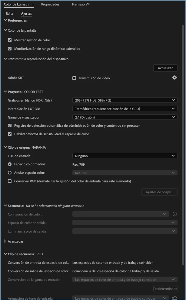
So what do they do? They set up highly scored monitors, calibrated by stuff costing more than your entire computer hardware, profiled to check the calibration, and in rooms with exact luminance levels and gray-ness behind that Reference monitor. And grade to and under the tightest specs they can.
And when done, they ... let it go. As “you can’t fix gramma’s green TV.”