
How does Premiere Pro interprets pictures with embedded color profiles?
I noticed that some pictures I import into Premiere look washed out in the timeline (and exports), but look OK in the media source pannel. Some other pictures look fine and consistent everywhere.
It appears that only pictures with an embedded color profile have this problem (in my case sRGB IEC61966-2.1).
To get an idea of the kind of "washed out" it creates, you can open the picture in Photoshop, convert it from sRGB to Rec. 709 (because of the conversion, it looks the same at that point), then assign it a sRGB profile again (since there's no conversion, the Rec. 709 data is now interpreted differenly and looks washed out).
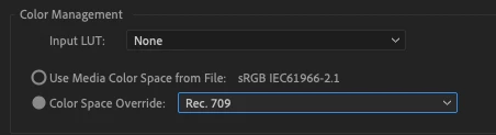
In Premiere, I mitigated this issue by right clicking on the picture in the project pannel, going in Modify, Interpret Footage, and in the Color Management section, setting Color Space Override to Rec. 709.
Here's some screenshots of this behaviour. First, the default settings:
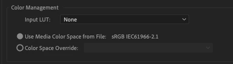
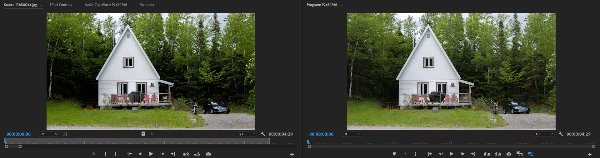
Which looks like this:
Then when forcing Rec. 709:
We get this:
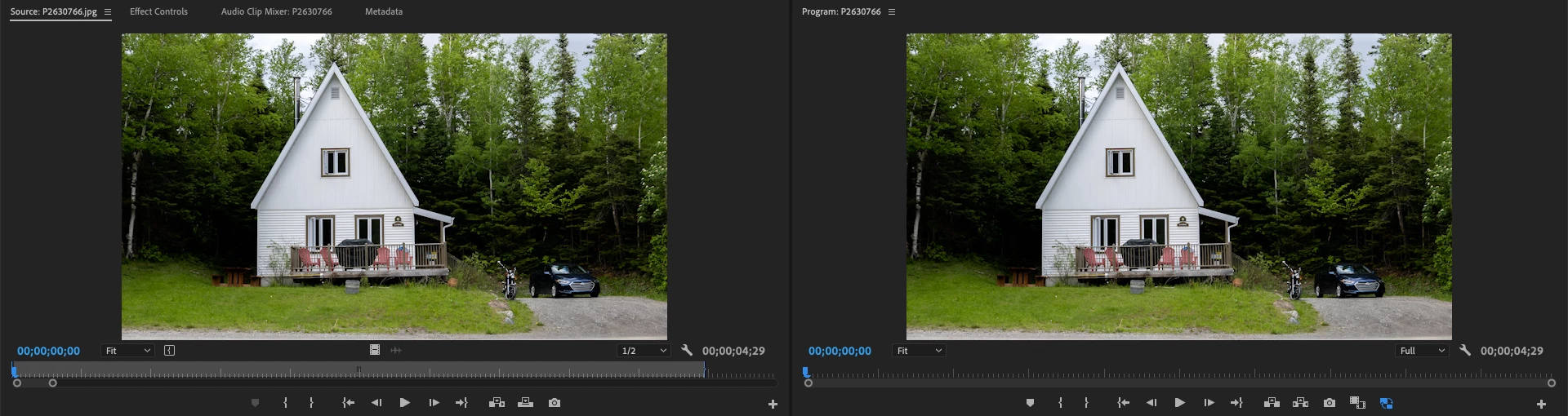
By overlaying the second screenshot over the first one and switching back and forth, it's easy to see that the source monitor displays the image the same in both cases, while in the timeline, the default one is washed out and the forced Rec. 709 one matches the source preview (which is the actual "look" I see in Lightroom, Photoshop, and other color managed applications).
Here's the original picture if it can help: https://drive.google.com/file/d/1ahsf5ovjR7WSvNVNnW5c9Xmz1kxz_RML/view
I'm on Premiere 2021 but I just tried with 2020 and I can see the same behaviour, so I'm not sure if it's a bug? Instead, I'm curious to understand why it behaves in this way, because it seems a bit counter intuitive to me to have to manually override the profile of color managed images with a "wrong" profile to have them render properly. Thanks!